04/10/2018, 20:09
3 Mẫu button với hiệu ứng đẹp mắt bằng CSS3
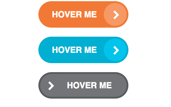
Những mẫu button đẹp và hiệu ứng đầy sáng tạo sẽ kích thích người dùng nhấp chuột vào. Đây là một trong những thành phần rất quan trọng trong các mẫu thiết kế web cũng như tạo giao diện thân thiện với người dùng. Trong bài viết này, mình sẽ chia sẻ cho các bạn 3 mẫu button sẽ giúp các bạn có thêm ý ...
Những mẫu button đẹp và hiệu ứng đầy sáng tạo sẽ kích thích người dùng nhấp chuột vào. Đây là một trong những thành phần rất quan trọng trong các mẫu thiết kế web cũng như tạo giao diện thân thiện với người dùng. Trong bài viết này, mình sẽ chia sẻ cho các bạn 3 mẫu button sẽ giúp các bạn có thêm ý tưởng cũng như có thể áp dụng chúng vào trong website của các bạn.
Xem Demo | Download
HTML
Như thường lệ, chúng ta chèn khai báo font Awesome để tạo icon.
<link rel='stylesheet prefetch' href='https://maxcdn.bootstrapcdn.com/font-awesome/4.7.0/css/font-awesome.min.css'>
Cấu trúc html của cả 3 button đều giống nhau như sau :
<div class="type-1">
  <div>
    <a href="" class="btn btn-1">
      <span class="txt">Hover me</span>
      <span class="round"><i class="fa fa-chevron-right"></i></span>
    </a>
  </div>
</div>

<div class="type-2">
  <div>
    <a href="" class="btn btn-1">
      <span class="txt">Hover me</span>
      <span class="round"><i class="fa fa-chevron-right"></i></span>
    </a>
  </div>
</div>

<div class="type-3">
  <div>
    <a href="" class="btn btn-1">
      <span class="txt">Hover me</span>
      <span class="round"><i class="fa fa-chevron-right"></i></span>
    </a>
  </div>
</div>
CSS
Mỗi kiểu sẽ có những hiệu ứng được định dạng với đoạn css bên dưới.
/* Mau sac cua cac button */
.btn-1 {
  background-color: #F27935;
}
.btn-1 .round {
  background-color: #f59965;
}

.btn-2 {
  background-color: #00AFD1;
}
.btn-2 .round {
  background-color: #00c4eb;
}

.btn-3 {
  background-color: #5A5B5E;
}
.btn-3 .round {
  background-color: #737478;
}

/* Thiết lập chung cho các button */

a {
  text-decoration: none;
  -moz-border-radius: 30px;
  -webkit-border-radius: 30px;
  border-radius: 30px;
  padding: 12px 53px 12px 23px;
  color: #fff;
  text-transform: uppercase;
  font-family: sans-serif;
  font-weight: bold;
  position: relative;
  -moz-transition: all 0.3s;
  -o-transition: all 0.3s;
  -webkit-transition: all 0.3s;
  transition: all 0.3s;
  display: inline-block;
}
a span {
  position: relative;
  z-index: 3;
}
a .round {
  -moz-border-radius: 50%;
  -webkit-border-radius: 50%;
  border-radius: 50%;
  awidth: 38px;
  height: 38px;
  position: absolute;
  right: 3px;
  top: 3px;
  -moz-transition: all 0.3s ease-out;
  -o-transition: all 0.3s ease-out;
  -webkit-transition: all 0.3s ease-out;
  transition: all 0.3s ease-out;
  z-index: 2;
}
a .round i {
  position: absolute;
  top: 50%;
  margin-top: -6px;
  left: 50%;
  margin-left: -4px;
  -moz-transition: all 0.3s;
  -o-transition: all 0.3s;
  -webkit-transition: all 0.3s;
  transition: all 0.3s;
}

.txt {
  font-size: 14px;
  line-height: 1.45;
}

/* Mẫu button thu nhat */

.type-1 a:hover {
  padding-left: 48px;
  padding-right: 28px;
}
.type-1 a:hover .round {
  awidth: calc(100% - 6px);
  -moz-border-radius: 30px;
  -webkit-border-radius: 30px;
  border-radius: 30px;
}
.type-1 a:hover .round i {
  left: 12%;
}

/* Mẫu button thứ hai */

.type-2 a:hover .round {
  background: none;
}
.type-2 a:hover .round i {
  left: 70%;
}

/* Mẫu button thứ ba */

.type-3 .round {
  background: transparent;
}
.type-3 a {
  position: relative;
  overflow: hidden;
}
.type-3 a.btn-1:after {
  background-color: #f59965;
}
.type-3 a.btn-2:after {
  background-color: #00c4eb;
}
.type-3 a.btn-3:after {
  background-color: #737478;
}
.type-3 a:after {
  content: "";
  -moz-border-radius: 50%;
  -webkit-border-radius: 50%;
  border-radius: 50%;
  awidth: 37px;
  height: 38px;
  position: absolute;
  right: 3px;
  top: 3px;
  -moz-transition: all 0.3s ease-out;
  -o-transition: all 0.3s ease-out;
  -webkit-transition: all 0.3s ease-out;
  transition: all 0.3s ease-out;
}
.type-3 a:hover:after {
  right: 100%;
  awidth: 50%;
}
.type-3 a:hover i {
  margin-left: 4px;
}
Chúc các bạn thành công !
Chuyên Mục: Css
Bài viết được đăng bởi webmaster