[Android] Tìm hiểu về Custom View và xây dựng thư viện Circular Seekbar
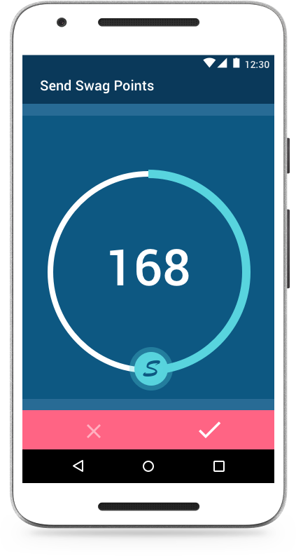
Hôm nay mình sẽ hướng dẫn các bạn tạo ra một custom view Seekbar dạng vòng như bên dưới, tạo thư viện và đẩy lên JCenter. Trong bài viết này, mình sẽ nói một số khái niệm cơ bản về custom view trong android và làm thế nào để xuất bản thư viện. Hãy xem cách widget này hoạt động, người dùng có thể ...
Hôm nay mình sẽ hướng dẫn các bạn tạo ra một custom view Seekbar dạng vòng như bên dưới, tạo thư viện và đẩy lên JCenter. Trong bài viết này, mình sẽ nói một số khái niệm cơ bản về custom view trong android và làm thế nào để xuất bản thư viện.
Hãy xem cách widget này hoạt động, người dùng có thể chạm vào biểu tượng chỉ thị quanh vòng cung để thiết lập giá trị. Biểu tượng sẽ ngừng kéo khi vượt quá giá trị min/max. Nó hoạt động như một phần mở rộng của Seekbar với khả năng tùy biến và sự kiện chuyển động.
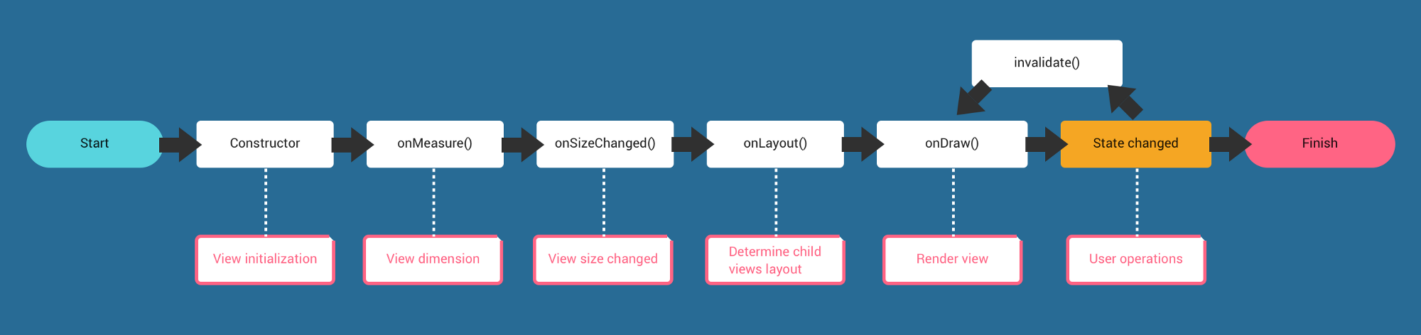
Như mọi người biết thì tất cả các view widget đều dựa trên View, để implement một custom view bạn cần hiểu vòng đời của view trước đã.
Để bắt đầu, đầu tiên ta phải tạo một class extends View và tạo 2 hàm tạo mặc định cho phép tạo view trong chương trình hoặc trong XML.
public class SwagPoints extends View {

    // used in view creation programmatically
    public SwagPoints(Context context) {
        super(context);
    }

    // used in XML layout file
    public SwagPoints(Context context, @Nullable AttributeSet attrs) {
        super(context, attrs);
    }
}
Tiếp đó, một số khái niệm ta phải quan tâm khi custom view :
1. Attributes : Xác định các thuộc tính cho phép các developer thay đổi diện mạo và hành vi trong tệp XML theo thiết kế của họ.
2. Size : Xác định kích thước của View và các thành phần của nó.
3. Drawing : Xác định cách mà view và các thành phần của nó được render trên màn hình.
4. Touch : Xác định cách mà người dùng tương tác với view bằng cách chạm.
1. Attributes
Ở đây ta sẽ cung cấp một số thuộc tính tùy chỉnh cho nhà phát triển. Ta tạo tệp attrs.xml theo đường dẫn res/values/attrs.xml và định nghĩa các thuộc tính cho view trong thẻ <declare-styleable> như sau :
<resources>
    <declare-styleable name="SwagPoints">
        <attr name="points" format="integer" />
        <attr name="max" format="integer" />
        <attr name="min" format="integer"/>
        <attr name="step" format="integer"/>

        <attr name="indicatorIcon" format="reference" />

        <attr name="progressWidth" format="dimension" />
        <attr name="progressColor" format="color" />

        <attr name="arcWidth" format="dimension" />
        <attr name="arcColor" format="color" />

        <attr name="textSize" format="dimension"/>
        <attr name="textColor" format="color"/>

        <attr name="clockwise" format="boolean" />
        <attr name="enabled" format="boolean" />

    </declare-styleable>

</resources>
Tiếp theo, sử dụng TypedArray để lấy các giá trị thuộc tính trong class và xác định các biến mẫu. Đẩy chúng vào hàm init() sau super() :
private void init(Context context, AttributeSet attrs) {

	float density = getResources().getDisplayMetrics().density;

	// Defaults, may need to link this into theme settings
	int arcColor = ContextCompat.getColor(context, R.color.color_arc);
	int progressColor = ContextCompat.getColor(context, R.color.color_progress);
	int textColor = ContextCompat.getColor(context, R.color.color_text);
	mProgressWidth = (int) (mProgressWidth * density);
	mArcWidth = (int) (mArcWidth * density);
	mTextSize = (int) (mTextSize * density);

	mIndicatorIcon = ContextCompat.getDrawable(context, R.drawable.indicator);

	if (attrs != null) {
		// Attribute initialization
		final TypedArray a = context.obtainStyledAttributes(attrs,
				R.styleable.SwagPoints, 0, 0);

		Drawable indicatorIcon = a.getDrawable(R.styleable.SwagPoints_indicatorIcon);
		if (indicatorIcon != null)
			mIndicatorIcon = indicatorIcon;

		int indicatorIconHalfWidth = mIndicatorIcon.getIntrinsicWidth() / 2;
		int indicatorIconHalfHeight = mIndicatorIcon.getIntrinsicHeight() / 2;
		mIndicatorIcon.setBounds(-indicatorIconHalfWidth, -indicatorIconHalfHeight, indicatorIconHalfWidth,
				indicatorIconHalfHeight);

		mPoints = a.getInteger(R.styleable.SwagPoints_points, mPoints);
		mMin = a.getInteger(R.styleable.SwagPoints_min, mMin);
		mMax = a.getInteger(R.styleable.SwagPoints_max, mMax);
		mStep = a.getInteger(R.styleable.SwagPoints_step, mStep);

		mProgressWidth = (int) a.getDimension(R.styleable.SwagPoints_progressWidth, mProgressWidth);
		progressColor = a.getColor(R.styleable.SwagPoints_progressColor, progressColor);

		mArcWidth = (int) a.getDimension(R.styleable.SwagPoints_arcWidth, mArcWidth);
		arcColor = a.getColor(R.styleable.SwagPoints_arcColor, arcColor);

		mTextSize = (int) a.getDimension(R.styleable.SwagPoints_textSize, mTextSize);
		mTextColor = a.getColor(R.styleable.SwagPoints_textColor, mTextColor);

		mClockwise = a.getBoolean(R.styleable.SwagPoints_clockwise,
				mClockwise);
		mEnabled = a.getBoolean(R.styleable.SwagPoints_enabled, mEnabled);
		a.recycle();
	}
}
2. Size
Để kiểm soát được kích thước của view, ta phải @override lại phương thức onMeasure() và tính toán kích thước của từng thành phần. Ở đây ta sẽ phải xác định bán kính cung theo chiều rộng, chiều cao của view.
@Override
protected void onMeasure(int awidthMeasureSpec, int heightMeasureSpec) {

	final int awidth = getDefaultSize(getSuggestedMinimumWidth(), awidthMeasureSpec);
	final int height = getDefaultSize(getSuggestedMinimumHeight(), heightMeasureSpec);
	final int min = Math.min(awidth, height);

	mTranslateX = (int) (awidth * 0.5f);
	mTranslateY = (int) (height * 0.5f);

	int arcDiameter = min - getPaddingLeft();
	mArcRadius = arcDiameter / 2;
	float top = height / 2 - (arcDiameter / 2);
	float left = awidth / 2 - (arcDiameter / 2);
	mArcRect.set(left, top, left + arcDiameter, top + arcDiameter);

	updateIndicatorIconPosition();
	super.onMeasure(awidthMeasureSpec, heightMeasureSpec);
}
3. Drawing
Đây chính là nơi bạn thể hiện khả năng vẽ của mình