Hiệu ứng ẩn hiện giỏ hàng cực đơn giản với CSS3
Hiện nay, nhiều mẫu website chuyên trang bán hàng ( eCommerce ) với những tính năng vượt trội xuất hiện ngày càng nhiều. Hôm nay mình sẽ chia sẻ cho các bạn một hiệu ứng nhỏ dành cho phần giỏ hàng, hiệu ứng này hoàn toàn được làm bằng CSS3 Animation, do đó các bạn ngoài việc áp dụng hiệu ứng vào ...
Hiện nay, nhiều mẫu website chuyên trang bán hàng (eCommerce) với những tính năng vượt trội xuất hiện ngày càng nhiều. Hôm nay mình sẽ chia sẻ cho các bạn một hiệu ứng nhỏ dành cho phần giỏ hàng, hiệu ứng này hoàn toàn được làm bằng CSS3 Animation, do đó các bạn ngoài việc áp dụng hiệu ứng vào chính những trang bán hàng của mình, mà còn có thể học thêm được nhiều thuộc tính có sẵn của CSS3.
Xem Demo | Download
HTML
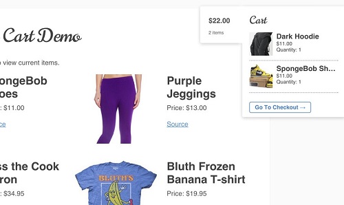
Đầu tiên, các bạn xây dựng khung chuẩn html như sau đối với giỏ hàng.
<div id="wrapper">
  <div class="cart-tab visible">
    <a href="#" title="View your shopping cart" class="cart-link">
      <span class="amount">$22.00</span>
      <span class="contents">2 items</span>
    </a>
    <div class="cart">
      <h2>Cart</h2>
      <div class="cart-items">
        <ul>
          <li class="clearfix">
            <img src="img/dark-clean-hoodie.jpg" class="productimg">
            <h4>Dark Hoodie</h4>
            <span class="item-price">$11.00</span>
            <span class="quantity">Quantity: 1</span>
          </li>

          <li class="clearfix">
            <img src="img/spongebob-nike-shoes.jpg" class="productimg">
            <h4>SpongeBob Shoes</h4>
            <span class="item-price">$11.00</span>
            <span class="quantity">Quantity: 1</span>
          </li>
        </ul>
      </div>

      <a href="#" class="checkout">Go To Checkout →</a>
    </div>
  </div>
CSS
Hiệu ứng này sẽ làm cho giỏ hàng có thể chạy xuyên suốt trang mỗi khi các bạn scroll, vì thế mà phần tử với class .cart-tab sẽ đuộc ấn định thuộc tính là position:fixed, và sau đây là các thuộc tính của CSS3 transition để tạo hiệu ứng động.
/** flyout menu **/
.cart-tab {
  awidth: 22em;
  position: fixed;
  top: 5em;
  z-index: 9999;
  background: #fff;
  right: -22em;
  -webkit-transition: right ease .5s;
  -moz-transition: right ease .5s;
  -o-transition: right ease .5s;
  transition: right ease .5s;
}

.cart-tab a.cart-link {
  position: absolute;
  top: 0;
  left: -9em;
  awidth: 8.6em;
  display: block;
  background: #fff;
  padding: 1.8em;
  text-decoration: none;
  -webkit-transition: left ease .5s;
  -moz-transition: left ease .5s;
  -o-transition: left ease .5s;
  transition: left ease .5s;
  -webkit-border-top-left-radius: 3px;
  -webkit-border-bottom-left-radius: 3px;
  -moz-border-radius-topleft: 3px;
  -moz-border-radius-bottomleft: 3px;
  border-top-left-radius: 3px;
  border-bottom-left-radius: 3px;
}
.cart-tab a.cart-link:after {
  content: "";
  display: block;
  position: absolute;
  top: 0;
  right: -10px;
  awidth: 10px;
  height: 100%;
  background: #fff;
}

.cart-tab:hover { right: 0; }

.cart-tab a.cart-link .amount {
  display: block;
  color: #515151;
  font-size: 1.5em;
  line-height: 1.7em;
  font-weight: bold;
  margin-bottom: 8px;
}
.cart-tab a.cart-link .contents {
  display: block;
  color: #666;
  font-size: 1em;
}

.cart-items { display: block; margin-bottom: 25px; }
.cart-items ul { display: block; list-style: none; }
.cart-items ul li { display: block; margin-bottom: 8px; padding-bottom: 10px; cursor: pointer; border-bottom: 1px dotted #888; }

.cart-items ul li .item-price, .cart-items ul li .quantity { display: block; margin-bottom: 2px; font-size: 1.1em; }
.productimg { display: block; float: left; margin-right: 8px; }

.cart-tab .cart { padding: 1.5em; margin: 0; }
.cart-tab .cart .checkout {
  font-size: 1.2em;
  padding: 4px 11px;
  border: 1px solid #467fc5;
  color: #467fc5;
  font-weight: bold;
  text-align: center;
  text-decoration: none;
  -webkit-border-radius: 4px;
  -moz-border-radius: 4px;
  border-radius: 4px;
}
.cart-tab .cart .checkout:hover { background: #467fc5; color: #fff; }

.cart-tab a.cart-link,.cart-tab .cart {
  -webkit-box-shadow: 0 2px 10px 0 rgba(0,0,0,0.2);
  -moz-box-shadow: 0 2px 10px 0 rgba(0,0,0,0.2);
  -o-box-shadow: 0 2px 10px 0 rgba(0,0,0,0.2);
  box-shadow: 0 2px 10px 0 rgba(0,0,0,0.2);
}

.cart-tab .cart {
  -webkit-border-bottom-left-radius: 3px;
  -webkit-border-bottom-right-radius: 3px;
  -moz-border-radius-bottomleft: 3px;
  -moz-border-radius-bottomright: 3px;
  border-bottom-left-radius: 3px;
  border-bottom-right-radius: 3px;
}
Mình hy vọng là các bạn sẽ có thể áp dụng thành công hiệu ứng này vào trong trang web bán hàng của các bạn.
Chúc các bạn thành công !
Chuyên Mục: Css
Bài viết được đăng bởi webmaster