12/08/2018, 17:05
Hướng dẫn viết game pacman với CSS3 animation
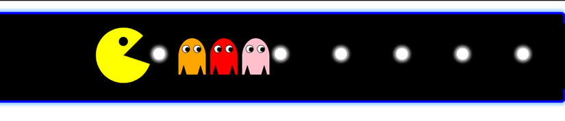
1. HTML Bước đầu chúng ta sử dụng đoạn HTML này để css background màu đen và hình hoạt hình chuyển động. <body> <div class="pista"> <div class="luces"><span></span><span></span><span></span><span></span><span></ ...
1. HTML
Bước đầu chúng ta sử dụng đoạn HTML này để css background màu đen và hình hoạt hình chuyển động.
<body>
 <div class="pista">
  <div class="luces"><span></span><span></span><span></span><span></span><span></span><span></span><span></span><span></span><span></span><span></span></div>
  <div class="tras-come"></div>
  <div class="packman"><div class="comecocos"></div></div>
	<div class="fantasmas">
	   <div class="fantasma tres"><div class="ojo"></div><div class="ojo"></div></div>
     <div class="fantasma uno"><div class="ojo"></div><div class="ojo"></div></div>
    <div class="fantasma dos"><div class="ojo"></div><div class="ojo"></div></div>
 </div>
 </div>
</body>
2. CSS
Sau đó bước này chúng ta style cho các hoạt hình chuyển động như ý muốn
* {margin:0; padding:0;}
html, body {overflow: hidden;}
.pista {
      background: #000;
      border: 5px solid blue;
      border-radius: 10px;
      height: 160px;
      margin: 25px 0;
      padding: 30px 0 0;
      box-shadow: 0 0 10px 5px rgba(48,160,255, .5);
      position: relative;
}
.pista:before, .pista:after {
    background: none repeat scroll 0 0 black;
    content: "";
    display: block;
    height: 145px;
    position: absolute;
    top: 20px;
    awidth: 20px;
}
.pista:before {left: -10px;}
.pista:after {right: -5px;}
.luces span {
      display: inline-block;
      awidth: 25px;
      height: 25px;
      border-radius: 100%;
      background: #fff;
      box-shadow: 0 0 10px 5px rgba(255,255,255, .8);
      margin: 45px 4%;
}
.packman {
     animation: comecocos 10s infinite linear;
     top: 0;
     left: 0;
     position: absolute;
     height: 100%;
     awidth: 100%;
}
.comecocos {
     position: absolute;
     top: 30px;
     left: -60px;
     awidth:1px;
     height:1px;
     border-right:60px solid transparent;
     border-top:60px solid yellow;
     border-left:60px solid yellow;
     border-bottom:60px solid yellow;
     border-radius: 60px;
     z-index: 3;

}
.comecocos:after {
    background: black;
    border-radius: 50%;
    content: "";
    height: 20px;
    left: -10px;
    position: absolute;
    top: -40px;
    awidth: 20px;
    z-index: 5;
}
.comecocos:before {
    border-color: yellow transparent yellow yellow;
    border-radius: 60px 60px 60px 60px;
    border-right: 60px solid transparent;
    border-style: solid;
    border-awidth: 60px;
    content: "";
    height: 1px;
    left: -60px;
    position: absolute;
    top: -60px;
    awidth: 1px;
    z-index: -1;
    animation: boca .95s infinite linear;
 }

.tras-come {
    background: black;
    position: absolute;
    awidth: 100%;
    height: 70px;
    left: 0px;
    top: 60px;
    opacity: 1;
     animation: tras-come 10s infinite linear;

}

.fantasmas {
    left: 0;
    position: absolute;
    top: 70%;
    awidth: 100%;
    z-index: 1;
     animation: fantasmas 10s infinite linear;
}
.fantasma {
    border-radius: 50% 50% 0 0;
    height: 80px;
    position: absolute;
    bottom: 0;
    awidth: 60px;

}
.fantasma:before, .fantasma:after {
     content:';
     awidth:1px;
     height:1px;
     position: absolute;
     bottom: 0;
     border-bottom:20px solid black;
     border-left:10px solid transparent;
     border-right:10px solid transparent;
    animation: patitas .5s infinite linear;
}
.fantasma:before {left: 5px;}
.fantasma:after {right: 5px;}

.uno {background: red; left: 150px;}
.dos {background: pink; left: 220px;}
.tres {background: orange; left: 80px;}
.ojo {
    background: #fff;
    awidth: 15px;
    height: 15px;
    boder-radius: 100%;
    border: 1px solid #000;
    display: inline-block;
    margin: 15px 0 0 0px;
    border: 1px solid #000000;
    border-radius: 100%;
    animation: ojos 8s infinite linear;
}
.ojo:before {
    content:';
    background: #000;
    border-radius: 100%;
    content: "";
    height: 10px;
    position: absolute;
    awidth: 10px;
}
 /***************keyframes******************/
@keyframes comecocos {
    0% { left: -20%;}
    50% { left: 50%;}
    100% { left: 100%;}
       }
@keyframes fantasmas {
    0% { left: -10%;}
    50% { left: 50%;}
    100% { left: 100%;}
       }
@keyframes patitas {
    0% {border-left:5px solid transparent; border-right:5px solid transparent;}
    25% {border-left:10px solid transparent; border-right:10px solid transparent;}
    50% {border-left:15px solid  transparent; border-right:15px solid transparent;}
    75% {border-left:10px solid transparent; border-right:10px solid transparent;}
    100% {border-left:5px solid  transparent; border-right:5px solid transparent;}
       }
@keyframes tras-come {
    0% { left: -10%; awidth:0%;}
    100% { left: 0%; awidth:100%}
       }
@keyframes boca {
    0%  { transform: rotate(0deg); }
    10% { transform: rotate(-18deg); }
    20% { transform: rotate(-36deg); }
    30% { transform: rotate(-54deg); }
    40% { transform: rotate(-72deg); }
    50% { transform: rotate(-90deg); }
    60% { transform: rotate(-72deg); }
    70% { transform: rotate(-54deg); }
    80% { transform: rotate(-36deg); }
    90% { transform: rotate(-18deg); }
    100% { transform: rotate(0deg); }
       }
@keyframes ojos {
     0% { transform: rotate(0deg); margin-left: -5px;}
     50% {transform: rotate(180deg); margin-left: 10px;}
     100% {transform: rotate(0deg); margin-left: -5px;}
    }
3. DEMO