12/08/2018, 16:39
Hướng dẫn viết Thumbnail Slider bằng CSS3
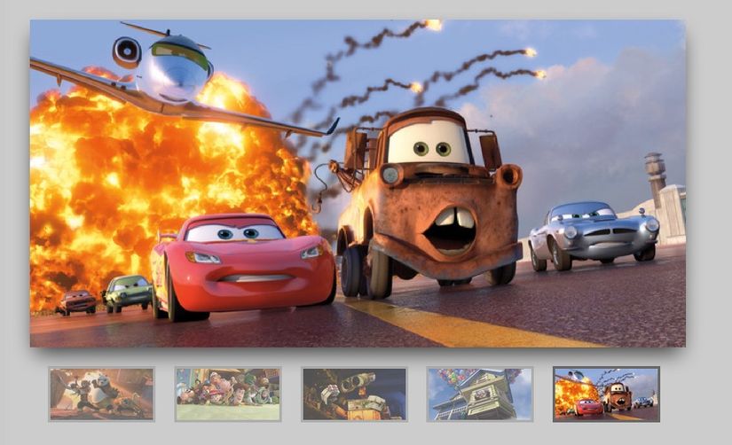
HTML theo cấu trúc sau Chúng ta sẽ tạo thanh trượt với hình thu nhỏ cách điệu sử dụng CSS3. Sử dụng rất đơn giản: Đầu vào Radio Labels với hình ảnh thumbnails để phát hiện sự kiện nhấp chuột <div class="slider"> <input type="radio" name="slide_switch" id="id1"/> <label ...
HTML theo cấu trúc sau
Chúng ta sẽ tạo thanh trượt với hình thu nhỏ cách điệu sử dụng CSS3. Sử dụng rất đơn giản: Đầu vào Radio Labels với hình ảnh thumbnails để phát hiện sự kiện nhấp chuột
<div class="slider">
	<input type="radio" name="slide_switch" id="id1"/>
	<label for="id1">
		<img src="http://thecodeplayer.com/uploads/media/3yiC6Yq.jpg" awidth="100"/>
	</label>
	<img src="http://thecodeplayer.com/uploads/media/3yiC6Yq.jpg"/>


	<input type="radio" name="slide_switch" id="id2" checked="checked"/>
	<label for="id2">
		<img src="http://thecodeplayer.com/uploads/media/40Ly3VB.jpg" awidth="100"/>
	</label>
	<img src="http://thecodeplayer.com/uploads/media/40Ly3VB.jpg"/>

	<input type="radio" name="slide_switch" id="id3"/>
	<label for="id3">
		<img src="http://thecodeplayer.com/uploads/media/00kih8g.jpg" awidth="100"/>
	</label>
	<img src="http://thecodeplayer.com/uploads/media/00kih8g.jpg"/>

	<input type="radio" name="slide_switch" id="id4"/>
	<label for="id4">
		<img src="http://thecodeplayer.com/uploads/media/2rT2vdx.jpg" awidth="100"/>
	</label>
	<img src="http://thecodeplayer.com/uploads/media/2rT2vdx.jpg"/>

	<input type="radio" name="slide_switch" id="id5"/>
	<label for="id5">
		<img src="http://thecodeplayer.com/uploads/media/8k3N3EL.jpg" awidth="100"/>
	</label>
	<img src="http://thecodeplayer.com/uploads/media/8k3N3EL.jpg"/>
</div>


<script src="http://thecodeplayer.com/uploads/js/prefixfree.js" type="text/javascript"></script>
CSS
/*Time for the CSS*/
* {margin: 0; padding: 0;}
body {background: #ccc;}

.slider{
	awidth: 640px; /*Same as awidth of the large image*/
	position: relative;
	/*Instead of height we will use padding*/
	padding-top: 320px; /*That helps bring the labels down*/

	margin: 100px auto;

	/*Lets add a shadow*/
	box-shadow: 0 10px 20px -5px rgba(0, 0, 0, 0.75);
}


/*Last thing remaining is to add transitions*/
.slider>img{
	position: absolute;
	left: 0; top: 0;
	transition: all 0.5s;
}

.slider input[name='slide_switch'] {
	display: none;
}

.slider label {
	/*Lets add some spacing for the thumbnails*/
	margin: 18px 0 0 18px;
	border: 3px solid #999;

	float: left;
	cursor: pointer;
	transition: all 0.5s;

	/*Default style = low opacity*/
	opacity: 0.6;
}

.slider label img{
	display: block;
}

/*Time to add the click effects*/
.slider input[name='slide_switch']:checked+label {
	border-color: #666;
	opacity: 1;
}
/*Clicking any thumbnail now should change its opacity(style)*/
/*Time to work on the main images*/
.slider input[name='slide_switch'] ~ img {
	opacity: 0;
	transform: scale(1.1);
}
/*That hides all main images at a 110% size
On click the images will be displayed at normal size to complete the effect
*/
.slider input[name='slide_switch']:checked+label+img {
	opacity: 1;
	transform: scale(1);
}
/*Clicking on any thumbnail now should activate the image related to it*/

/*We are done :)*/