04/10/2018, 20:06
Off Canvas Menu với hiệu ứng Flip Out bằng CSS3
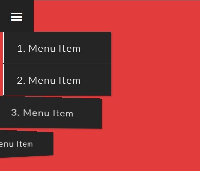
Hôm nay mình tiếp tục giới thiệu cho các bạn thêm một mẫu menu web thường hay được sử dụng trong các thiết kế giao diện dành riêng cho mobile hay các giao diện web có khả năng responsive. Với hiệu ứng Flip Out có trong menu này, các bạn sẽ có thêm một kinh nghiệm trong việc xây dựng các hiệu ứng ...
Hôm nay mình tiếp tục giới thiệu cho các bạn thêm một mẫu menu web thường hay được sử dụng trong các thiết kế giao diện dành riêng cho mobile hay các giao diện web có khả năng responsive. Với hiệu ứng Flip Out có trong menu này, các bạn sẽ có thêm một kinh nghiệm trong việc xây dựng các hiệu ứng bằng CSS3.
Xem Demo | Download
HTML
Khung chuẩn html sẽ gồm 2 phần, một phần là dành cho menu và phần còn lại là nội dung web như sau :
<aside class="container">
  <input type="checkbox" id="menu__trigger">
  <section class="menu">

    <nav>
      <a href="#">1. Menu Item</a>
      <a href="#">2. Menu Item</a>
      <a href="#">3. Menu Item</a>
      <a href="#">4. Menu Item</a>
      <a href="#">5. Menu Item</a>
      <a href="#">6. Menu Item</a>
      <a href="#">7. Menu Item</a>
      <a href="#">8. Menu Item</a>
    </nav>
  </section>

  <section class="content">
    <label for="menu__trigger" class="entypo-menu"></label>

    <h1>Off Canvas Menu Effect</h1>

  </section>
</aside>
CSS
Sau đó các bạn tạo hiệu ứng với đoạn css bên dưới.
[class*="entypo-"]:before {
  font-family: 'entypo', sans-serif;
}

html {
  min-height: 100%;
  min-awidth: 100%;
}
html body {
  min-height: 100%;
  min-awidth: 100%;
  font-family: 'Lato', sans-serif;
}
html body input[type="checkbox"] {
  position: absolute;
  height: 0;
  awidth: 0;
  display: none;
}
html body input[type="checkbox"]:checked ~ .menu nav a {
  -webkit-transform: translate3d(0px, 0, 0) rotateY(0deg);
  transform: translate3d(0px, 0, 0) rotateY(0deg);
  -webkite-transform-style: preserve-3d;
  transform-style: preserve-3d;
  -webkit-transition: all .4s ease-in-out;
  transition: all .4s ease-in-out;
  background: #252525;
  color: #fff;
}
html body input[type="checkbox"]:checked ~ .menu nav a:nth-child(2) {
  -webkit-transition-delay: .1s;
  transition-delay: .1s;
}
html body input[type="checkbox"]:checked ~ .menu nav a:nth-child(3) {
  -webkit-transition-delay: .2s;
  transition-delay: .2s;
}
html body input[type="checkbox"]:checked ~ .menu nav a:nth-child(4) {
  -webkit-transition-delay: .3s;
  transition-delay: 0.3s;
}
html body input[type="checkbox"]:checked ~ .menu nav a:nth-child(5) {
  -webkit-transition-delay: .4s;
  transition-delay: .4s;
}
html body input[type="checkbox"]:checked ~ .menu nav a:nth-child(6) {
  -webkit-transition-delay: .5s;
  transition-delay: 0.5s;
}
html body input[type="checkbox"]:checked ~ .menu nav a:nth-child(7) {
  -webkit-transition-delay: .6s;
  transition-delay: 0.6s;
}
html body input[type="checkbox"]:checked ~ .menu nav a:nth-child(8) {
  -webkit-transition-delay: .7s;
  transition-delay: 0.7s;
}
html body section.menu {
  position: fixed;
  z-index: 10;
  top: 0;
  bottom: 0;
  min-height: 100%;
}
html body section.menu nav {
  padding-top: 4rem;
  -webkit-perspective: 20rem;
  perspective: 20rem;
}
html body section.menu nav a {
  display: block;
  awidth: 12rem;
  padding: 1.25rem 0rem 1.25rem 1.75rem;
  background: #222;
  border-bottom: 1px solid #2a2a2a;
  box-shadow: 2px 2px 2px rgba(0, 0, 0, 0.15), inset 2px 0 0 #fff;
  color: #fff;
  letter-spacing: 1.5px;
  font-weight: 300;
  font-size: 1.25rem;
  text-decoration: none;
  -webkit-transform: translate3d(-100%, 0, 0) rotateY(90deg);
  transform: translate3d(-100%, 0, 0) rotateY(90deg);
  -webkit-transform-origin: 0% 50%;
  transform-origin: 0% 50%;
  -webkit-transform-style: preserve-3d;
  transform-style: preserve-3d;
  -webkit-transition: all .25s ease-in-out;
  transition: all .25s ease-in-out;
}
html body section.menu nav a:nth-child(1) {
  -webkit-transition-delay: .235s;
  transition-delay: .235s;
}
html body section.menu nav a:nth-child(2) {
  -webkit-transition-delay: .2s;
  transition-delay: .2s;
}
html body section.menu nav a:nth-child(3) {
  -webkit-transition-delay: .165s;
  transition-delay: .165s;
}
html body section.menu nav a:nth-child(4) {
  -webkit-transition-delay: .13s;
  transition-delay: .13s;
}
html body section.menu nav a:nth-child(5) {
  -webkit-transition-delay: .095s;
  transition-delay: .095s;
}
html body section.menu nav a:nth-child(6) {
  -webkit-transition-delay: .06s;
  transition-delay: .06s;
}
html body section.menu nav a:nth-child(7) {
  -webkit-transition-delay: .25s;
  transition-delay: .025s;
}
html body section.content {
  position: absolute;
  top: 0;
  bottom: 0;
  left: 0;
  right: 0;
  min-height: 100%;
  min-awidth: 100%;
  display: table;
  background: #e23d3d;
}
html body section.content label {
  position: fixed;
  z-index: 1000;
  padding: 1rem 1.5rem;
  background: #222;
  font-size: 2rem;
  line-height: 2rem;
  color: #fff;
  cursor: pointer;
}
html body section.content h1 {
  display: table-cell;
  vertical-align: middle;
  text-align: center;
  font-size: 3rem;
  letter-spacing: 1px;
  color: #fff;
}
Mình hy vọng các bạn sẽ thích thú với mẫu menu mà mình giới thiệu cho các bạn trong bài viết này.
Chúc các bạn thành công !
Chuyên Mục: Css
Bài viết được đăng bởi webmaster