04/10/2018, 20:10
Sign In/Up Form Transitions cực cool với CSS3
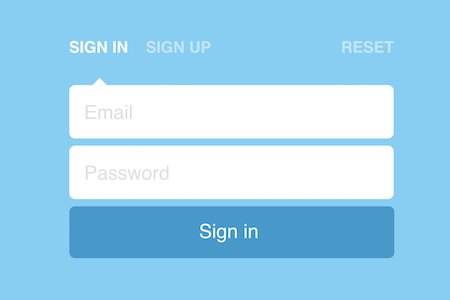
Xin chào các bạn, rất vui khi mà mình lại có thể post một bài viết mới. Hôm nay, mình sẽ chia sẻ cho các bạn một đoạn css3 có thể giúp các bạn tạo hiệu ứng transition cho form đăng nhập/xuất mà các bạn thường dùng trên trang web, blog. Xem Demo | Download HTML Như thường lệ, ...
Xin chào các bạn, rất vui khi mà mình lại có thể post một bài viết mới. Hôm nay, mình sẽ chia sẻ cho các bạn một đoạn css3 có thể giúp các bạn tạo hiệu ứng transition cho form đăng nhập/xuất mà các bạn thường dùng trên trang web, blog.
Xem Demo | Download
HTML
Như thường lệ, chúng ta sẽ bắt đầu bằng việc tạo form, các bạn copy theo khung chuẩn html như sau :
<form>
  <input checked id='signin' name='action' type='radio' value='signin'>
  <label for='signin'>Sign in</label>
  <input id='signup' name='action' type='radio' value='signup'>
  <label for='signup'>Sign up</label>
  <input id='reset' name='action' type='radio' value='reset'>
  <label for='reset'>Reset</label>
  <div id='wrapper'>
    <div id='arrow'></div>
    <input id='email' placeholder='Email' type='text'>
    <input id='pass' placeholder='Password' type='password'>
    <input id='repass' placeholder='Repeat password' type='password'>
  </div>
  <button type='submit'>
    <span>
      Reset password
      <br>
      Sign in
      <br>
      Sign up
    </span>
  </button>
</form>
CSS
Và công việc của các bạn cũng cực kỳ đơn giản là copy lại đoạn css bên dưới để tạo hiệu ứng cho form, các bạn có thể tham khảo từng đoạn để xem cách mà người ta tạo hiệu ứng như thế nào, từ đó các bạn có thể sáng tạo theo cách của riêng mình.
body, html {
  margin: 0;
  padding: 0;
}

html, body { margin: 0; }

:focus { outline: none; }
::-webkit-input-placeholder { color: #DEDFDF; }
::-moz-placeholder { color: #DEDFDF; }
:-moz-placeholder { color: #DEDFDF; }
::-ms-input-placeholder { color: #DEDFDF; }

body {
  background: #6ED0F6;
  color: #fff;
  font-family: 'Raleway', sans-serif;
  -webkit-font-smoothing: antialiased;
}

#wrapper, label, #arrow, button span { transition: all .5s cubic-bezier(.6,0,.4,1); }

#wrapper { overflow: hidden; }

#signin:checked ~ #wrapper { height: 178px; }
#signin:checked ~ #wrapper #arrow { left: 32px; }
#signin:checked ~ button span { transform: translate3d(0,-72px,0); }

#signup:checked ~ #wrapper { height: 262px; }
#signup:checked ~ #wrapper #arrow { left: 137px; }
#signup:checked ~ button span { transform: translate3d(0,-144px,0); }

#reset:checked ~ #wrapper { height: 94px; }
#reset:checked ~ #wrapper #arrow { left: 404px; }
#reset:checked ~ button span { transform: translate3d(0,0,0); }

form {
  awidth: 450px;
  height: 370px;
  margin: -185px -225px;
  position: absolute;
  left: 50%;
  top: 50%;
}

input[type=radio] { display: none; }

label {
  cursor: pointer;
  display: inline-block;
  font-size: 22px;
  font-weight: 800;
  opacity: .5;
  margin-bottom: 30px;
  text-transform: uppercase;
}
label:hover {
  transition: all .3s cubic-bezier(.6,0,.4,1);
  opacity: 1;
}
label[for="signin"] { margin-right: 20px; }
label[for="reset"] { float: right; }
input[type=radio]:checked + label { opacity: 1; }

input[type=text],
input[type=password] {
  background: #fff;
  border: none;
  border-radius: 8px;
  font-size: 27px;
  font-family: 'Raleway', sans-serif;
  height: 72px;
  awidth: 99.5%;
  margin-bottom: 10px;
  opacity: 1;
  text-indent: 20px;
  transition: all .2s ease-in-out;
}
button {
  background: #079BCF;
  border: none;
  border-radius: 8px;
  color: #fff;
  cursor: pointer;
  font-family: 'Raleway', sans-serif;
  font-size: 27px;
  height: 72px;
  awidth: 100%;
  margin-bottom: 10px;
  overflow: hidden;
  transition: all .3s cubic-bezier(.6,0,.4,1);
}
button span {
  display: block;
  line-height: 72px;
  position: relative;
  top: -2px;
  transform: translate3d(0,0,0);
}
button:hover {
  background: #007BA5;
}

#arrow {
  height: 0;
  awidth: 0;
  border-bottom: 10px solid #fff;
  border-left: 10px solid transparent;
  border-right: 10px solid transparent;
  position: relative;
  left: 32px;
}


#hint {
  awidth: 100%;
  text-align: center;
  position: absolute;
  bottom: 20px;
}
Chúc các bạn có một mùa giáng sinh vui vẻ bên gia đình và bạn thân.
Chuyên Mục: Css
Bài viết được đăng bởi webmaster