Tạo nút bấm với các Pseudo-elements trong CSS
CSS pseudo-elements là những thành phần được sử dụng nhiều nhất trong các câu lệnh css.Việc nắm vững những thành phần này không những giúp bạn tạo được những mẫu thiết kế như ý mà còn có thể tô điểm , sáng tạo thêm những điều không tưởng khác. Trong bài viết này, mình và các bạn sẽ cùng tìm ...
CSS pseudo-elements là những thành phần được sử dụng nhiều nhất trong các câu lệnh css.Việc nắm vững những thành phần này không những giúp bạn tạo được những mẫu thiết kế như ý mà còn có thể tô điểm , sáng tạo thêm những điều không tưởng khác.
Trong bài viết này, mình và các bạn sẽ cùng tìm hiểu rõ hơn về các Pseudo-elements hỗ trợ trong việc thiết kế web như thế nào. Chúng ta sẽ lần lượt tạo những nút bấm với nhiều kiểu khác nhau từ những Pseudo-elements này.
Xem Demo | Download
HTML Markup
Để tạo các nút bấm, chúng ta chỉ cần có đoạn html chuẩn như sau:
<a class="a_demo_one" href="#">
     Click me!
</a>
VÍ DỤ 1 :
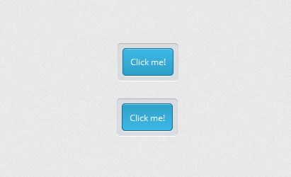
Đây là dạng nút bấm đơn giản , chỉ với một màu gradient và đường viền chìm xung quanh, chúng ta sẽ định dạng css như sau :
1 Đầu tiên là đổ màu gradient và định dạng căn bản cho nút bấm
.a_demo_one {
    background-color: #3BB3E0;
    background-image: -moz-linear-gradient(center bottom , #2CA0CA 0%, #3EB8E5 100%);
    border: 1px solid #186F8F;
    border-radius: 5px 5px 5px 5px;
    box-shadow: 0 1px 0 #7FD2F1 inset, 0 1px 0 #FFFFFF;
    color: #FFFFFF;
    font-family: 'Open Sans',sans-serif;
    font-size: 12px;
    padding: 10px;
    position: relative;
    text-decoration: none;
}
2 Kế tiếp là cho đường viền chìm xung quanh nút bấm , ở bước này, chúng ta sẽ sử dụng một Pseudo-elements là :before
.a_demo_one:before {
    background-color: #CCD0D5;
    border-radius: 5px 5px 5px 5px;
    box-shadow: 0 1px 1px #909193 inset, 0 1px 0 #FFFFFF;
    content: "";
    display: block;
    height: 100%;
    left: -8px;
    padding: 8px;
    position: absolute;
    top: -8px;
    awidth: 100%;
    z-index: -1;
}
3 cuối cùng là cho màu nền thay đổi khi chúng ta click vào nút bấm.
.a_demo_one:active {
    background-image: -moz-linear-gradient(center bottom , #3EB8E5 0%, #2CA0CA 100%);
    padding: 11px 10px 9px;
    top: 1px;
}
VÍ DỤ 2
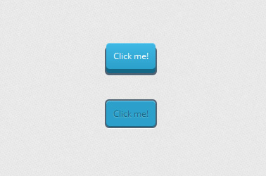
Trong ví dụ này, các nút bấm sẽ được thiết kế phức tạp hơn một chút , bởi vì chúng ta sẽ tạo nút bấm dạng 3D. Nhưng các bạn cùng đừng quá lo, vì chỉ cần làm theo từng bước sau đây là okie. Chúng ta vẫn giữ nguyên bộ khung html như ở ví dụ 1 nhé.
1 Đầu tiên là tạo nút bấm với hình dạng 3D cơ bản.
.a_demo_one {
	background-color:#3bb3e0;
	padding:10px;
	position:relative;
	font-family: 'Open Sans', sans-serif;
	font-size:12px;
	text-decoration:none;
	color:#fff;
	background-image: linear-gradient(bottom, rgb(44,160,202) 0%, rgb(62,184,229) 100%);
	background-image: -o-linear-gradient(bottom, rgb(44,160,202) 0%, rgb(62,184,229) 100%);
	background-image: -moz-linear-gradient(bottom, rgb(44,160,202) 0%, rgb(62,184,229) 100%);
	background-image: -webkit-linear-gradient(bottom, rgb(44,160,202) 0%, rgb(62,184,229) 100%);
	background-image: -ms-linear-gradient(bottom, rgb(44,160,202) 0%, rgb(62,184,229) 100%);
	background-image: -webkit-gradient(
	linear,
	left bottom,
	left top,
	color-stop(0, rgb(44,160,202)),
	color-stop(1, rgb(62,184,229))
	);
	-webkit-box-shadow: inset 0px 1px 0px #7fd2f1, 0px 6px 0px #156785;
	-moz-box-shadow: inset 0px 1px 0px #7fd2f1, 0px 6px 0px #156785;
	-o-box-shadow: inset 0px 1px 0px #7fd2f1, 0px 6px 0px #156785;
	box-shadow: inset 0px 1px 0px #7fd2f1, 0px 6px 0px #156785;
	-webkit-border-radius: 5px;
	-moz-border-radius: 5px;
	-o-border-radius: 5px;
	border-radius: 5px;
}
2 Để hiệu ứng 3D trông thực hơn, các bạn tiếp tục với đoạn css sau :
.a_demo_one:before {
	background-color:#072239;
	content:"";
	display:block;
	position:absolute;
	awidth:100%;
	height:100%;
	padding-left:2px;
	padding-right:2px;
	padding-bottom:4px;
	left:-2px;
	top:5px;
	z-index:-1;
	-webkit-border-radius: 6px;
	-moz-border-radius: 6px;
	-o-border-radius: 6px;
	border-radius: 6px;
	-webkit-box-shadow: 0px 1px 0px #fff;
	-moz-box-shadow: 0px 1px 0px #fff;
	-o-box-shadow: 0px 1px 0px #fff;
	box-shadow: 0px 1px 0px #fff;
}
3 Để tạo người dùng có cảm giác nhấn nút, chúng ta sử dụng đoạn css sau :
.a_demo_two:active {
	color:#156785;
	text-shadow: 0px 1px 1px rgba(255,255,255,0.3);
	background:rgb(44,160,202);
	-webkit-box-shadow: inset 0px 1px 0px #7fd2f1, inset 0px -1px 0px #156785;
	-moz-box-shadow: inset 0px 1px 0px #7fd2f1, inset 0px -1px 0px #156785;
	-o-box-shadow: inset 0px 1px 0px #7fd2f1, inset 0px -1px 0px #156785;
	box-shadow: inset 0px 1px 0px #7fd2f1, inset 0px -1px 0px #156785;
	top:7px;
}

.a_demo_two:active::before {
	top:-2px;
}
VÍ DỤ 3
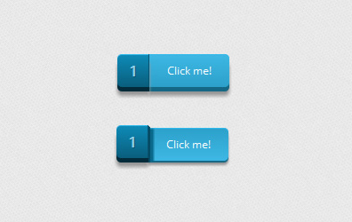
1 Tạo hình cho nút bấm bằng đoạn css sau :
.a_demo_one {
	background-color:#3bb3e0;
	font-family: 'Open Sans', sans-serif;
	font-size:12px;
	text-decoration:none;
	color:#fff;
	position:relative;
	padding:10px 20px;
	border-left:solid 1px #2ab7ec;
	margin-left:35px;
	background-image: linear-gradient(bottom, rgb(44,160,202) 0%, rgb(62,184,229) 100%);
	background-image: -o-linear-gradient(bottom, rgb(44,160,202) 0%, rgb(62,184,229) 100%);
	background-image: -moz-linear-gradient(bottom, rgb(44,160,202) 0%, rgb(62,184,229) 100%);
	background-image: -webkit-linear-gradient(bottom, rgb(44,160,202) 0%, rgb(62,184,229) 100%);
	background-image: -ms-linear-gradient(bottom, rgb(44,160,202) 0%, rgb(62,184,229) 100%);
	background-image: -webkit-gradient(
	linear,
	left bottom,
	left top,
	color-stop(0, rgb(44,160,202)),
	color-stop(1, rgb(62,184,229))
	);
	-webkit-border-top-right-radius: 5px;
	-webkit-border-bottom-right-radius: 5px;
	-moz-border-radius-topright: 5px;
	-moz-border-radius-bottomright: 5px;
	border-top-right-radius: 5px;
	border-bottom-right-radius: 5px;
	-webkit-box-shadow: inset 0px 1px 0px #2ab7ec, 0px 5px 0px 0px #156785, 0px 10px 5px #999;
	-moz-box-shadow: inset 0px 1px 0px #2ab7ec, 0px 5px 0px 0px #156785, 0px 10px 5px #999;
	-o-box-shadow: inset 0px 1px 0px #2ab7ec, 0px 5px 0px 0px #156785, 0px 10px 5px #999;
	box-shadow: inset 0px 1px 0px #2ab7ec, 0px 5px 0px 0px #156785, 0px 10px 5px #999;
}

.a_demo_one::before {
	background-color:#2561b4;
	content:"1";
	awidth:23px;
	max-height:27px;
	height:100%;
	position:absolute;
	display:block;
	padding-top:8px;
	padding-left:11px;
	top:0px;
	left:-36px;
	font-size:16px;
	font-weight:bold;
	color:#8fd1ea;
	text-shadow:1px 1px 0px #07526e;
	border-right:solid 1px #07526e;
	background-image: linear-gradient(bottom, rgb(10,94,125) 0%, rgb(14,139,184) 100%);
	background-image: -o-linear-gradient(bottom, rgb(10,94,125) 0%, rgb(14,139,184) 100%);
	background-image: -moz-linear-gradient(bottom, rgb(10,94,125) 0%, rgb(14,139,184) 100%);
	background-image: -webkit-linear-gradient(bottom, rgb(10,94,125) 0%, rgb(14,139,184) 100%);
	background-image: -ms-linear-gradient(bottom, rgb(10,94,125) 0%, rgb(14,139,184) 100%);
	background-image: -webkit-gradient(
	linear,
	left bottom,
	left top,
	color-stop(0, rgb(10,94,125)),
	color-stop(1, rgb(14,139,184))
	);
	-webkit-border-top-left-radius: 5px;
	-webkit-border-bottom-left-radius: 5px;
	-moz-border-radius-topleft: 5px;
	-moz-border-radius-bottomleft: 5px;
	border-top-left-radius: 5px;
	border-bottom-left-radius: 5px;
	-webkit-box-shadow:inset 0px 1px 0px #2ab7ec, 0px 5px 0px 0px #032b3a, 0px 10px 5px #999 ;
	-moz-box-shadow:inset 0px 1px 0px #2ab7ec, 0px 5px 0px 0px #032b3a, 0px 10px 5px #999 ;
	-o-box-shadow:inset 0px 1px 0px #2ab7ec, 0px 5px 0px 0px #032b3a, 0px 10px 5px #999 ;
	box-shadow:inset 0px 1px 0px #2ab7ec, 0px 5px 0px 0px #032b3a, 0px 10px 5px #999 ;
}
2 Tạo hiệu ứng khi click chuột vào nút bấm với đoạn css sau :
.a_demo_one:active {
	top:3px;
	background-image: linear-gradient(bottom, rgb(62,184,229) 0%, rgb(44,160,202) 100%);
	background-image: -o-linear-gradient(bottom, rgb(62,184,229) 0%, rgb(44,160,202) 100%);
	background-image: -moz-linear-gradient(bottom, rgb(62,184,229) 0%, rgb(44,160,202) 100%);
	background-image: -webkit-linear-gradient(bottom, rgb(62,184,229) 0%, rgb(44,160,202) 100%);
	background-image: -ms-linear-gradient(bottom, rgb(62,184,229) 0%, rgb(44,160,202) 100%);
	background-image: -webkit-gradient(
	linear,
	left bottom,
	left top,
	color-stop(0, rgb(62,184,229)),
	color-stop(1, rgb(44,160,202))
	);
	-webkit-box-shadow: inset 0px 1px 0px #2ab7ec, 0px 2px 0px 0px #156785, 0px 5px 3px #999;
	-moz-box-shadow: inset 0px 1px 0px #2ab7ec, 0px 2px 0px 0px #156785, 0px 5px 3px #999;
	-o-box-shadow: inset 0px 1px 0px #2ab7ec, 0px 2px 0px 0px #156785, 0px 5px 3px #999;
	box-shadow: inset 0px 1px 0px #2ab7ec, 0px 2px 0px 0px #156785, 0px 5px 3px #999;
}

.a_demo_one:active::before {
	top:-3px;
	-webkit-box-shadow:inset 0px 1px 0px #2ab7ec, 0px 5px 0px 0px #032b3a, 1px 1px 0px 0px #044a64, 2px 2px 0px 0px #044a64, 2px 5px 0px 0px #044a64, 6px 4px 2px #0b698b, 0px 10px 5px #999 ;
	-moz-box-shadow:inset 0px 1px 0px #2ab7ec, 0px 5px 0px 0px #032b3a, 1px 1px 0px 0px #044a64, 2px 2px 0px 0px #044a64, 2px 5px 0px 0px #044a64, 6px 4px 2px #0b698b, 0px 10px 5px #999 ;
	-o-box-shadow:inset 0px 1px 0px #2ab7ec, 0px 5px 0px 0px #032b3a, 1px 1px 0px 0px #044a64, 2px 2px 0px 0px #044a64, 2px 5px 0px 0px #044a64, 6px 4px 2px #0b698b, 0px 10px 5px #999 ;
	box-shadow:inset 0px 1px 0px #2ab7ec, 0px 5px 0px 0px #032b3a, 1px 1px 0px 0px #044a64, 2px 2px 0px 0px #044a64, 2px 5px 0px 0px #044a64, 6px 4px 2px #0b698b, 0px 10px 5px #999 ;
}
VÍ DỤ 4
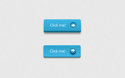
Trong ví dụ này , chúng ta cũng làm khá giống như những ví dụ trước đây, chỉ là chúng ta sẽ thêm hình ảnh mũi tên vào nút bấm.
1 Đầu tiên vẫn luôn là tạo hình cho nút bấm :
.a_demo_one {
	background-color:#3bb3e0;
	font-family: 'Open Sans', sans-serif;
	font-size:12px;
	text-decoration:none;
	color:#fff;
	position:relative;
	padding:10px 20px;
	padding-right:50px;
	background-image: linear-gradient(bottom, rgb(44,160,202) 0%, rgb(62,184,229) 100%);
	background-image: -o-linear-gradient(bottom, rgb(44,160,202) 0%, rgb(62,184,229) 100%);
	background-image: -moz-linear-gradient(bottom, rgb(44,160,202) 0%, rgb(62,184,229) 100%);
	background-image: -webkit-linear-gradient(bottom, rgb(44,160,202) 0%, rgb(62,184,229) 100%);
	background-image: -ms-linear-gradient(bottom, rgb(44,160,202) 0%, rgb(62,184,229) 100%);
	background-image: -webkit-gradient(
	linear,
	left bottom,
	left top,
	color-stop(0, rgb(44,160,202)),
	color-stop(1, rgb(62,184,229))
	);
	-webkit-border-radius: 5px;
	-moz-border-radius: 5px;
	-o-border-radius: 5px;
	border-radius: 5px;
	-webkit-box-shadow: inset 0px 1px 0px #2ab7ec, 0px 5px 0px 0px #156785, 0px 10px 5px #999;
	-moz-box-shadow: inset 0px 1px 0px #2ab7ec, 0px 5px 0px 0px #156785, 0px 10px 5px #999;
	-o-box-shadow: inset 0px 1px 0px #2ab7ec, 0px 5px 0px 0px #156785, 0px 10px 5px #999;
	box-shadow: inset 0px 1px 0px #2ab7ec, 0px 5px 0px 0px #156785, 0px 10px 5px #999;
}
2 Tạo icon là hình mũi tên và chèn vào nút bấm với đoạn css sau :
.a_demo_one:before {
	background-color:#2591b4;
	background-image:url(../images/right_arrow.png);
	background-repeat:no-repeat;
	background-position:center center;
	content:"";
	awidth:20px;
	height:20px;
	position:absolute;
	right:15px;
	top:50%;
	margin-top:-9px;
	-webkit-border-radius: 50%;
	-moz-border-radius: 50%;
	-o-border-radius: 50%;
	border-radius: 50%;
	-webkit-box-shadow: inset 0px 1px 0px #052756, 0px 1px 0px #60c9f0;
	-moz-box-shadow: inset 0px 1px 0px #052756, 0px 1px 0px #60c9f0;
	-o-box-shadow: inset 0px 1px 0px #052756, 0px 1px 0px #60c9f0;
	box-shadow: inset 0px 1px 0px #052756, 0px 1px 0px #60c9f0;
}
3 Cuối cùng là cho hiệu ứng khi click vào nút bấm :
.a_demo_one:active {
	top:3px;
	background-image: linear-gradient(bottom, rgb(62,184,229) 0%, rgb(44,160,202) 100%);
	background-image: -o-linear-gradient(bottom, rgb(62,184,229) 0%, rgb(44,160,202) 100%);
	background-image: -moz-linear-gradient(bottom, rgb(62,184,229) 0%, rgb(44,160,202) 100%);
	background-image: -webkit-linear-gradient(bottom, rgb(62,184,229) 0%, rgb(44,160,202) 100%);
	background-image: -ms-linear-gradient(bottom, rgb(62,184,229) 0%, rgb(44,160,202) 100%);
	background-image: -webkit-gradient(
	linear,
	left bottom,
	left top,
	color-stop(0, rgb(62,184,229)),
	color-stop(1, rgb(44,160,202))
	);
	-webkit-box-shadow: inset 0px 1px 0px #2ab7ec, 0px 2px 0px 0px #156785, 0px 5px 3px #999;
	-moz-box-shadow: inset 0px 1px 0px #2ab7ec, 0px 2px 0px 0px #156785, 0px 5px 3px #999;
	-o-box-shadow: inset 0px 1px 0px #2ab7ec, 0px 2px 0px 0px #156785, 0px 5px 3px #999;
	box-shadow: inset 0px 1px 0px #2ab7ec, 0px 2px 0px 0px #156785, 0px 5px 3px #999;
}

.a_demo_one:active::before {
	top:50%;
	margin-top:-12px;
	-webkit-box-shadow: inset 0px 1px 0px #60c9f0, 0px 3px 0px #0e3871, 0px 6px 3px #1a80a6;
	-moz-box-shadow: inset 0px 1px 0px #60c9f0, 0px 3px 0px #0e3871, 0px 6px 3px #1a80a6;
	-o-box-shadow: inset 0px 1px 0px #60c9f0, 0px 3px 0px #0e3871, 0px 6px 3px #1a80a6;
	box-shadow: inset 0px 1px 0px #60c9f0, 0px 3px 0px #0e3871, 0px 6px 3px #1a80a6;
}
VÍ DỤ 5
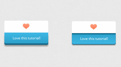
Ví dụ này cũng có cách làm tương tự như ví dụ 4, tuy nhiên chúng ta cần chỉnh sửa vị trí lại một chút xíu.
1 Định hình nút bấm
.a_demo_one {
	background-color:#3bb3e0;
	awidth:150px;
	display:inline-block;
	font-family: 'Open Sans', sans-serif;
	font-size:12px;
	text-decoration:none;
	color:#fff;
	position:relative;
	margin-top:40px;
	padding-bottom:10px;
	padding-top:10px;
	background-image: linear-gradient(bottom, rgb(44,160,202) 0%, rgb(62,184,229) 100%);
	background-image: -o-linear-gradient(bottom, rgb(44,160,202) 0%, rgb(62,184,229) 100%);
	background-image: -moz-linear-gradient(bottom, rgb(44,160,202) 0%, rgb(62,184,229) 100%);
	background-image: -webkit-linear-gradient(bottom, rgb(44,160,202) 0%, rgb(62,184,229) 100%);
	background-image: -ms-linear-gradient(bottom, rgb(44,160,202) 0%, rgb(62,184,229) 100%);
	background-image: -webkit-gradient(
	linear,
	left bottom,
	left top,
	color-stop(0, rgb(44,160,202)),
	color-stop(1, rgb(62,184,229))
	);
	-webkit-border-bottom-right-radius: 5px;
	-webkit-border-bottom-left-radius: 5px;
	-moz-border-radius-bottomright: 5px;
	-moz-border-radius-bottomleft: 5px;
	border-bottom-right-radius: 5px;
	border-bottom-left-radius: 5px;
	-webkit-box-shadow: inset 0px 1px 0px #2ab7ec, 0px 5px 0px 0px #156785, 0px 10px 5px #999;
	-moz-box-shadow: inset 0px 1px 0px #2ab7ec, 0px 5px 0px 0px #156785, 0px 10px 5px #999;
	-o-box-shadow: inset 0px 1px 0px #2ab7ec, 0px 5px 0px 0px #156785, 0px 10px 5px #999;
	box-shadow: inset 0px 1px 0px #2ab7ec, 0px 5px 0px 0px #156785, 0px 10px 5px #999;
}

.a_demo_one:before {
	background-color:#fff;
	background-image:url(../images/heart.gif);
	background-repeat:no-repeat;
	background-position:center center;
	content:"";
	awidth:150px;
	height:40px;
	position:absolute;
	top:-30px;
	left:0px;
	margin-top:-11px;
	z-index:-1;
	-webkit-border-top-left-radius: 5px;
	-webkit-border-top-right-radius: 5px;
	-moz-border-radius-topleft: 5px;
	-moz-border-radius-topright: 5px;
	border-top-left-radius: 5px;
	border-top-right-radius: 5px;
}
2 Hiệu ứng khi click chuột
.a_demo_one:active::before {
	top: -30px;
	-webkit-box-shadow: 0px 3px 0px #ccc;
	-moz-box-shadow: 0px 3px 0px #ccc;
	-o-box-shadow: 0px 3px 0px #ccc;
	box-shadow: 0px 3px 0px #ccc;
}

.a_demo_one:active {
	top:0px;
	background-image: linear-gradient(bottom, rgb(62,184,229) 0%, rgb(44,160,202) 100%);
	background-image: -o-linear-gradient(bottom, rgb(62,184,229) 0%, rgb(44,160,202) 100%);
	background-image: -moz-linear-gradient(bottom, rgb(62,184,229) 0%, rgb(44,160,202) 100%);
	background-image: -webkit-linear-gradient(bottom, rgb(62,184,229) 0%, rgb(44,160,202) 100%);
	background-image: -ms-linear-gradient(bottom, rgb(62,184,229) 0%, rgb(44,160,202) 100%);
	background-image: -webkit-gradient(
	linear,
	left bottom,
	left top,
	color-stop(0, rgb(62,184,229)),
	color-stop(1, rgb(44,160,202))
	);
	-webkit-box-shadow: inset 0px 4px 1px #0b698b, 0px 2px 0px 0px #156785, 0px 5px 3px #999;
	-moz-box-shadow: 0px 2px 0px 1px #156785, 0px 5px 3px #999;
	-o-box-shadow: 0px 2px 0px 1px #156785, 0px 5px 3px #999;
	box-shadow: inset 0px 4px 1px #0b698b, 0px 2px 0px 0px #156785, 0px 5px 3px #999;
}
Thế là xong, bây giờ các bạn đã có thể hiểu thêm về cách sử dụng Pseudo-elements và có nhiều sự lựa chọn hơn cho các nút bấm trên web của mình. Đặc biệt là qua bài viết này, kinh nghiệm cũng như kiến thức về CSS của các bạn đã được nâng lên một tầm cao mới.
Chúc các bạn thành công !
Chuyên Mục: Css
Bài viết được đăng bởi webmaster