04/10/2018, 20:09
Thiết kế mẫu 3D Tab Bar with CSS3
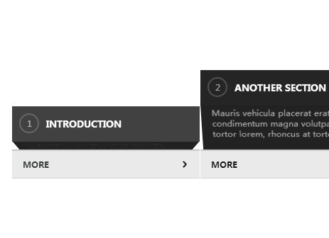
Tiếp tục mang đến cho các bạn những hiệu ứng được làm từ CSS3. Lần này, chúng ta sẽ tạo các tab chứa nội dung ngắn gọn sẽ xuất hiện khi di chuyển chuột vào với hiệu ứng 3D cực cool. Xem Demo | Download HTML Các bạn tạo các tab theo cấu trúc html như đoạn code bên dưới. ...
Tiếp tục mang đến cho các bạn những hiệu ứng được làm từ CSS3. Lần này, chúng ta sẽ tạo các tab chứa nội dung ngắn gọn sẽ xuất hiện khi di chuyển chuột vào với hiệu ứng 3D cực cool.
Xem Demo | Download
HTML
Các bạn tạo các tab theo cấu trúc html như đoạn code bên dưới.
<ul class="tabs">
  <li>
    <div class="fold">
      <h3>Introduction</h3>
      <p>In aliquam nisi nec mauris ultricies eleifend. Vivamus sit amet vulputate tellus. Cras eu purus ac diam.</p>
    </div>
    <a href="#" class="more">More</a>
  </li>
  <li>
    <div class="fold">
      <h3>Another Section</h3>
      <p>Mauris vehicula placerat erat, vitae condimentum magna volutpat ac. Cras tortor lorem, rhoncus at tortor id.</p>
    </div>
    <a href="#" class="more">More</a>
  </li>
  <li>
    <div class="fold">
      <h3>Further reading</h3>
      <p>Ut et pharetra velit, vitae dictum erat. Morbi sit amet dictum eros. Curabitur hendrerit leo at lectus eleifend, a volutpat.</p>
    </div>
    <a href="#" class="more">More</a>
  </li>
</ul>
CSS
Sau đó, chúng ta sẽ tạo hiệu ứng cho các tab này với đoạn css sau :
* {
  box-spacing: border-box;
}

body {
  background: #FFF;
}

.tabs {
  display: block;
  list-style: none;
  margin: 0 auto;
  padding: 0;
  awidth: 800px;
}

.tabs * {
  transition: all 350ms cubic-bezier(.7, .5, .3, 1);
}

.tabs li {
  border-right: 1px solid #FFF;
  counter-increment: tab;
  display: inline;
  perspective: 350px;
  float: left;
  height: 90px;
  overflow: hidden;
  padding-top: 100px;
  position: relative;
  transform-origin: 50% 0;
  transform: translateY(400px);
  transition: all 600ms cubic-bezier(.3, .7, .1, 1);
  awidth: 33%;
  vertical-align: top;
}

/* Initial transition */
.tabs li:nth-child(2) {
  transition-delay: 150ms;
}

.tabs li:nth-child(3) {
  transition-delay: 300ms;
}

.ready .tabs li {
  opacity: 1;
  transform: translateY(0);
}

.tabs li .fold {
  backface-visibility: hidden;
  transform-style: preserve-3d;
}

/* Tab heading */
.tabs li h3 {
  backface-visibility: hidden;
  background: #444;
  color: #FFF;
  font-size: 13px;
  line-height: 50px;
  margin: 0;
  height: 50px;
  text-transform: uppercase;
}

.tabs li h3:before {
  background-repeat: no-repeat;
  background-position: 50% 50%;
  background-origin: content-box;
  background-size: contain;
  border: 2px solid rgba(255, 255, 255, .2);
  border-radius: 100%;
  color: rgba(255, 255, 255, .6);
  content: counter(tab);
  display: block;
  float: left;
  font-size: 12px;
  font-weight: 400;
  height: 24px;
  line-height: 25px;
  margin: 10px 10px 0 10px;
  text-align: center;
  awidth: 24px;
}

/* Revealed copy */
li .fold p {
  backface-visibility: hidden;
  background: #222;
  color: #222;
  font-size: 12px;
  line-height: 140%;
  height: 55px;
  margin: -1px 0 0;
  padding: 5px 15px 15px;
  transform: rotateX(-60deg);
  transform-origin: 50% 0;
}

/* Call to action */
.tabs li .more {
  backface-visibility: hidden;
  background: #EAEAEA;
  bottom: 0;
  border-bottom: 1px solid rgba(0, 0, 0, .1);
  box-shadow: inset 0 4px 2px -3px rgba(0, 0, 0, .3);
  color: #3A3F41;
  font-size: 11px;
  font-weight: bold;
  height: 40px;
  left: 0;
  line-height: 43px;
  text-decoration: none;
  text-transform: uppercase;
  position: absolute;
  padding: 0 15px;
  awidth: 100%;
}

.tabs li:before,
.tabs li:after {
  background: #444;
  backface-visibility: hidden;
  content: ';
  display: block;
  awidth: 2px;
  height: 6px;
  position: absolute;
  transform-origin: 50% 50%;
  z-index: 2;
}

.tabs li:before {
  bottom: 19px;
  right: 20px;
  transform: rotate(-45deg);
}

.tabs li:after {
  bottom: 15px;
  right: 20px;
  transform: rotate(45deg);
}

/* Tab hover */
.tabs li:hover .fold {
  transform: translateY(-75px);
}

.tabs li:hover h3 {
  background: #222;
}

.tabs li:hover .more {
  color: #111;
}

li:hover .fold p {
  transform: rotateX(0deg);
  background: #222;
  color: #BBB;
  outline: 1px solid transparent;
}

li:hover:before,
li:hover:after {
  background: #111;
}

@media only screen and (max-awidth:800px) {
  .tabs {
    awidth: 600px;
  }

  .tabs li {
    awidth: 49%;
  }

  .tabs li:nth-child(3) {
    display: none;
  }
}
Rất đơn giản và dễ thực hiện phải không các bạn, mình mong là các bạn sẽ học được những câu lệnh cũng như hiểu được cách sử dụng những thuộc tính có trong CSS3.
Chúc các bạn thành công !
Chuyên Mục: Css
Bài viết được đăng bởi webmaster