Gradient trong CSS3
CSS3 gradients cho phép bạn hiển thị chuyển tiếp giữa hai hoặc nhiều màu sắc được chỉ định. Trước đó, bạn phải sử dụng hình ảnh cho những hiệu ứng này. Tuy nhiên, bằng cách sử dụng CSS3 gradient bạn có thể giảm thời gian tải cùng băng thông xuống. Ngoài ra, các ...
CSS3 gradients cho phép bạn hiển thị chuyển tiếp giữa hai hoặc nhiều màu sắc được chỉ định.
Trước đó, bạn phải sử dụng hình ảnh cho những hiệu ứng này. Tuy nhiên, bằng cách sử dụng CSS3 gradient bạn có thể giảm thời gian tải cùng băng thông xuống. Ngoài ra, các phần tử với gradient sẽ hợp lý hơn khi phóng to, bởi vì gradient được tạo ra bởi trình duyệt. CSS3 định nghĩa hai loại gradient:
- Linear Gradients (đi xuống / lên / trái / phải / đường chéo)
- Radial Gradients (định nghĩa bởi trung tâm)
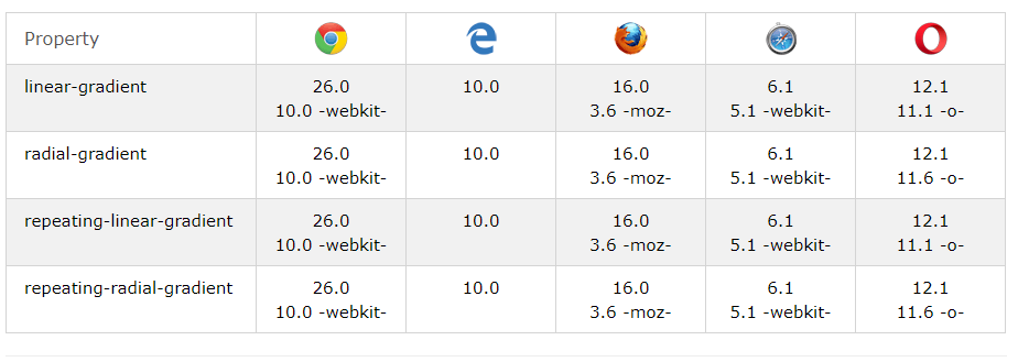
Trình duyệt hỗ trợ
Các con số trong bảng xác định phiên bản trình duyệt đầu tiên hỗ trợ đầy đủ thuộc tính.
Số theo sau là -webkit-, -moz-, hoặc -o- chỉ định phiên bản đầu tiên làm việc với tiền tố.
Linear Gradient
Để tạo một linear gradient (gradient tuyến tính), bạn phải xác định ít nhất hai điểm dừng của màu. Điểm dừng màu là các màu bạn muốn hiển thị chuyển tiếp. Bạn cũng có thể đặt một điểm bắt đầu và một hướng (hoặc một góc) cùng với hiệu ứng gradient.
Cú pháp:
background: linear-gradient(direction, color-stop1, color-stop2, …);
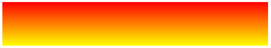
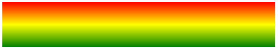
Linear Gradient – trên xuống dưới (mặc định)
Ví dụ sau cho thấy một gradient tuyến tính bắt đầu ở phía trên. Bắt đầu từ màu đỏ rồi chuyển sang màu vàng:
#grad {
    background: red; /* For browsers that do not support gradients */
    background: -webkit-linear-gradient(red, yellow); /* For Safari 5.1 to 6.0 */
    background: -o-linear-gradient(red, yellow); /* For Opera 11.1 to 12.0 */
    background: -moz-linear-gradient(red, yellow); /* For Firefox 3.6 to 15 */
    background: linear-gradient(red, yellow); /* Standard syntax */
}
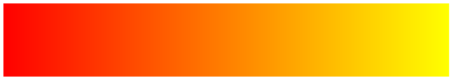
Linear Gradient – Trái sang phải
Ví dụ sau cho thấy một gradient tuyến tính bắt đầu từ bên trái. Bắt đầu màu đỏ, chuyển sang màu vàng:
#grad {
  background: red; /* For browsers that do not support gradients */
  background: -webkit-linear-gradient(left, red , yellow); /* For Safari 5.1 to 6.0 */
  background: -o-linear-gradient(right, red, yellow); /* For Opera 11.1 to 12.0 */
  background: -moz-linear-gradient(right, red, yellow); /* For Firefox 3.6 to 15 */
  background: linear-gradient(to right, red , yellow); /* Standard syntax */
}
Linear Gradient – đường chéo
Bạn có thể tạo một đường chéo gradient bằng cách xác định cả vị trí bắt đầu theo chiều ngang và chiều dọc. Ví dụ sau cho thấy một gradient tuyến tính bắt đầu ở phía trên bên trái (và đi xuống dưới bên phải). Bắt đầu màu đỏ rồi chuyển sang màu vàng:

#grad {
  background: red; /* For browsers that do not support gradients */
  background: -webkit-linear-gradient(left top, red, yellow); /* For Safari 5.1 to 6.0 */
  background: -o-linear-gradient(bottom right, red, yellow); /* For Opera 11.1 to 12.0 */
  background: -moz-linear-gradient(bottom right, red, yellow); /* For Firefox 3.6 to 15 */
  background: linear-gradient(to bottom right, red, yellow); /* Standard syntax */
}
Sử dụng góc
Nếu bạn muốn kiểm soát nhiều hơn về hướng của gradient, bạn có thể định nghĩa một góc, thay vì các hướng xác định trước (đến dưới cùng, trên cùng, sang phải, sang trái, sang phải dưới, vv).
Cú pháp:
background: linear-gradient(angle, color-stop1, color-stop2);
Góc được xác định là một góc giữa một đường ngang và đường gradient. Ví dụ dưới đây chỉ ra cách sử dụng các góc trên gradient tuyến tính:
#grad {
  background: red; /* For browsers that do not support gradients */
  background: -webkit-linear-gradient(-90deg, red, yellow); /* For Safari 5.1 to 6.0 */
  background: -o-linear-gradient(-90deg, red, yellow); /* For Opera 11.1 to 12.0 */
  background: -moz-linear-gradient(-90deg, red, yellow); /* For Firefox 3.6 to 15 */
  background: linear-gradient(-90deg, red, yellow); /* Standard syntax */
}
Sử dụng nhiều điểm dừng màu
Ví dụ sau cho thấy một gradient tuyến tính (từ trên xuống dưới) với nhiều điểm dừng màu sắc:
#grad {
  background: red; /* For browsers that do not support gradients */
  background: -webkit-linear-gradient(red, yellow, green); /* For Safari 5.1 to 6.0 */
  background: -o-linear-gradient(red, yellow, green); /* For Opera 11.1 to 12.0 */
  background: -moz-linear-gradient(red, yellow, green); /* For Firefox 3.6 to 15 */
  background: linear-gradient(red, yellow, green); /* Standard syntax */
}
Ví dụ sau cho thấy làm thế nào để tạo một gradient tuyến tính (từ trái sang phải) với màu của cầu vồng và một số văn bản:
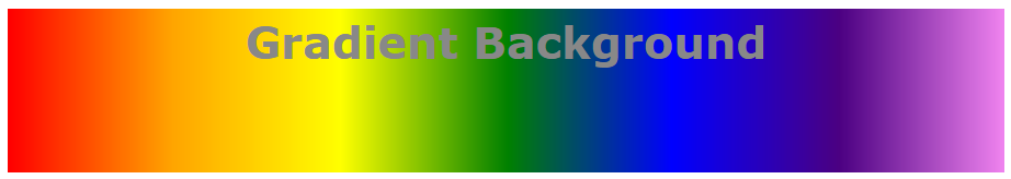
#grad {
  background: red; /* For browsers that do not support gradients */
  /* For Safari 5.1 to 6.0 */
  background: -webkit-linear-gradient(left,red,orange,yellow,green,blue,indigo,violet);
  /* For Opera 11.1 to 12.0 */
  background: -o-linear-gradient(left,red,orange,yellow,green,blue,indigo,violet);
  /* For Fx 3.6 to 15 */
  background: -moz-linear-gradient(left,red,orange,yellow,green,blue,indigo,violet);
  /* Standard syntax */
  background: linear-gradient(to right, red,orange,yellow,green,blue,indigo,violet);
}
Sử dụng transparency
CSS3 gradient cũng hỗ trợ transparency, có thể được sử dụng để tạo hiệu ứng làm mờ. Để thêm độ trong suốt, sử dụng hàm rgba() để xác định điểm dừng màu. Tham số cuối cùng trong hàm rgba() có thể là một giá trị từ 0 đến 1, và nó định nghĩa độ trong suốt của màu sắc: 0 cho thấy độ trong suốt hoàn toàn, 1 cho biết màu sắc đầy đủ (không làm mờ).
Ví dụ sau cho thấy một gradient tuyến tính bắt đầu từ bên trái. Bắt đầu được làm mờ rồi chuyển sang màu đỏ hoàn toàn:

#grad {
  background: red; /* For browsers that do not support gradients */
  background: -webkit-linear-gradient(left,rgba(255,0,0,0),rgba(255,0,0,1)); /*Safari 5.1-6*/
  background: -o-linear-gradient(right,rgba(255,0,0,0),rgba(255,0,0,1)); /*Opera 11.1-12*/
  background: -moz-linear-gradient(right,rgba(255,0,0,0),rgba(255,0,0,1)); /*Fx 3.6-15*/
  background: linear-gradient(to right, rgba(255,0,0,0), rgba(255,0,0,1)); /*Standard*/
}
Lặp lại một linear-gradient
Hàm repeating-linear-gradient() được sử dụng để lặp lại các gradient tuyến tính:
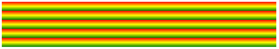
Ví dụ lặp lạo gradient tuyến tính:
#grad {
  background: red; /* For browsers that do not support gradients */
  /* Safari 5.1 to 6.0 */
  background: -webkit-repeating-linear-gradient(red, yellow 10%, green 20%);
  /* Opera 11.1 to 12.0 */
  background: -o-repeating-linear-gradient(red, yellow 10%, green 20%);
  /* Firefox 3.6 to 15 */
  background: -moz-repeating-linear-gradient(red, yellow 10%, green 20%);
  /* Standard syntax */
  background: repeating-linear-gradient(red, yellow 10%, green 20%);
}
Radial Gradient
Một gradient theo bán kính được xác định bởi trung tâm của nó. Để tạo một gradient theo bán kính, bạn cũng phải xác định ít nhất hai điểm dừng màu.
Cú pháp:
background: radial-gradient(shape size at position, start-color, …, last-color);
Theo mặc định, hình dạng là ellipse, kích thước là góc xa nhất, và vị trí là trung tâm.
Radial Gradient – điểm dừng màu trắng (mặc định)
Ví dụ sau cho thấy một gradient theo bán kính với điểm dừng màu đều nhau:

#grad {
  background: red; /* For browsers that do not support gradients */
  background: -webkit-radial-gradient(red, yellow, green); /* Safari 5.1 to 6.0 */
  background: -o-radial-gradient(red, yellow, green); /* For Opera 11.6 to 12.0 */
  background: -moz-radial-gradient(red, yellow, green); /* For Firefox 3.6 to 15 */
  background: radial-gradient(red, yellow, green); /* Standard syntax */
}
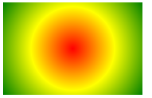
Radial Gradient – điểm dừng màu khác nhau
Ví dụ sau cho thấy một gradient theo bán kính với điểm dừng màu sắc khác nhau:

#grad {
  background: red; /* For browsers that do not support gradients */
  background: -webkit-radial-gradient(red 5%, yellow 15%, green 60%); /* Safari 5.1-6.0 */
  background: -o-radial-gradient(red 5%, yellow 15%, green 60%); /* For Opera 11.6-12.0 */
  background: -moz-radial-gradient(red 5%, yellow 15%, green 60%); /* For Firefox 3.6-15 */
  background: radial-gradient(red 5%, yellow 15%, green 60%); /* Standard syntax */
}
Thiết lập hình dạng
Tham số shape xác định hình dạng, có thể lấy vòng tròn giá trị hoặc hình elip. Giá trị mặc định là ellipse. Ví dụ sau cho thấy một gradient theo bán kính với hình dạng của một vòng tròn:
#grad {
  background: red; /* For browsers that do not support gradients */
  background: -webkit-radial-gradient(circle, red, yellow, green); /* Safari */
  background: -o-radial-gradient(circle, red, yellow, green); /* Opera 11.6 to 12.0 */
  background: -moz-radial-gradient(circle, red, yellow, green); /* Firefox 3.6 to 15 */
  background: radial-gradient(circle, red, yellow, green); /* Standard syntax */
}
Sử dụng từ khoá size khác nhau
Thông số size định nghĩa kích thước của gradient. Có thể là bốn giá trị:
- closest-side
- farthest-side
- closest-corner
- farthest-corner
Ví dụ gradient theo bán kính với từ khóa size khác nhau:
#grad1 {
  background: red; /* For browsers that do not support gradients */
  /* Safari 5.1 to 6.0 */
  background: -webkit-radial-gradient(60% 55%, closest-side, red, yellow, black);
  /* For Opera 11.6 to 12.0 */
  background: -o-radial-gradient(60% 55%, closest-side, red, yellow, black);
  /* For Firefox 3.6 to 15 */
  background: -moz-radial-gradient(60% 55%, closest-side, red, yellow, black);
  /* Standard syntax */
  background: radial-gradient(closest-side at 60% 55%, red, yellow, black);
}

#grad2 {
  /* Safari 5.1 to 6.0 */
  background: -webkit-radial-gradient(60% 55%, farthest-side, red, yellow, black);
  /* Opera 11.6 to 12.0 */
  background: -o-radial-gradient(60% 55%, farthest-side, red, yellow, black);
  /* For Firefox 3.6 to 15 */
  background: -moz-radial-gradient(60% 55%, farthest-side, red, yellow, black);
  /* Standard syntax */
  background: radial-gradient(farthest-side at 60% 55%, red, yellow, black);
}
Try it Yourself »
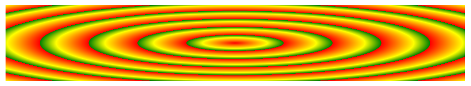
Lặp lại một radial-gradient
Hàm repeating-radial-gradient() được sử dụng để lặp lại các gradient theo bán kính:
#grad {
  background: red; /* For browsers that do not support gradients */
  /* For Safari 5.1 to 6.0 */
  background: -webkit-repeating-radial-gradient(red, yellow 10%, green 15%);
  /* For Opera 11.6 to 12.0 */
  background: -o-repeating-radial-gradient(red, yellow 10%, green 15%);
  /* For Firefox 3.6 to 15 */
  background: -moz-repeating-radial-gradient(red, yellow 10%, green 15%);
  /* Standard syntax */
  background: repeating-radial-gradient(red, yellow 10%, green 15%);
}
- Học lập trình front-end cơ bản với bootstrap 4/html5/css3
- Học lập trình front-end nâng cao qua Project thực tế
- Học thiết kế web với Photoshop, CSS theo kiểu SASS
- Học cách sử dụng Git_hub cho lập trình viên
- Học lập trình Back-end PHP theo mô hình MVC cơ bản
- Học lập trình Back-end PHP theo mô hình MVC nâng cao
- Học lập trình Cơ sở dữ liệu với AngularJS
- Học lập trình theme wordpress. Làm ra mọi website hoàn chỉnh với wordpress
- Combo lập trình front-end từ cơ bản – nâng cao
- Combo lập trình back-end từ cơ bản đến nâng cao
- Combo lập trình web với word press từ A-Z