12/08/2018, 17:05
Tạo terminal commands line với HTML/CSS
Trong bài viết này tôi sẽ giới thiệu tới các bước để tạo terminal commands line chỉ với HTML/CSS, kết quả như hình dưới đây : Mã HTML Cấu trúc HTML như sau, mình giải thích trong comment. <div class="terminal-menu"> <div class="terminal-buttons terminal-close"></div> ...
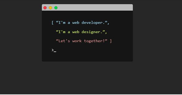
Trong bài viết này tôi sẽ giới thiệu tới các bước để tạo terminal commands line chỉ với HTML/CSS, kết quả như hình dưới đây :
Mã HTML
Cấu trúc HTML như sau, mình giải thích trong comment.
<div class="terminal-menu">
<div class="terminal-buttons terminal-close"></div>
<div class="terminal-buttons terminal-minimize"></div>
<div class="terminal-buttons terminal-zoom"></div>
</div>
<div class="terminal-screen">
<p class="line1">[ “I'm a web developer.”,
<span class="cursor1">_</span>
</p>
<p class="line2"> “I'm a web designer.”,
<span class="cursor2">_</span>
</p>
<p class="line3"> “Let's work together!” ]
<span class="cursor3">_</span>
</p>
<p class="line4">>
<span class="cursor4">_</span>
</p>
</div>
Code CSS
Dưới đây là mã code cho ví dụ, mình có giải thích trong comment
//Style chung
body {
  background-color: #272727;
  padding: 10px;
}

p {
  position: relative;
  left: 50%;
  margin-left: -8.5em;
  text-align: left;
  font-size: 1.25em;
  font-family: monospace;
  white-space: nowrap;
  overflow: hidden;
  awidth: 0;
}

span {
  color: #fff;
  font-weight: bold;
}

//Style cho buttons
.terminal-buttons {
  height: 10px;
  awidth: 10px;
  border-radius: 50%;
  border: 1px solid #000;
  position: relative;
  top: 6px;
  left: 6px;
  background-color: #ff3b47;
  border-color: #9d252b;
  display: inline-block;
}

//Style cho button minimize
.terminal-minimize {
  left: 11px;
  background-color: #ffc100;
  border-color: #9d802c;
}

//Style cho button zoom
.terminal-zoom {
  left: 16px;
  background-color: #00d742;
  border-color: #049931;
}

//Style cho terminal menu
.terminal-menu {
  awidth: 350px;
  box-sizing: border-box;
  height: 25px;
  background-color: #bbb;
  margin: 0 auto;
  border-top-right-radius: 5px;
  border-top-left-radius: 5px;
}

//Style cho terminal screen
.terminal-screen {
  background-color: #151515;
  box-sizing: border-box;
  awidth: 350px;
  margin: 0 auto;
  padding: 20px;
  border-bottom-left-radius: 5px;
  border-bottom-right-radius: 5px;
}

//Hiệu ứng cho dòng 1 & con trỏ 1
.line1 {
  color: #9CD9F0;
  -webkit-animation: type .5s 1s steps(20, end) forwards;
  -moz-animation: type .5s 1s steps(20, end) forwards;
  -o-animation: type .5s 1s steps(20, end) forwards;
  animation: type .5s 1s steps(20, end) forwards;
}

.cursor1 {
  -webkit-animation: blink 1s 2s 2 forwards;
  -moz-animation: blink 1s 2s 2 forwards;
  -o-animation: blink 1s 2s 2 forwards;
  animation: blink 1s 2s 2 forwards;
}

//Hiệu ứng cho dòng 2 & con trỏ 2
.line2 {
  color: #CDEE69;
  -webkit-animation: type .5s 4.25s steps(20, end) forwards;
  -moz-animation: type .5s 4.25s steps(20, end) forwards;
  -o-animation: type .5s 4.25s steps(20, end) forwards;
  animation: type .5s 4.25s steps(20, end) forwards;
}

.cursor2 {
  -webkit-animation: blink 1s 5.25s 2 forwards;
  -moz-animation: blink 1s 5.25s 2 forwards;
  -o-animation: blink 1s 5.25s 2 forwards;
  animation: blink 1s 5.25s 2 forwards;
}

//Hiệu ứng cho dòng 3 & con trỏ 3
.line3 {
  color: #E09690;
  -webkit-animation: type .5s 7.5s steps(20, end) forwards;
  -moz-animation: type .5s 7.5s steps(20, end) forwards;
  -o-animation: type .5s 7.5s steps(20, end) forwards;
  animation: type .5s 7.5s steps(20, end) forwards;
}

.cursor3 {
  -webkit-animation: blink 1s 8.5s 2 forwards;
  -moz-animation: blink 1s 8.5s 2 forwards;
  -o-animation: blink 1s 8.5s 2 forwards;
  animation: blink 1s 8.5s 2 forwards;
}

//Hiệu ứng cho dòng 4 & con trỏ 4
.line4 {
  color: #fff;
  -webkit-animation: type .5s 10.75s steps(20, end) forwards;
  -moz-animation: type .5s 10.75s steps(20, end) forwards;
  -o-animation: type .5s 10.75s steps(20, end) forwards;
  animation: type .5s 10.75s steps(20, end) forwards;
}

.cursor4 {
  -webkit-animation: blink 1s 11.5s infinite;
  -moz-animation: blink 1s 8.5s infinite;
  -o-animation: blink 1s 8.5s infinite;
  animation: blink 1s 8.5s infinite;
}

//Định nghĩa style cho keyframe blink
@-webkit-keyframes blink {
  0% {
    opacity: 0;
  }
  40% {
    opacity: 0;
  }
  50% {
    opacity: 1;
  }
  90% {
    opacity: 1;
  }
  100% {
    opacity: 0;
  }
}

@-moz-keyframes blink {
  0% {
    opacity: 0;
  }
  40% {
    opacity: 0;
  }
  50% {
    opacity: 1;
  }
  90% {
    opacity: 1;
  }
  100% {
    opacity: 0;
  }
}

@-o-keyframes blink {
  0% {
    opacity: 0;
  }
  40% {
    opacity: 0;
  }
  50% {
    opacity: 1;
  }
  90% {
    opacity: 1;
  }
  100% {
    opacity: 0;
  }
}

@keyframes blink {
  0% {
    opacity: 0;
  }
  40% {
    opacity: 0;
  }
  50% {
    opacity: 1;
  }
  90% {
    opacity: 1;
  }
  100% {
    opacity: 0;
  }
}

//Định nghĩa style cho keyframe type
@-webkit-keyframes type {
  to {
    awidth: 17em;
  }
}

@-moz-keyframes type {
  to {
    awidth: 17em;
  }
}

@-o-keyframes type {
  to {
    awidth: 17em;
  }
}

@keyframes type {
  to {
    awidth: 17em;
  }
}
Kết quả
Bạn xem kết quả tại đây nhé, nếu có bất cứ câu hỏi nào, hãy viết xuống comment nhé. Thanks all!