Thiết kế responsive footer đẹp mắt với CSS3
Với một footer chứa đầy đủ thông tin, cũng như được thiết kế gọn gàng và bắt mắt , là một phần rất quan trọng trong việc thiết kế website. Hôm nay mình sẽ chia sẻ cho các bạn một mẫu footer rất thường hay được áp dụng trong các trang web quốc tế lẫn Việt Nam. Mẫu footer này gồm có 2 phần : Phần đầu ...
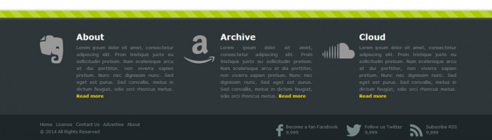
Với một footer chứa đầy đủ thông tin, cũng như được thiết kế gọn gàng và bắt mắt , là một phần rất quan trọng trong việc thiết kế website. Hôm nay mình sẽ chia sẻ cho các bạn một mẫu footer rất thường hay được áp dụng trong các trang web quốc tế lẫn Việt Nam. Mẫu footer này gồm có 2 phần : Phần đầu sẽ chứa 3 cột với tiêu đề và một đoạn mô tả ngắn, phần thứ 2 sẽ chứa một menu nhỏ và các nút chia sẻ trên mạng xã hội hiện nay.
Đây là mẫu footer mà mình muốn chia sẻ cho các bạn trong ngày hôm nay.
Xem Demo | Download
HTML
Trước hết, chúng ta cần có khung chuẩn html như sau :
<!DOCTYPE HTML>
<html>
<head>
<meta charset="utf-8" />
<meta name="author" content="Script Tutorials" />
<title>Stylish responsive footer | Script Tutorials</title>
<meta name="viewport" content="awidth=device-awidth, initial-scale=1.0, maximum-scale=1.0, user-scalable=no">
<link href="css/styles.css" rel="stylesheet">
</head>
<body>
<footer>
<div class="splitter"></div>
<ul>
</ul>
<div class="bar">
<div class="bar-wrap">
<ul class="links">
<li><a href="#">Home</a></li>
<li><a href="#">License</a></li>
<li><a href="#">Contact Us</a></li>
<li><a href="#">Advertise</a></li>
<li><a href="#">About</a></li>
</ul>
<div class="social">
</div>
<div class="clear"></div>
<div class="copyright">© 2014 All Rights Reserved</div>
</div>
</div>
</footer>
</body>
</html>
Như các bạn thấy, nội dung chính của trang web sẽ được đặt nằm trên phần tử footer. Phần tử đầu tiên của footer là thẻ div với class là .splitter, đây sẽ là phần mà chúng ta tạo một đường dọc kẻ để chia cắt phần nội dung với phần footer. Đặc biệt là dòng kẻ này sẽ được làm hoàn toàn bằng CSS3.
Bây giờ chúng ta sẽ chèn nội dung mẫu của phần đầu tiên trên footer, chính là phần 3 cột với đoạn html như sau:
<ul>
    <li>
        <div class="icon" data-icon="E"></div>
        <div class="text">
            <h4>About</h4>
            <div>Lorem ipsum dolor sit amet, consectetur adipiscing elit. Proin tristique justo eu sollicitudin pretium. Nam scelerisque arcu at dui porttitor, non viverra sapien pretium. Nunc nec dignissim nunc. Sed eget est purus. Sed convallis, metus in dictum feugiat, odio orci rhoncus metus. <a href="#">Read more</a></div>
        </div>
    </li>
    <li>
        <div class="icon" data-icon="a"></div>
        <div class="text">
            <h4>Archive</h4>
            <div>Lorem ipsum dolor sit amet, consectetur adipiscing elit. Proin tristique justo eu sollicitudin pretium. Nam scelerisque arcu at dui porttitor, non viverra sapien pretium. Nunc nec dignissim nunc. Sed eget est purus. Sed convallis, metus in dictum feugiat, odio orci rhoncus metus. <a href="#">Read more</a></div>
        </div>
    </li>
    <li>
        <div class="icon" data-icon="s"></div>
        <div class="text">
            <h4>Cloud</h4>
            <div>Lorem ipsum dolor sit amet, consectetur adipiscing elit. Proin tristique justo eu sollicitudin pretium. Nam scelerisque arcu at dui porttitor, non viverra sapien pretium. Nunc nec dignissim nunc. Sed eget est purus. Sed convallis, metus in dictum feugiat, odio orci rhoncus metus. <a href="#">Read more</a></div>
        </div>
    </li>
</ul>
Tiếp theo các bạn chèn thêm mẫu menu và nút chia sẻ mạng xã hội ở phần thứ 2.
<div class="bar">
<div class="bar-wrap">
<ul class="links">
<li><a href="#">Home</a></li>
<li><a href="#">License</a></li>
<li><a href="#">Contact Us</a></li>
<li><a href="#">Advertise</a></li>
<li><a href="#">About</a></li>
</ul>
<div class="social">
<a href="#" class="fb">
<span data-icon="f" class="icon"></span>
<span class="info">
<span class="follow">Become a fan Facebook</span>
<span class="num">9,999</span>
</span>
</a>
<a href="#" class="tw">
<span data-icon="T" class="icon"></span>
<span class="info">
<span class="follow">Follow us Twitter</span>
<span class="num">9,999</span>
</span>
</a>
<a href="#" class="rss">
<span data-icon="R" class="icon"></span>
<span class="info">
<span class="follow">Subscribe RSS</span>
<span class="num">9,999</span>
</span>
</a>
</div>
<div class="clear"></div>
<div class="copyright">© 2014 All Rights Reserved</div>
</div>
</div>
CSS
Bây giờ là lúc chúng ta sẽ định dạng cho từng phần bằng CSS. Như thường lệ, sẽ là khai báo chung cho cả trang.
@import url(http://weloveiconfonts.com/api/?family=zocial);

* {
    margin: 0;
    padding: 0;
}
@font-face {
    font-family: 'zocial', sans-serif;
}
[data-icon]:before {
    font-family: 'zocial';
    content: attr(data-icon);
    -webkit-font-smoothing: antialiased;
}
body {
    font-family: 'Verdana', sans-serif;
}

a {
    text-decoration: none;

    -webkit-transition: all .2s linear;
    -moz-transition: all .2s linear;
    -ms-transition: all .2s linear;
    -o-transition:  all .2s linear;
    transition: all .2s linear;
}
.clear {
    clear: both;
}
Dòng đầu tiên khai báo font ‘Zocial’ , đây là font mà chúng ta sẽ sử dụng để tạo các icon trong footer này. Chúng ta sẽ tiếp tục công việc với đặt màu nền cho footer.
footer {
    background-color: #2E3639;
    position: relative;
    z-index: 1;
}
Như mình đã nói ở bên trên, đường dọc kẻ sẽ được tạo ra với đoạn css sau :
footer .splitter {
    background-color: #ac0;
    background-image: -webkit-gradient(linear, 0 100%, 100% 0, color-stop(.25, rgba(255, 255, 255, .2)), color-stop(.25, transparent),
        color-stop(.5, transparent), color-stop(.5, rgba(255, 255, 255, .2)),
        color-stop(.75, rgba(255, 255, 255, .2)), color-stop(.75, transparent),
        to(transparent));
    background-image: -webkit-linear-gradient(45deg, rgba(255, 255, 255, .2) 25%, transparent 25%,
        transparent 50%, rgba(255, 255, 255, .2) 50%, rgba(255, 255, 255, .2) 75%,
        transparent 75%, transparent);
    background-image: -moz-linear-gradient(45deg, rgba(255, 255, 255, .2) 25%, transparent 25%,
        transparent 50%, rgba(255, 255, 255, .2) 50%, rgba(255, 255, 255, .2) 75%,
        transparent 75%, transparent);
    background-image: -ms-linear-gradient(45deg, rgba(255, 255, 255, .2) 25%, transparent 25%,
        transparent 50%, rgba(255, 255, 255, .2) 50%, rgba(255, 255, 255, .2) 75%,
        transparent 75%, transparent);
    background-image: -o-linear-gradient(45deg, rgba(255, 255, 255, .2) 25%, transparent 25%,
        transparent 50%, rgba(255, 255, 255, .2) 50%, rgba(255, 255, 255, .2) 75%,
        transparent 75%, transparent);
    background-image: linear-gradient(45deg, rgba(255, 255, 255, .2) 25%, transparent 25%,
        transparent 50%, rgba(255, 255, 255, .2) 50%, rgba(255, 255, 255, .2) 75%,
        transparent 75%, transparent);

    -webkit-background-size: 50px 50px;
    -moz-background-size: 50px 50px;
    background-size: 50px 50px;

    -moz-box-shadow: 1px 1px 8px gray;
    -webkit-box-shadow: 1px 1px 8px gray;
    box-shadow: 1px 1px 8px gray;

    height: 20px;
}
Tiếp theo là phần dành cho 3 cột.
footer > ul {
    list-style: none outside none;
    margin: 0 auto;
    max-awidth: 1200px;
    overflow: hidden;
    padding: 25px 0;
    position: relative;
    awidth: 95%;
}
footer > ul li {
    float: left;
    padding: 20px 15px;
    awidth: 33.3%;

    box-sizing:border-box;
    -webkit-box-sizing:border-box;
    -moz-box-sizing:border-box;
}
footer > ul li:first-child {
    padding-left: 0;
}
footer > ul li:nth-child(3) {
    padding-right: 0;
}
footer > ul li .icon {
    color: #999999;
    float: left;
    font-size: 80px;
    line-height: 80px;
}
footer > ul li .text {
    color: #848889;
    font-size: 13px;
    line-height: 20px;
    margin-left: 105px;
    position: relative;
    text-align: justify;
}
.text h4 {
    color: #FFFFFF;
    font-size: 24px;
    font-weight: bold;
    margin-bottom: 10px;
}
.text a {
    border-bottom: 1px dotted transparent;
    color: #FFDD00;
    font-weight: bold;
}
.text a:hover {
    border-color: #FFDD00;
}
Tiếp tục là phần dành cho menu.
footer .bar {
    background-color: #1E2629;
    padding: 20px 0;
}
footer .bar-wrap {
    font-size: 12px;
    margin: 0 auto;
    max-awidth: 1200px;
    position: relative;
    awidth: 95%;
}
.links {
    float: left;
    list-style: none outside none;
    position: relative;
}
.links li {
    float: left;
    margin-right: 10px;
}
.links a {
    color: #778888;
}
.links a:hover {
    color: #FFFFFF;
}
Chia sẻ mạng xã hội.
.social {
    position: absolute;
    right: 0;
    top: 0;
}
.social a {
    color: #778888;
    margin-left: 20px;
}
.social a:hover {
    color: #FFFFFF;
}
.social .icon {
    display: inline-block;
    font-size: 36px;
    margin-right: 5px;
    vertical-align: middle;

    -webkit-transition: -webkit-transform .3s linear;
    -moz-transition: -moz-transform .3s linear;
    -ms-transition: -ms-transform .3s linear;
    -o-transition:  -o-transform .3s linear;
    transition: transform .3s linear;
}
.social a:hover  .icon {
    -webkit-transform: rotate(360deg);
    -moz-transform: rotate(360deg);
    -ms-transform: rotate(360deg);
    -o-transform: rotate(360deg);
    transform: rotate(360deg);
}
.social .info {
    display: inline-block;
    vertical-align: middle;
}
.social .info .follow {
    display: block;
}
.social .info .num {
    display: block;
}
.copyright {
    color: #778888;
    margin-top: 5px;
}
Cuối cùng, phần quan trọng nhất là tạo khả năng Responsive, giúp cho footer có khả năng hiển thị tốt trên mọi kích thước màn hình.
@media screen and (max-awidth: 1000px){
    .links, .social, .copyright{
        float:none;
        text-align:center;
    }
    .social {
        position:relative;
        margin:10px 0;
    }
    .links li {
        display:inline-block;
        float:none;
    }
    .bar {
        position:relative;
    }
    .bar-wrap {
        margin-bottom:0;
    }
}

@media screen and (max-awidth: 835px)  {
    footer > ul li {
        float:none;
        awidth:auto;
    }
}

@media screen and (max-awidth: 768px)  {
    .links li {
        margin-right:5px;
    }
}
Chúc các bạn tìm được nhiều điều bỏ ích từ bài viết này, mình sẽ cố gắng mang đến cho các bạn thêm nhiều bài viết về lĩnh vực thiết kế web, giúp các bạn có được những kỹ năng cần thiết để có thể kiếm tiền.
Chúc các bạn thành công !
Chuyên Mục: Css
Bài viết được đăng bởi webmaster