Progressive Web App (PWA)
Progressive web apps seem to be the latest buzzword. But what does that mean? I this article I will present about Key concept of a progressive web app and why it matters. Web development has changed a lot over the years. When Ajax transformed the web from the static pages into dynamic interactive ...
Progressive web apps seem to be the latest buzzword. But what does that mean? I this article I will present about Key concept of a progressive web app and why it matters.
Web development has changed a lot over the years. When Ajax transformed the web from the static pages into dynamic interactive experiences. Users’ expectations went from clicking on the side of a map and waiting seconds for it to scroll to something like the Google Maps experience, with live panning and zooming, you don’t have to live with that horrible click and wait for user experience.
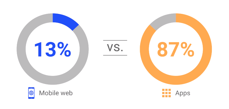
Unfortunately, the improvements we have seen on the desktop web have not translated as well to the mobile web. Consider this, if I ask you to open Google Maps on your phone, would you do it using the native app or through the browser? Chances are you would use the native app. Mobile is the key factor driving this revolution. We now use mobile devices more than desktop computers and depending on which stats you look at, it has been this way for more than two years. On mobile users spend most of their time in native apps rather than on the web. In fact they they spend 87% of their time in native apps versus only 13% of their time on the mobile web.
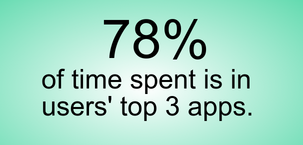
When asked why, users often say that apps are more predictable, they are easy to find on the home screen and feature push notifications that bring them back. So should we abandon the web and go build native apps? Of course not. There is a flip side to native app usage. App usage is highly concentrated, and users tend to only install and use a few apps. Users opinion is that they see native apps as a big commitment in space time and cost.
According to a recent study, the average user installs zero apps per month. By contrast, mobile users visit over 100 websites every month. This is the power of URLs and the ephemerality of the web. One way to think about the difference between native and web apps is on the capability axis.
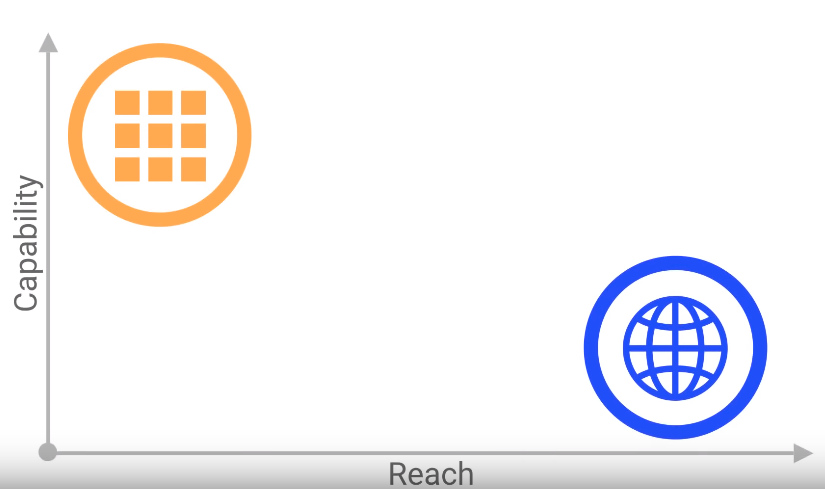
When you tap on their icon, native apps start quickly. They tend to work offline, then can show notifications, sync in the background and have access to sensors like camera and microphone. But the reach is somewhat limited, requiring a different version for each platform. The web is safer, and its permission model is more respectful of your privacy. But without some of the same capabilities, it doesn’t matter how many people can use it.
We want to combine the capabilities and experiences users are used to in native apps with the reach of web. We want the best of both worlds.
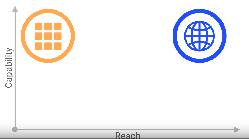
A progressive web app is simply that a great user experience that feels integrated and earns a place on my home screen without having to give up the reach to get it. The term “progressive web apps” really just means radically improving the quality of your end-to-end user experience. At their simplest, PWAs are normal websites created with the technologies we know and love as web developers HTML, CSS, and JavaScript. But they go a few steps further and offer users an enhanced experience. In order to do that we need to focus on four things: making the app fast, making the experience more integrated, ensuring that it works reliably, and keeping users engaged.
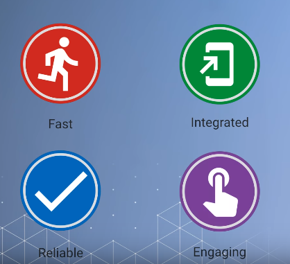
Let’s take a look at each of these properties in a little bit more depth.
Fast
Users expect apps to load quickly and to have smooth scrolling. Unfortunately, the web has a bad name for this, especially on mobile. For now, let’s focus on load performance, which means making sure that your web apps loads fast. Now, this is not just esoteric. We all know that time is money. This chart shows just how true that is.
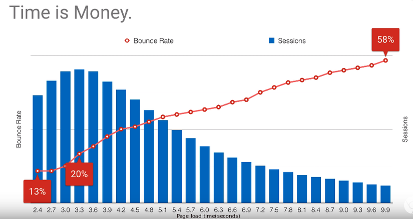
20% of users will abandon a site if it takes more than three seconds to load. Now, I could make a joke about kids today and short attention spans, but I'm guilty of this, too. Other studies show even worse results. After three seconds, 53% of users will abandon a site. In short, speed kills.
Integrated
Users shouldn't have to reach through a browser tab to access your app. In fact, the user shouldn't even think about the fact that they're on the web. Instead, they should be able to interact with it in the same way that they interact with all of the other apps on their device. They expect to launch it from the same place they launch all of their other apps. They expect to see it in the task list. They expect it to have all of the capabilities and hardware access that other apps have. Web payments-- something that we'll cover in a future video-- is a good example of keeping a user in your flow. Instead of requiring the user to fill out a complex checkout form, the Payment Request API simplifies it down to a few taps and can even integrate with other payment apps like PayPal or Android Pay. Another good example is media playback. With the Media Session API, you can provide metadata about what's currently playing and even handle media-related events from the user. If the screen is locked, the user can quickly see what song is playing and maybe skip to the next song.
Reliable
Users don't expect the web to work without a network connection. And often, they don't even bother to try when it's a slow or intermittent connection. We need to change that perception. Web apps must be reliable. When the user taps on a home screen icon, they expect it to load instantly and reliably. Apps launched from the home screen should never show the downasaur. Thinking back to the '90s when the web grew up, this is how we got online. Going online meant putting the whole house into online mode. I remember having to yell upstairs, don't pick up the phone. And if someone did, it would kill my connection. We used to know when we were online. But now, in the broadband era, we don't even think about it. Desktop connectivity is just always there. We've become used to always being online. And when we're not and we see this cute little downasaur, it's a disaster. Mobile phones aren't always online. Maybe you've turned on airplane mode or your subway stop doesn't have service. And even when you have four bars, you might not have a live connection. But it's not just the no connection that breaks the user's trust. It's slow and intermittent connections that affect users just as much. Still, mobile apps never show the downasaur. Nothing on my home screen shows this. In order for a web app to earn its place on the home screen, we need to make them reliable, even when the network isn't.
Engaging
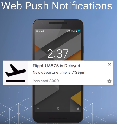
An engaging app goes beyond functional and ensures that the whole experience is delightful, making it easy for the user to do what they need to do. Using features like web push, it's always up to date. Notifications keep the user informed. An engaging app uses the right capabilities at the right time in a beautiful way. One example-- push notifications. They've existed for a while, but I'm really excited that we finally have access to them as web developers, and they even work when the browser is closed. On mobile devices, notifications are a fundamental part of turning a monthly active user into a daily active user.
