Ẩn hiện menu với CSS3 và jQuery
Một menu với khả năng linh động sẽ giúp ích rất nhiều cho những trang web không có quá nhiều diện tích trong việc hiển thị nội dung. Với sự kết hợp giữa CSS3 và jQuery, chúng ta sẽ hoàn toàn có thể tạo được những menu với khả năng ẩn hiện hết sức linh hoạt. Mẫu menu mà mình giới thiệu cho các bạn ...
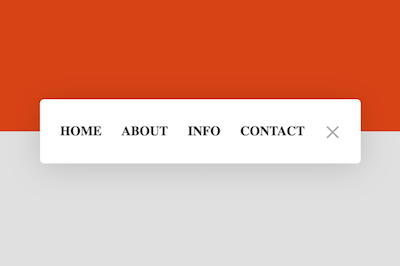
Một menu với khả năng linh động sẽ giúp ích rất nhiều cho những trang web không có quá nhiều diện tích trong việc hiển thị nội dung. Với sự kết hợp giữa CSS3 và jQuery, chúng ta sẽ hoàn toàn có thể tạo được những menu với khả năng ẩn hiện hết sức linh hoạt. Mẫu menu mà mình giới thiệu cho các bạn trong bài viết này là minh chứng rõ ràng cho những điều mình vừa nói.
Xem Demo | Download
HTML
Các bạn tạo menu theo cấu trúc html như sau :
<div class="menu expanded">
  <div class="container close">
    <div class="toggle close"></div>
  </div>
  <span class=""><a href="#">Home </a></span>
  <span class=""><a href="#">About</a></span>
  <span class=""><a href="#">Info</a></span>
  <span class=""><a href="#">Contact</a></span>
</div>
CSS
Chúng ta sẽ sử dụng đoạn css bên dưới để tạo hiệu ứng thoát ẩn đầy mê hoặc.
html {
  font-size: 16.36364px;
}
html ul li {
  list-style: none;
}
html body {
  display: flex;
  justify-content: center;
  align-items: center;
  position: relative;
  min-height: 95vh;
  background: #E0E0E0;
  border: 2.5vh solid #ffffff;
  /*animation: respiration ease-out 3s 1s;
    animation-iteration-count: infinite;*/
}
html body:before {
  position: absolute;
  top: 0;
  left: 0;
  right: 0;
  bottom: 50%;
  background: #D84315;
  content: "";
}
html body .menu {
  position: relative;
  display: flex;
  flex-direction: row;
  justify-content: space-between;
  align-items: center;
  box-sizing: border-box;
  height: 70px;
  awidth: 70px;
  padding: 15px 20px;
  border-radius: 5px;
  background: #ffffff;
  box-shadow: 0 4px 64px rgba(0, 0, 0, 0.15);
  transition: 1.3s cubic-bezier(0.53, 0, 0.15, 1.3);
  z-index: 2;
}
html body .menu.expanded {
  height: 80px;
  awidth: 400px;
}
html body .menu span {
  white-space: nowrap;
  visibility: visible;
  opacity: 1;
  transition: .3s;
  transform: rotateY(0deg);
}
html body .menu span:nth-of-type(1) {
  transition-delay: .4s;
}
html body .menu span:nth-of-type(2) {
  transition-delay: .5s;
}
html body .menu span:nth-of-type(3) {
  transition-delay: .6s;
}
html body .menu span:nth-of-type(4) {
  transition-delay: .7s;
}
html body .menu span.hidden {
  awidth: 0;
  visibility: hidden;
  opacity: 0;
  transform: rotateY(90deg);
}
html body .menu span.hidden:nth-of-type(1) {
  transition-delay: .3s;
}
html body .menu span.hidden:nth-of-type(2) {
  transition-delay: .2s;
}
html body .menu span.hidden:nth-of-type(3) {
  transition-delay: .1s;
}
html body .menu span.hidden:nth-of-type(4) {
  transition-delay: 0s;
}
html body .menu a {
  text-decoration: none;
  text-transform: uppercase;
  font-weight: bold;
  color: #333333;
  padding: 5px;
  transition: .3s;
}
html body .menu a:hover {
  color: #D84315;
}
html body .container {
  order: 1;
  awidth: 20px;
  height: 24px;
  padding: 5px;
  display: flex;
  flex-direction: row;
  justify-content: space-between;
  align-items: center;
  cursor: pointer;
}
html body .container:hover .toggle:before {
  top: -9px;
}
html body .container:hover .toggle:after {
  bottom: -7px;
}
html body .container .toggle {
  position: relative;
  awidth: 100%;
  height: 2px;
  background: #aaaaaa;
}
html body .container .toggle:before {
  position: relative;
  display: flex;
  top: -7px;
  height: 2px;
  awidth: 100%;
  background: #aaaaaa;
  content: "";
  transition: top .25s ease, bottom .25s ease, transform .5s ease;
}
html body .container .toggle:after {
  position: relative;
  display: flex;
  bottom: -5px;
  height: 2px;
  awidth: 100%;
  background: #aaaaaa;
  content: "";
  transition: top .25s ease, bottom .25s ease, transform .25s ease;
}
html body .container .toggle.close {
  height: 0;
}
html body .container .toggle.close:before {
  transform: rotate(45deg);
  top: 0;
}
html body .container .toggle.close:after {
  transform: rotate(-45deg);
  bottom: 2px;
}
@keyframes respiration {
  0% {
    min-height: 100vh;
    border: 0vh solid #ffffff;
  }
  75% {
    min-height: 95vh;
    border: 2.5vh solid #ffffff;
  }
  100% {
    min-height: 100vh;
    border: 0vh solid #ffffff;
  }
}
jQuery
Để kích hoạt hiệu ứng cho menu, chúng ta cần chèn thêm đoạn script sau đây.
<script src='https://cdnjs.cloudflare.com/ajax/libs/jquery/2.1.3/jquery.min.js'></script>
<script>$('.container').on('click', function() {
  $('.menu').toggleClass('expanded');
  $('span').toggleClass('hidden');
  $('.container , .toggle').toggleClass('close');
});
</script>
Từ bài viết này, các bạn hoàn toàn có thể tự sáng tạo thêm những hiệu ứng khác tuỳ theo ý tưởng, và đây cũng là bài học đáng giá cho những bạn mới tìm hiểu về CSS3 và jQuery.
Chúc các bạn thành công !
Chuyên Mục: Css, Javascript
Bài viết được đăng bởi webmaster