ạo đồng hồ treo tường với HTML và CSS - Học CSS3 căn bản & nâng cao
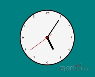
Hầu như mỗi nhà đều có một chiếc đồng hồ treo tường, và trang web cũng tương tư. Nó giống như một ngôi nhà riêng của chúng ta trang mạng. Do vậy việc thiết kế nên chiếc đồng hồ cũng rất cần thiết. Hôm nay, các bạn sẽ cùng Zaidap.com thao tác để tạo chiếc đồng hồ bên dưới 1. Phần HTML Phần ...
Hầu như mỗi nhà đều có một chiếc đồng hồ treo tường, và trang web cũng tương tư. Nó giống như một ngôi nhà riêng của chúng ta trang mạng. Do vậy việc thiết kế nên chiếc đồng hồ cũng rất cần thiết. Hôm nay, các bạn sẽ cùng Zaidap.com thao tác để tạo chiếc đồng hồ bên dưới
1. Phần HTML
Phần bố cục cho đồng hồ khá phức tạp
<!DOCTYPE html>
<html>
<head>
  <meta charset="utf-8">
  <meta http-equiv="X-UA-Compatible" content="IE=edge">
  <title>Page Title</title>
  <meta name="viewport" content="width=device-width, initial-scale=1">
  <link rel="stylesheet" type="text/css" media="screen" href="clock1.css">
  <script src="main.js"></script>
</head>
<body>
  <div class="clock">
    <div class="hourHand"></div>
    <div class="minuteHand"></div>
    <div class="sec"><div class="secondHand"></div></div>
    <div class="center"></div>
    <div class="red-center center"></div>
    <ul>
        <li><span>1</span></li>
        <li><span>2</span></li>
        <li><span>3</span></li>
        <li><span>4</span></li>
        <li><span>5</span></li>
        <li><span>6</span></li>
        <li><span>7</span></li>
        <li><span>8</span></li>
        <li><span>9</span></li>
        <li><span>10</span></li>
        <li><span>11</span></li>
        <li><span>12</span></li>
    </ul>
  </div>

</body>
</html>
Bao gồm phần các kim đồng hồ và phần số. Riêng phần kim giây có cấu tạo hơi khác di cách di chuyển khác biệt của nó. Điều mà Zaidap.com sẽ đề cập trong phần CSS.
2. Phần CSS
Trước hết hãy lướt qua toàn bộ đoạn mã
body{
  background-color: teal;;
  padding: 0;
  margin: 0;
}

.clock {
  width: 300px;
  height: 300px;
  border-radius: 50%;
  background-color: whitesmoke;
  margin: 100px auto 0px auto;
  position: relative;
  border: 5px solid #1a0000;
  display: flex;
  justify-content: center;
  align-items: center;
}

.center{
  background-color: #000;
  position: absolute;
  left: calc(50% - 10px);
  top:  calc(50% - 10px);
  width: 20px;
  height: 20px;
  border-radius: 50%;
  z-index: 20;
}

.red-center {
  width: 8px;
  height: 8px;
  z-index: 30;
  background-color: red;
  left: calc(50% - 4px);
  top: calc(50% - 4px);
}

.hourHand{
  width: 10px;
  height: 75px;
  background-color: #000;
  transform-origin: bottom center;
  border-radius: 4px;
  position: absolute;
  top: 75px;
  left: 145px;
  z-index: 10;
  transform: rotate(150deg);
  animation: hourMove 43200s linear infinite;
  outline: 100px solid transparent;
}

@keyframes hourMove {
  0% {
    transform: rotate(150deg);
  }
  100% {
    transform: rotate(510deg);
  }
}

.minuteHand{
  width: 5px;
  height: 120px;
  background-color: #000;
  transform-origin: bottom center;
  border-radius: 4px;
  position: absolute;
  top: 30px;
  left: 147px;
  z-index: 9;
  transform: rotate(0);
  animation: minMove 3600s linear infinite;
  outline: 100px solid transparent;
}

@keyframes minMove {
  0% {
    transform: rotate(0);
  }
  100% {
    transform: rotate(360deg);
  }
}

.secondHand{
  width: 2px;
  height: 150px;
  background-color:red;
  transform-origin: bottom center;
  border-radius: 4px;
  position: absolute;
  top: -120px;
  left: -1px;
  transition: all 0.06s;
  z-index: 8;
  transform: rotate(0);
  outline: 100px solid transparent;
}

.sec {
  position: relative;
  z-index: 30;
  animation: secMove 60s normal infinite steps(60,end);
}

@keyframes secMove {
  0% {
    transform: rotate(0);
  }
  100% {
    transform: rotate(360deg);
  }
}

.clock ul{
  list-style: none;
  padding: 0;

}
.clock ul li{
  position: absolute;
  width:20px;
  height:20px;
  text-align: center;
  line-height: 20px;
  font-size: 20px;
  columns: #000;
  font-family: "Droid Serif", serif;
}

.clock ul li:nth-child(1){
  right: 22%;
  top: 6.5%;
}

.clock ul li:nth-child(2){
  right: 6%;
  top: 25%;
}

.clock ul li:nth-child(3){
  right: 1%;
  top: calc(50% - 10px);
}

.clock ul li:nth-child(4){
  right: 6%;
  top: 69%;
}

.clock ul li:nth-child(5){
  right: 22%;
  top: 84%;
}

.clock ul li:nth-child(6){
  right: calc(50% - 10px);
  top: calc(99% - 20px);
}

.clock ul li:nth-child(7){
  left: 22%;
  top: 84%;
}

.clock ul li:nth-child(8){
  left: 6%;
  top: 69%;
}

.clock ul li:nth-child(9){
  left: 1%;
  top: calc(50% - 10px);
}

.clock ul li:nth-child(10){
  left: 6%;
  top: 25%;
}

.clock ul li:nth-child(11){
  left: 22%;
  top: 6.5%;
}

.clock ul li:nth-child(12){
  right: calc(50% - 10px);
  top: 1%;
}
Bước 1: tạo định dạng cho thẻ body
body{
  background-color: teal;;
  padding: 0;
  margin: 0;
}
Bước 2: tạo định dạng cho đồng hồ
.clock {
  width: 300px;
  height: 300px;
  border-radius: 50%;
  background-color: whitesmoke;
  margin: 100px auto 0px auto;
  position: relative;
  border: 5px solid #1a0000;
  display: flex;
  justify-content: center;
  align-items: center;
}
Chú ý thiết lập thuộc tính position: relative vì các phần tử con sẽ phụ thuộc thẻ này.
Bước 3: tạo chấm tròn trung tâm màu đen
.center{
  background-color: #000;
  position: absolute;
  left: calc(50% - 10px);
  top:  calc(50% - 10px);
  width: 20px;
  height: 20px;
  border-radius: 50%;
  z-index: 20;
}
Đây xem như là bước tạo trục chính cho kim giờ và kim phút.
Chú ý để canh giữa ta thiết lập như sau
{
  left: calc(50% - 10px);
  top:  calc(50% - 10px);
}
Giá trị 10px tức là bằng một nửa chiều cao và rộng của chấm tròn.
Bước 4: tạo chấm tròn đỏ cho kim giây
.red-center {
  width: 8px;
  height: 8px;
  z-index: 30;
  background-color: red;
  left: calc(50% - 4px);
  top: calc(50% - 4px);
}
Bước này tương tự bước 3 nhưng lưu ý thiết lập lại các giá trị
{
  z-index: 30;
  background-color: red;
}
Bước 5: tạo kim giờ
.hourHand{
  width: 10px;
  height: 75px;
  background-color: #000;
  transform-origin: bottom center;
  border-radius: 4px;
  position: absolute;
  top: 75px;
  left: 145px;
  z-index: 10;
  transform: rotate(150deg);
  animation: hourMove 43200s linear infinite;
  outline: 100px solid transparent;
}
Bước 6: tạo di chuyển cho kim giờ
@keyframes hourMove {
  0% {
    transform: rotate(150deg);
  }
  100% {
    transform: rotate(510deg);
  }
}
Bước 7: tạo kim phút
.minuteHand{
  width: 5px;
  height: 120px;
  background-color: #000;
  transform-origin: bottom center;
  border-radius: 4px;
  position: absolute;
  top: 30px;
  left: 147px;
  z-index: 9;
  transform: rotate(0);
  animation: minMove 3600s linear infinite;
  outline: 100px solid transparent;
}
Bước 8: tạo di chuyển cho kim phút
@keyframes minMove {
  0% {
    transform: rotate(0);
  }
  100% {
    transform: rotate(360deg);
  }
}
Bước 9: tạo kim giây
.secondHand{
  width: 2px;
  height: 150px;
  background-color:red;
  transform-origin: bottom center;
  border-radius: 4px;
  position: absolute;
  top: -120px;
  left: -1px;
  transition: all 0.06s;
  z-index: 8;
  transform: rotate(0);
  outline: 100px solid transparent;
}
Bước 10: tạo lớp bao đóng cho kim giây
.sec {
  position: relative;
  z-index: 30;
  animation: secMove 60s normal infinite steps(60,end);
}
Chú ý trong thuộc tính animation giá trị steps(60, end) được thiết lập để tạo bước di chuyển chân thật như ngoài thực tế.
Bước 11: tạo di chuyển cho kim giây
@keyframes secMove {
  0% {
    transform: rotate(0);
  }
  100% {
    transform: rotate(360deg);
  }
}
Bước 12: tạo các giá trị giờ
.clock ul{
  list-style: none;
  padding: 0;

}
.clock ul li{
  position: absolute;
  width:20px;
  height:20px;
  text-align: center;
  line-height: 20px;
  font-size: 20px;
  columns: #000;
  font-family: "Droid Serif", serif;
}
Bước 13: định dạng vòng tròn số
.clock ul li:nth-child(1){
  right: 22%;
  top: 6.5%;
}

.clock ul li:nth-child(2){
  right: 6%;
  top: 25%;
}

.clock ul li:nth-child(3){
  right: 1%;
  top: calc(50% - 10px);
}

.clock ul li:nth-child(4){
  right: 6%;
  top: 69%;
}

.clock ul li:nth-child(5){
  right: 22%;
  top: 84%;
}

.clock ul li:nth-child(6){
  right: calc(50% - 10px);
  top: calc(99% - 20px);
}

.clock ul li:nth-child(7){
  left: 22%;
  top: 84%;
}

.clock ul li:nth-child(8){
  left: 6%;
  top: 69%;
}

.clock ul li:nth-child(9){
  left: 1%;
  top: calc(50% - 10px);
}

.clock ul li:nth-child(10){
  left: 6%;
  top: 25%;
}

.clock ul li:nth-child(11){
  left: 22%;
  top: 6.5%;
}

.clock ul li:nth-child(12){
  right: calc(50% - 10px);
  top: 1%;
}
Ở bước này canh chỉnh tỷ lệ phần trăm cho hợp lý.
3. Lấy thời gian hiện tại
Nếu như các bạn muốn lấy thời gian hiện tại luôn thì thêm đoạn javascript tai đây. Sẽ có được hiệu ứng như demo bên dưới
window.onload = function() {

  const hourHand = document.querySelector('.hourHand');
      const minuteHand = document.querySelector('.minuteHand');
      const secondHand = document.querySelector('.sec');

      function setDate() {
          const today = new Date();

          const second = today.getSeconds();
          const secondDeg = ((second / 60) * 360) + 360;
          secondHand.style.transform = `rotate(${secondDeg}deg)`;

          const minute = today.getMinutes();
          const minuteDeg = ((minute / 60) * 360);
          minuteHand.style.transform = `rotate(${minuteDeg}deg)`;

          const hour = today.getHours();
          const hourDeg = ((hour / 12 ) * 360 );
          hourHand.style.transform = `rotate(${hourDeg}deg)`;

      }
      setInterval(setDate, 1000);

  }
4. Lời Kết
Qua bài này, Zaidap.com đã hướng dẫn các bạn tạo thành công đồng hồ treo tường. Các bạn có thể tinh chỉnh để cho đồng hồ thêm đẹp hơn như đổ bóng, làm hiệu ứng gương ...
Cảm ơn các bạn, hẹn gặp lại trong bài viết sau.
Chuyên đề học lập trình web: Học phần HTML / CSS
Đây là chương thứ nhất trong chuyên đề tự học lập trình web với PHP. Trong chương này chúng ta sẽ học HTML và CSS trước.
Các bạn hãy sub kênh để ủng hộ mình nhé. Link chuyên đê tại đây.