ạo hiệu ứng mưa với HTML và CSS - Học CSS3 căn bản & nâng cao
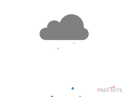
Một trang web nếu hiển thị được các hiệu ứng thời tiết nắng, mưa, gió thì sẽ rất sinh động. Hôm nay, Zaidap.com sẽ hướng các bạn tạo hiệu ứng mưa như hình 1. Phần HTML Phần bố cục chia làm 2 mảng chính: đám mây và giọt mưa. <!DOCTYPE ...
Một trang web nếu hiển thị được các hiệu ứng thời tiết nắng, mưa, gió thì sẽ rất sinh động. Hôm nay, Zaidap.com sẽ hướng các bạn tạo hiệu ứng mưa như hình
1. Phần HTML
Phần bố cục chia làm 2 mảng chính: đám mây và giọt mưa.
<!DOCTYPE html>
<html>
<head>
  <meta charset="utf-8">
  <meta http-equiv="X-UA-Compatible" content="IE=edge">
  <title>Rain</title>
  <meta name="viewport" content="width=device-width, initial-scale=1">
  <link rel="stylesheet" type="text/css" media="screen" href="rain.css">
  <script src="main.js"></script>
</head>
<body>
  <div class="cloud">
    <div class="c1"></div>
    <div class="c2"></div>
    <div class="c3"></div>
  </div>
  <div class="drop d1"></div>
  <div class="drop d2"></div>
  <div class="drop d3"></div>
  <div class="drop d4"></div>
  <div class="drop d5"></div>
  <div class="drop2 d1"></div>
  <div class="drop2 d2"></div>
  <div class="drop2 d3"></div>
  <div class="drop2 d4"></div>
  <div class="drop2 d5"></div>
</body>
</html>
Trong giọt mưa, Zaidap.com chia thành hai nhóm nhỏ nhằm tạo hiệu ứng mưa to.
Các bạn có thể tạo nhiều nhóm hơn để mưa to hơn nữa.
2. Phần CSS
Trước hết hãy lướt qua phần mã nguồn
body {
  display: flex;
  justify-content: center;
  align-items: center;
  min-height: 500px;
  position: relative;
}

.cloud {
  position: relative;
  height: 100px;
  width: 200px;
}

.cloud > div {
  border: 2px solid black;
  border: none;
  background-color: grey;
  animation: lightning linear 2s infinite;
}

@keyframes lightning {
  0% {
    background-color: #ffffb3
  }
  5% {
    background-color: grey;
  }
  8% {
    background-color: #ffffb3
  }
  10% {
    background-color: grey;
  }
  100% {
    background-color: grey;
  }
}

.c1 {
  position: absolute;
  width: 60px;
  height: 60px;
  border-radius: 30px;
  bottom: 20px;
  left: 30px;
  z-index: 1;
}

.c2 {
  position: absolute;
  width: 100px;
  height: 100px;
  border-radius: 50px;
  right: 20px;
  bottom: 5px;
  z-index: 1;
}

.c3 {
  position: absolute;
  width: 200px;
  height: 50px;
  border-radius: 25px;
  bottom: 0;
  z-index: 2;
}

.drop {
  position: relative;
}

.drop:after {
  display: block;
  content: "";
  background: #2e8ece;
  width: 20px;
  height: 20px;
  position: absolute;
  left: 315px;
  animation: drop 1s ease infinite;
  border-radius: 50%;
  transform: scale(0.7,1) rotate(45deg);
  box-shadow: 1px 1px 7px #1a1a1a;
}

.drop2 {
  position: relative;
}

.drop2::after {
  display: block;
  content: "";
  background: #2e8ece;
  width: 20px;
  height: 20px;
  position: absolute;
  left: 315px;
  animation: drop 1.5s 0.03s ease infinite;
  border-radius: 50%;
  transform: scale(0.7,1) rotate(45deg);
  box-shadow: 1px 1px 7px #1a1a1a;
}


.drop.d1::after {
  left: -40px;
  animation-delay: -0.2s;
}

.drop.d2::after {
  left: -70px;
  animation-delay: -0.35s;
}

.drop.d3::after {
  left: -100px;
  animation-delay: -0.3s;
}

.drop.d4::after {
  left: -130px;
  animation-delay: 0;
}

.drop.d5::after {
  left: -160px;
  animation-delay: 0.13s;
}

.drop2.d1::after {
  left: -45px;
  animation-delay: -0.7s;
}

.drop2.d2::after {
  left: -75px;
  animation-delay: -0.45s;
}

.drop2.d3::after {
  left: -105px;
  animation-delay: -0.93s;
}

.drop2.d4::after {
  left: -135px;
  animation-delay: 0.2;
}

.drop2.d5::after {
  left: -165px;
  animation-delay: 0.613s;
}

@keyframes drop {
  0%{
    transform: scale(0.1,0.1) rotate(45deg);
    top: 25px;
    border-top-left-radius: 50%;
  }
  95%{
    border-top-left-radius: 0;
    transform: scale(0.5,0.5) rotate(45deg);
  }
  100%{
    top: 300px;
    border-top-left-radius: 50%;
    transform: scale(0.5,0.1) rotate(45deg);
  }
}
Bước 1: tạo định dạng cho thẻ body
body {
  display: flex;
  justify-content: center;
  align-items: center;
  min-height: 500px;
  position: relative;
}
Bước 2: tạo định dạng cho lớp cloud
.cloud {
  position: relative;
  height: 100px;
  width: 200px;
}
Bước 3: tạo định dạng chung cho từng nhóm mây con
.cloud > div {
  border: 2px solid black;
  border: none;
  background-color: grey;
  animation: lightning linear 2s infinite;
}
Bước 4: tạo hiệu ứng sấm chớp
@keyframes lightning {
  0% {
    background-color: #ffffb3
  }
  5% {
    background-color: grey;
  }
  8% {
    background-color: #ffffb3
  }
  10% {
    background-color: grey;
  }
  100% {
    background-color: grey;
  }
}
Lưu ý sự thay đổi màu nền cần nhanh, nên độ lệch giữa các khoảng phần trăm phải thấp.
Bước 5: tạo định dạng các đám mây con
.c1 {
  position: absolute;
  width: 60px;
  height: 60px;
  border-radius: 30px;
  bottom: 20px;
  left: 30px;
  z-index: 3;
}

.c2 {
  position: absolute;
  width: 100px;
  height: 100px;
  border-radius: 50px;
  right: 20px;
  bottom: 5px;
  z-index: 3;
}

.c3 {
  position: absolute;
  width: 200px;
  height: 50px;
  border-radius: 25px;
  bottom: 0;
  z-index: 3;
}
Bước 6: tạo định dạng nhóm giọt mưa 1
.drop {
  position: relative;
}

.drop:after {
  display: block;
  content: "";
  background: #2e8ece;
  width: 20px;
  height: 20px;
  position: absolute;
  left: 315px;
  animation: drop 1s ease infinite;
  border-radius: 50%;
  transform: scale(0.7,1) rotate(45deg);
  box-shadow: 1px 1px 7px #1a1a1a;
}
Bước 7: tạo định dạng nhóm giọt mưa 2
.drop2 {
  position: relative;
}

.drop2::after {
  display: block;
  content: "";
  background: #2e8ece;
  width: 20px;
  height: 20px;
  position: absolute;
  left: 315px;
  animation: drop 1.5s 0.03s ease infinite;
  border-radius: 50%;
  transform: scale(0.7,1) rotate(45deg);
  box-shadow: 1px 1px 7px #1a1a1a;
}
Bước 8: tạo độ trễ và vị trí cho các giọt mưa nhóm 1
.drop.d1::after {
  left: -40px;
  animation-delay: -0.2s;
}

.drop.d2::after {
  left: -70px;
  animation-delay: -0.35s;
}

.drop.d3::after {
  left: -100px;
  animation-delay: -0.3s;
}

.drop.d4::after {
  left: -130px;
  animation-delay: 0;
}

.drop.d5::after {
  left: -160px;
  animation-delay: 0.13s;
}
Bước 9: tạo độ trễ và vị trí cho các giọt mưa nhóm 2
.drop2.d1::after {
  left: -45px;
  animation-delay: -0.7s;
}

.drop2.d2::after {
  left: -75px;
  animation-delay: -0.45s;
}

.drop2.d3::after {
  left: -105px;
  animation-delay: -0.93s;
}

.drop2.d4::after {
  left: -135px;
  animation-delay: 0.2;
}

.drop2.d5::after {
  left: -165px;
  animation-delay: 0.613s;
}
Bước 10: tạo hiệu ứng giọt mưa rơi
@keyframes drop {
  0%{
    transform: scale(0.1,0.1) rotate(45deg);
    top: 25px;
    border-top-left-radius: 50%;
  }
  95%{
    border-top-left-radius: 0;
    transform: scale(0.5,0.5) rotate(45deg);
  }
  100%{
    top: 300px;
    border-top-left-radius: 50%;
    transform: scale(0.5,0.1) rotate(45deg);
  }
}
3. Lời Kết
Qua bài viết này, các bạn đã học được cách tạo hiệu ứng mưa rơi kèm sấm chớp. Ở bài tiếp theo, Zaidap.com sẽ hướng dẫn các bạn hiệu ứng thời tiết nắng đẹp.
Cảm ơn các bạn, hẹn gặp lại trong bài viết tiếp theo.
Chuyên đề học lập trình web: Học phần HTML / CSS
Đây là chương thứ nhất trong chuyên đề tự học lập trình web với PHP. Trong chương này chúng ta sẽ học HTML và CSS trước.
Các bạn hãy sub kênh để ủng hộ mình nhé. Link chuyên đê tại đây.