Tạo web banner động với CSS3
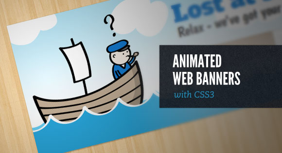
Bằng cách cắt nhỏ riêng lẻ từng hình trong banner và sử dụng hiệu ứng animation có trong CSS3, các bạn có thể tạo ra các banner động mà không cần phải dùng đến Flash. Với cách làm này , các bạn có thể tạo ra các banner động chạy tốt trên các thiết bị không hỗ trợ Flash (như iphone, ipad chẳng ...
Bằng cách cắt nhỏ riêng lẻ từng hình trong banner và sử dụng hiệu ứng animation có trong CSS3, các bạn có thể tạo ra các banner động mà không cần phải dùng đến Flash. Với cách làm này , các bạn có thể tạo ra các banner động chạy tốt trên các thiết bị không hỗ trợ Flash (như iphone, ipad chẳng hạn…) . Tuy nhiên nhược điểm của cách làm này là nó không hỗ trợ trên tất cả các trình duyệt, đặc biệt là IE7 và các trình duyệt IE cũ hơn.
Xem Demo | Download
Bước 1 : HTML Markup
Chúng ta sẽ cần có bộ khung html để minh họa như sau :
<div id="ad-1">
    <div id="content">
        <h2>Lost at sea?</h2>
        <h3>Relax - we've got your rudder.</h3>
        <form>
            <input type="text" id="email" value="Email address..." />
            <input type="submit" id="submit" value="Guide me" />
        </form>
    </div>
    <div id="clouds">
        <ul id="cloud-group-1">
            <li class="cloud-1"></li>
            <li class="cloud-2"></li>
            <li class="cloud-3"></li>
        </ul>
        <ul id="cloud-group-2">
            <li class="cloud-1"></li>
            <li class="cloud-2"></li>
            <li class="cloud-3"></li>
        </ul>
    </div>
    <ul id="boat">
        <li>
            <div id="question-mark"></div>
        </li>
    </ul>
    <ul id="water">
        <li id="water-back"></li>
        <li id="water-front"></li>
    </ul>
</div>
Bước 2 : CSS
Kế đến chúng ta sẽ định dạng css cơ bản cho bộ khung này. Đầu tiên là nền của banner
#ad-1 {
    awidth: 720px;
    height: 300px;
    float: left;
    margin: 40px auto 0;
    background-image: url(../images/ad-1/background.png);
    background-position: center;
    background-repeat: no-repeat;
    overflow: hidden;
    position: relative;
    box-shadow: 0px 0px 6px #000;
}
Hình ảnh sử dụng trong đoạn css bên trên các bạn có thể tìm thấy ở mục download. Kế tiếp chúng ta sẽ định dạng cho dòng chữ và form
#ad-1 #content {
    awidth: 325px;
    float: right;
    margin: 40px;
    text-align: center;
    z-index: 4;
    position: relative;
    overflow: visible;
}
#ad-1 h2 {
    font-family: 'Alfa Slab One', cursive;
    color: #137dd5;
    font-size: 50px;
    line-height: 50px;
    text-shadow: 0px 0px 4px #fff;
    animation: delayed-fade-animation 7s 1 ease-in-out; /* This will fade in our h2 with a simulated delay */
}
#ad-1 h3 {
    font-family: 'Boogaloo', cursive;
    color: #202224;
    font-size: 31px;
    line-height: 31px;
    text-shadow: 0px 0px 4px #fff;
    animation: delayed-fade-animation 10s 1 ease-in-out; /* This will fade in our h3 with a simulated delay */
}
#ad-1 form {
    margin: 30px 0 0 6px;
    position: relative;
    animation: form-animation 12s 1 ease-in-out;  /* This will slide in our email address form with a cool elastic effect. This also has a simulated delay */
}
#ad-1 #email {
    awidth: 158px;
    height: 48px;
    float: left;
    padding: 0 20px;
    font-size: 16px;
    font-family: 'Lucida Grande', sans-serif;
    color: #fff;
    text-shadow: 1px 1px 0px #a2917d;
    border-top-left-radius: 5px;
    border-bottom-left-radius: 5px;
    border:1px solid #a2917d;
    outline: none;
    box-shadow: -1px -1px 1px #fff;
    background-color: #c7b29b;
    background-image: linear-gradient(bottom, rgb(216,201,185) 0%, rgb(199,178,155) 100%);
}
#ad-1 #email:focus {
    background-image: linear-gradient(bottom, rgb(199,178,155) 0%, rgb(199,178,155) 100%);

}
#ad-1 #submit {
    height: 50px;
    float: left;
    cursor: pointer;
    padding: 0 20px;
    font-size: 20px;
    font-family: 'Boogaloo', cursive;
    color: #137dd5;
    text-shadow: 1px 1px 0px #fff;
    border-top-right-radius: 5px;
    border-bottom-right-radius: 5px;
    border:1px solid #bcc0c4;
    border-left: none;
    background-color: #fff;
    background-image: linear-gradient(bottom, rgb(245,247,249) 0%, rgb(255,255,255) 100%);
}
#ad-1 #submit:hover {
    background-image: linear-gradient(bottom, rgb(255,255,255) 0%, rgb(255,255,255) 100%);
}
Bây giờ chúng ta sẽ định dạng cho phần water và khai báo animation
#ad-1 li#water-back {
    awidth: 1200px;
    height: 84px;
    background-image: url(../images/ad-1/water-back.png);
    background-repeat: repeat-x;
    z-index: 1;
    position: absolute;
    bottom: 10px;
    left: -20px;
    animation: water-back-animation 3s infinite ease-in-out; /* Bobbing water effect */
}
#ad-1 li#water-front {
    awidth: 1200px;
    height: 158px;
    background-image: url(../images/ad-1/water-front.png);
    background-repeat: repeat-x;
    z-index: 3;
    position: absolute;
    bottom: -70px;
    left:-30px;
    animation: water-front-animation 2s infinite ease-in-out; /* Another bobbing water effect - yet slightly different. We'll make this animation move a little bit faster in order to create some perspective. */
}
Làm tương tự cho phần định dạng chiếc thuyền (boat )
#ad-1 ul#boat {
    awidth: 249px;
    height: 215px;
    z-index: 2;
    position: absolute;
    bottom: 25px;
    left: 20px;
    overflow: visible;
    animation: boat-in-animation 3s 1 ease-out; /* Slides the group in when ad starts */
}
#ad-1 ul#boat li {
    awidth: 249px;
    height: 215px;
    background-image: url(../images/ad-1/boat.png);
    position: absolute;
    bottom: 0px;
    left: 0px;
    overflow: visible;
    animation: boat-animation 2s infinite ease-in-out; /* Simulate the boat bobbing on the water - similar to the animation already used on the water itself. */
}
#ad-1 #question-mark {
    awidth: 24px;
    height: 50px;
    background-image: url(../images/ad-1/question-mark.png);
    position: absolute;
    right: 34px;
    top: -30px;
    animation: delayed-fade-animation 4s 1 ease-in-out; /* Fade in the question mark */
}
Phần đám mây :
#ad-1 #clouds {
    position: absolute;
    top: 0px;
    z-index: 0;
    animation: cloud-animation 30s infinite linear; /* Scrolls the clouds off to the left, resets, and repeats */
}
#ad-1 #cloud-group-1 {
    awidth:720px;
    position: absolute;
    left:0px;
}
#ad-1 #cloud-group-2 {
    awidth: 720px;
    position: absolute;
    left: 720px;
}
#ad-1 .cloud-1 {
    awidth: 172px;
    height: 121px;
    background-image: url(../images/ad-1/cloud-1.png);
    position: absolute;
    top: 10px;
    left: 40px;
}
#ad-1 .cloud-2 {
    awidth: 121px;
    height: 75px;
    background-image: url(../images/ad-1/cloud-2.png);
    position: absolute;
    top: -25px;
    left: 300px;
}
#ad-1 .cloud-3 {
    awidth: 132px;
    height: 105px;
    background-image: url(../images/ad-1/cloud-3.png);
    position: absolute;
    top: -5px;
    left: 530px;
}
Bước 3 : Phần hoạt cảnh (Animations)
Đây chính là phần trọng tâm nhất của bài viết này. Sau khi chúng ta đã khai báo animation cho các đối tượng, bây giờ chúng ta sẽ tiến hành tạo hiệu ứng.
– Đầu tiên là các hiệu ứng cho các đối tượng sử dụng animation delayed-fade-animation
@keyframes delayed-fade-animation {
    0%   {opacity: 0;}
    80%  {opacity: 0;}
    100% {opacity: 1;}
}
Hiệu ứng cho form
@keyframes form-animation {
    0%   {opacity: 0; right: -400px;}
    90%  {opacity: 0; right: -400px;}
    95%  {opacity: 0.5; right: 20px;}
    100% {opacity: 1; right: 0px;}
}
Hiệu ứng này sẽ làm cho chiếc thuyền xuất hiện từ bên trái :
@keyframes boat-in-animation {
    0%   {left: -200px;}
    100% {left: 20px;}
}
Hiệu ứng chuyển động của những đám mây
@keyframes cloud-animation {
    0%       {left: 0px;}
    99.9999%   {left: -720px;}
    100%     {left: 0px;}
}
Hiệu ứng này sẽ làm cho thuyền trông như đang lênh đênh trên biển :
@keyframes boat-animation {
    0%   {bottom: 0px; left: 0px;}
    25%  {bottom: -2px; left: -2px;}
    70%  {bottom: 2px; left: -4px;}
    100% {bottom: -1px; left: 0px;}
}
Và cuối cùng là hiệu ứng sóng biển
@keyframes water-back-animation {
    0%   {bottom: 10px; left: -20px;}
    25%  {bottom: 8px; left: -22px;}
    70%  {bottom: 12px; left: -24px;}
    100% {bottom: 9px; left: -20px;}
}
@keyframes water-front-animation {
    0%   {bottom: -70px; left: -30px;}
    25%  {bottom: -68px; left: -32px;}
    70%  {bottom: -72px; left: -34px;}
    100% {bottom: -69px; left: -30px;}
}
Chỉ cần các bạn nắm vững phần animation trong CSS3 là các bạn có thể làm được nhiều hiệu ứng khác nhau. Ngoài ra nếu các bạn muốn nâng cao, có thể tìm hiểu thêm về CSS transformations.
Chúc các bạn thành công !
Chuyên Mục: Css
Bài viết được đăng bởi webmaster
-
Quang Đinh
-
papyrut
-