04/10/2018, 20:07
Thiết kế sliding tags cho web với CSS3
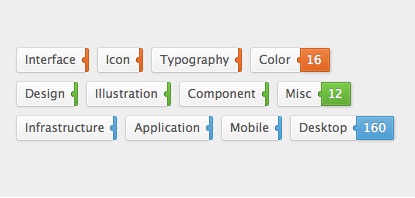
Hôm nay mình sẽ chia sẻ cho các bạn thêm một mẫu tabs với hiệu ứng slide, mẫu tabs này được thiết kế đơn giản và hoàn toàn phù hợp với phong cách thiết kế hiện nay. Thông qua mẫu tab này, các bạn có thể thêm sức sáng tạo cũng như học thêm được nhiều thuộc tính có trong CSS3. Xem Demo | ...
Hôm nay mình sẽ chia sẻ cho các bạn thêm một mẫu tabs với hiệu ứng slide, mẫu tabs này được thiết kế đơn giản và hoàn toàn phù hợp với phong cách thiết kế hiện nay. Thông qua mẫu tab này, các bạn có thể thêm sức sáng tạo cũng như học thêm được nhiều thuộc tính có trong CSS3.
Xem Demo | Download
HTML
Đầu tiên, chúng ta cần khugn chuẩn html như sau :
  <ul class="tags">
      <li><a href="index.html">Interface <span>4</span></a></li>
      <li><a href="index.html">Icon <span>8</span></a></li>
      <li><a href="index.html">Typography <span>15</span></a></li>
      <li><a href="index.html">Color <span>16</span></a></li>
    </ul>
CSS
Sau đó các bạn tạo hiệu ứng với đoạn css sau :
.tags {
  zoom: 1;
}
.tags:before, .tags:after {
  content: ';
  display: table;
}
.tags:after {
  clear: both;
}
.tags li {
  position: relative;
  float: left;
  margin: 0 0 8px 12px;
}
.tags li:active {
  margin-top: 1px;
  margin-bottom: 7px;
}
.tags li:after {
  content: ';
  z-index: 2;
  position: absolute;
  top: 10px;
  right: -2px;
  awidth: 5px;
  height: 6px;
  opacity: .95;
  background: #eb6b22;
  border-radius: 3px 0 0 3px;
  -webkit-box-shadow: inset 1px 0 #99400e;
  box-shadow: inset 1px 0 #99400e;
}
.tags a, .tags span {
  display: block;
  -webkit-box-sizing: border-box;
  -moz-box-sizing: border-box;
  box-sizing: border-box;
}
.tags a {
  height: 26px;
  line-height: 23px;
  padding: 0 9px 0 8px;
  font-size: 12px;
  color: #555;
  text-decoration: none;
  text-shadow: 0 1px white;
  background: #fafafa;
  border-awidth: 1px 0 1px 1px;
  border-style: solid;
  border-color: #dadada #d2d2d2 #c5c5c5;
  border-radius: 3px 0 0 3px;
  background-image: -webkit-linear-gradient(top, #fcfcfc, #f0f0f0);
  background-image: -moz-linear-gradient(top, #fcfcfc, #f0f0f0);
  background-image: -o-linear-gradient(top, #fcfcfc, #f0f0f0);
  background-image: linear-gradient(to bottom, #fcfcfc, #f0f0f0);
  -webkit-box-shadow: inset 0 0 0 1px rgba(255, 255, 255, 0.7), 0 1px 2px rgba(0, 0, 0, 0.05);
  box-shadow: inset 0 0 0 1px rgba(255, 255, 255, 0.7), 0 1px 2px rgba(0, 0, 0, 0.05);
}
.tags a:hover span {
  padding: 0 7px 0 6px;
  max-awidth: 40px;
  -webkit-box-shadow: inset 0 0 0 1px rgba(255, 255, 255, 0.15), 1px 1px 2px rgba(0, 0, 0, 0.2);
  box-shadow: inset 0 0 0 1px rgba(255, 255, 255, 0.15), 1px 1px 2px rgba(0, 0, 0, 0.2);
}
.tags span {
  position: absolute;
  top: 1px;
  left: 100%;
  z-index: 2;
  overflow: hidden;
  max-awidth: 0;
  height: 24px;
  line-height: 21px;
  padding: 0 0 0 2px;
  color: white;
  text-shadow: 0 -1px rgba(0, 0, 0, 0.3);
  background: #eb6b22;
  border: 1px solid;
  border-color: #d15813 #c85412 #bf5011;
  border-radius: 0 2px 2px 0;
  opacity: .95;
  background-image: -webkit-linear-gradient(top, #ed7b39, #df5e14);
  background-image: -moz-linear-gradient(top, #ed7b39, #df5e14);
  background-image: -o-linear-gradient(top, #ed7b39, #df5e14);
  background-image: linear-gradient(to bottom, #ed7b39, #df5e14);
  -webkit-transition: 0.3s ease-out;
  -moz-transition: 0.3s ease-out;
  -o-transition: 0.3s ease-out;
  transition: 0.3s ease-out;
  -webkit-transition-property: padding, max-awidth;
  -moz-transition-property: padding, max-awidth;
  -o-transition-property: padding, max-awidth;
  transition-property: padding, max-awidth;
}
Các bạn có thể thêm màu vào các tags như sau :
.green li:after {
  background: #65bb34;
  -webkit-box-shadow: inset 1px 0 #3a6b1e;
  box-shadow: inset 1px 0 #3a6b1e;
}
.green span {
  background: #65bb34;
  border-color: #549b2b #4f9329 #4b8b27;
  background-image: -webkit-linear-gradient(top, #71ca3f, #5aa72e);
  background-image: -moz-linear-gradient(top, #71ca3f, #5aa72e);
  background-image: -o-linear-gradient(top, #71ca3f, #5aa72e);
  background-image: linear-gradient(to bottom, #71ca3f, #5aa72e);
}
Vậy là xong, nếu có gì thắc mắc, các bạn đừng ngần ngại để lại lời nhắn dưới dạng comment nhé.
Chúc các bạn thành công !
Chuyên Mục: Css
Bài viết được đăng bởi webmaster