04/10/2018, 20:10
Tùy chỉnh thứ tự mẫu danh sách ấn tượng hơn với CSS3
Việc sắp xếp nội dung theo thứ tự thì hầu như trang web nào cũng sử dụng, tuy nhiên những mẫu định dạng mặc định của nó khá thô sơ và không mấy ấn tượng. Trong bài viết này, chúng ta sẽ thử sử dụng một vài thuộc tính có trong CSS3 để ” hack ” cho nó đẹp hơn xem sao. Xem Demo | ...
Việc sắp xếp nội dung theo thứ tự thì hầu như trang web nào cũng sử dụng, tuy nhiên những mẫu định dạng mặc định của nó khá thô sơ và không mấy ấn tượng. Trong bài viết này, chúng ta sẽ thử sử dụng một vài thuộc tính có trong CSS3 để ” hack ” cho nó đẹp hơn xem sao.
Xem Demo | Download
HTML
Thông thường thì chúng ta có danh sách như sau :
<ol class="rounded-list">
    <li><a href="">List item</a></li>
    <li><a href="">List item</a></li>
    <li><a href="">List item</a>
        <ol>
            <li><a href="">List sub item</a></li>
            <li><a href="">List sub item</a></li>
            <li><a href="">List sub item</a></li>
        </ol>
    </li>
    <li><a href="">List item</a></li>
    <li><a href="">List item</a></li>
</ol>
CSS
Chúng ta sẽ sử dụng 2 thuộc tính là counter-reset và counter-increment, những thuộc tính này có tác dụng giống như bộ đếm, nó sẽ giúp danh sách theo thứ tự từ nhỏ đến lớn.
ol {
    counter-reset: li; /* Initiate a counter */
    list-style: none; /* Remove default numbering */
    *list-style: decimal; /* Keep using default numbering for IE6/7 */
    font: 15px 'trebuchet MS', 'lucida sans';
    padding: 0;
    margin-bottom: 4em;
    text-shadow: 0 1px 0 rgba(255,255,255,.5);
}

ol ol {
    margin: 0 0 0 2em; /* Add some left margin for inner lists */
}
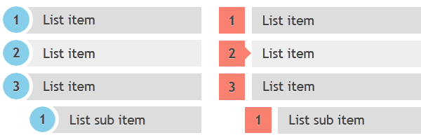
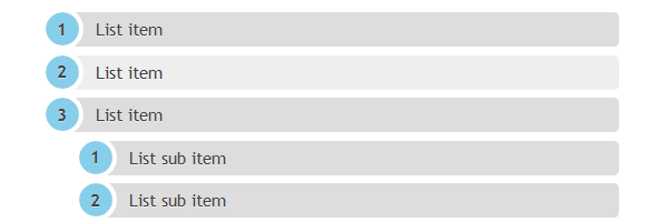
Rounded-shaped numbers
.rounded-list a{
    position: relative;
    display: block;
    padding: .4em .4em .4em 2em;
    *padding: .4em;
    margin: .5em 0;
    background: #ddd;
    color: #444;
    text-decoration: none;
    border-radius: .3em;
    transition: all .3s ease-out;
}

.rounded-list a:hover{
    background: #eee;
}

.rounded-list a:hover:before{
    transform: rotate(360deg);
}

.rounded-list a:before{
    content: counter(li);
    counter-increment: li;
    position: absolute;
    left: -1.3em;
    top: 50%;
    margin-top: -1.3em;
    background: #87ceeb;
    height: 2em;
    awidth: 2em;
    line-height: 2em;
    border: .3em solid #fff;
    text-align: center;
    font-weight: bold;
    border-radius: 2em;
    transition: all .3s ease-out;
}
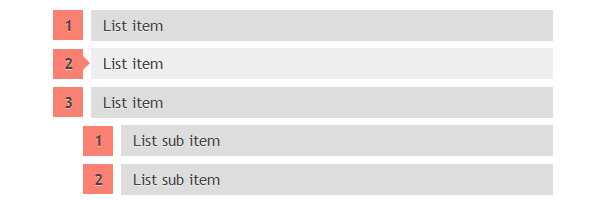
Rectangle-shaped numbers
.rectangle-list a{
    position: relative;
    display: block;
    padding: .4em .4em .4em .8em;
    *padding: .4em;
    margin: .5em 0 .5em 2.5em;
    background: #ddd;
    color: #444;
    text-decoration: none;
    transition: all .3s ease-out;
}

.rectangle-list a:hover{
    background: #eee;
}

.rectangle-list a:before{
    content: counter(li);
    counter-increment: li;
    position: absolute;
    left: -2.5em;
    top: 50%;
    margin-top: -1em;
    background: #fa8072;
    height: 2em;
    awidth: 2em;
    line-height: 2em;
    text-align: center;
    font-weight: bold;
}

.rectangle-list a:after{
    position: absolute;
    content: ';
    border: .5em solid transparent;
    left: -1em;
    top: 50%;
    margin-top: -.5em;
    transition: all .3s ease-out;
}

.rectangle-list a:hover:after{
    left: -.5em;
    border-left-color: #fa8072;
}
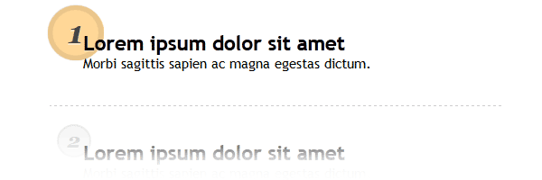
Circle-shaped numbers
.circle-list li{
    padding: 2.5em;
    border-bottom: 1px dashed #ccc;
}

.circle-list h2{
    position: relative;
    margin: 0;
}

.circle-list p{
    margin: 0;
}

.circle-list h2:before{
    content: counter(li);
    counter-increment: li;
    position: absolute;
    z-index: -1;
    left: -1.3em;
    top: -.8em;
    background: #f5f5f5;
    height: 1.5em;
    awidth: 1.5em;
    border: .1em solid rgba(0,0,0,.05);
    text-align: center;
    font: italic bold 1em/1.5em Georgia, Serif;
    color: #ccc;
    border-radius: 1.5em;
    transition: all .2s ease-out;
}

.circle-list li:hover h2:before{
    background-color: #ffd797;
    border-color: rgba(0,0,0,.08);
    border-awidth: .2em;
    color: #444;
    transform: scale(1.5);
}
Cám ơn các bạn đã theo dõi bài viết, và hy vọng là các bạn sẽ thích nó.
Chuyên Mục: Css
Bài viết được đăng bởi webmaster