Mẫu Social Share Nằm Góc Phải Màn Hình Với CSS3 & jQuery
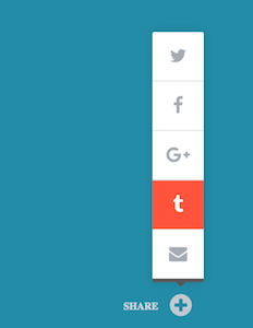
Hôm nay mình sẽ mang đến cho các bạn một hiệu ứng ẩn hiện cực cool với sự kết hợp giữa CSS3 và jQuery. Trong bài viết này, chúng ta sẽ thử tạo nút chia sẻ mạng xã hội được đặt tại ví trí bottom của trang web. Qua bài viết này, các bạn cũng có thể áp dụng nút chia sẻ này vào chính trang web hay blog ...
Hôm nay mình sẽ mang đến cho các bạn một hiệu ứng ẩn hiện cực cool với sự kết hợp giữa CSS3 và jQuery. Trong bài viết này, chúng ta sẽ thử tạo nút chia sẻ mạng xã hội được đặt tại ví trí bottom của trang web. Qua bài viết này, các bạn cũng có thể áp dụng nút chia sẻ này vào chính trang web hay blog mà các bạn đang sở hữu.
Xem Demo | Download
HTML
Các icons mà chúng ta sử dụng trong bài viết này là từ font Awesome, vì vậy các bạn nên chèn font này ngay bên trong thẻ head.
<link rel='stylesheet prefetch' href='//maxcdn.bootstrapcdn.com/font-awesome/4.7.0/css/font-awesome.min.css'>
Sau đó các bạn dùng cấu trúc html sau cho các nút chia sẻ mạng xã hội.
<div class="ttw-share-arrow"></div>


<div class="ttw-share-activate-button ">
    <div class="share-desc">SHARE</div>    <i class="fa  fa-plus-circle"></i>
</div>


<ul class="social-share-wrapper">


                <li>
        <a class="ttw-twitter-button" target="_blank" href="#">
            <i class="fa fa-twitter"></i>
        </a>
        </li>


                <li>
        <a class="ttw-facebook-button" target="_blank" href="#">
            <i class="fa fa-facebook"></i>
        </a>
        </li>


                <li>
        <a class="ttw-googleplus-button" target="_blank" href="#">
            <i class="fa fa-google-plus"></i>
        </a>
        </li>


                <li>
        <a class="ttw-tumblr-button" target="_blank" href="#">
            <i class="fa fa-tumblr"></i>
        </a>
        </li>


                <li>
        <a class="ttw-email-button" href="#">
            <i class="fa fa-envelope"></i>
        </a>
        </li>


</ul>
CSS
Trong đoạn css bên dưới, mình có để lại các ghi chú từng bước , các bạn có thể copy hoặc đọc từng phần sẽ hiểu rõ quy tắc làm việc của từng hiệu ứng.
/* ACTIVATION BUTTON
**************************************************/
.ttw-share-activate-button {
  min-awidth:50px;
  cursor:pointer;
  text-align:right;
  position:fixed;
  z-index:999999;
  right:77px;
  bottom:73px;
  text-decoration:none !important;
  font-size:11px;
  font-weight:700;

  /* activation button label */
  color:#D2D9DF;

  -webkit-transition: all .5s ease;
  -moz-transition: all .5s ease;
  transition: all .5s ease;

  -webkit-transform: translateY(0);
  -moz-transform: translateY(0);
  transform: translateY(0);

  /* remove the flickering effect of a tapped link/button when on a touch device */
  -webkit-tap-highlight-color:rgba(0,0,0,0);
}


/* show activation button when scrolled down (if active) */
.ttw-share-activate-button-visible {
  -webkit-transform: translateY(100px);
  -moz-transform: translateY(100px);
  transform: translateY(100px);
}
.share-desc {
  display:inline-block;
  position:relative;
  bottom:5px;
}
/* activation button icon initial position */
.ttw-share-activate-button i {
  font-size:28px;
  margin:0 0 0 10px;
  color:#C2CAD0;

  -webkit-transform:rotate(0deg);
  -moz-transform:rotate(0deg);
  transform:rotate(0deg);
}
/* activation button icon hover color */
.ttw-share-activate-button-active i,
.ttw-share-activate-button:hover i {
  color:#A9AFB4;

  -webkit-transition: all .5s ease;
  -moz-transition: all .5s ease;
  transition: all .5s ease;
}
/* activation button animation */
.ttw-share-activate-button-active i {
  -webkit-transform:rotate(180deg);
  -moz-transform:rotate(180deg);
  transform:rotate(180deg);

  -webkit-transition: -webkit-transform .5s ease, color .1s ease;
  -moz-transition: -moz-transform .5s ease, color .1s ease;
  transition: transform .5s ease, color .1s ease;
}


/* THE ARROW
**************************************************/
.ttw-share-arrow {
  awidth:0;
  height:0;
  margin:0 auto !important;
  border-left:5px solid transparent;
  border-right:5px solid transparent;
  bottom: 107px !important;
  right: 84px;
  display:none;

  /* tooltip color */
  border-top:5px solid #5A5A5A;

  position:fixed;
  z-index:999999;
}
.ttw-share-arrow-active {
  display:inline;
  opacity:1 !important;


  -webkit-transform: translateY(0px) !important;
  -moz-transform: translateY(0px) !important;
  transform: translateY(0px) !important;
}


/* Twitter, Facebook, GooglePlus button joint properties
**************************************************/
.social-share-wrapper {
  position:fixed;
  z-index:999999;
  overflow:hidden;
  font-size:20px;
  text-align:center;
  awidth:56px;
  margin:0 0 15px 0;

  opacity:0;
  right:-100%;
  bottom:65px;
}
.social-share-wrapper-active {
  opacity: 1 !important;
  right: 64px;
  bottom: 97px;
}
/* the shadow */
.social-share-wrapper-shadow {
  -webkit-transition: -webkit-box-shadow 1s ease;
  -moz-transition: -moz-box-shadow 1s ease;
  transition: box-shadow 1s ease;

  /* share buttons shadow size and color */
  -moz-box-shadow: 0 0 20px 1px rgba(0,0,0,.1);
  -webkit-box-shadow: 0 0 20px 1px rgba(0,0,0,.1);
  box-shadow: 0 0 20px 1px rgba(0,0,0,.1);
}
.social-share-wrapper li {
  list-style-type:none;
  background:#fff;
  /* button separator color */
  border-top:1px solid #E0E0E0;
}

/* disable top border on first item */
.social-share-wrapper li:first-child {
  border-top:none !important;

  /* create top left rounded corner for first item */
  -webkit-border-top-left-radius:2px;
  -moz-border-top-left-radius:2px;
  border-top-left-radius:2px;

  /* create top right rounded corner for first item */
  -webkit-border-top-right-radius:2px;
  -moz-border-top-right-radius:2px;
  border-top-right-radius:2px;
}
/* first child (from the top) */
.social-share-wrapper li:nth-last-child(5) {
  /* disable top border on first item */
  border-top:none !important;

  -webkit-transform: translateY(275px) scale(0.1);
  -moz-transform: translateY(275px) scale(0.1);
  transform: translateY(275px) scale(0.1);

  -webkit-transition: all .5s ease;
  -moz-transition: all .5s ease;
  transition: all .5s ease;
}
/* second child (from the top) */
.social-share-wrapper li:nth-last-child(4) {
  -webkit-transform: translateY(200px) scale(0.25);
  -moz-transform: translateY(200px) scale(0.25);
  transform: translateY(200px) scale(0.25);

  -webkit-transition: all .4s ease;
  -moz-transition: all .4s ease;
  transition: all .4s ease;
}
/* third child (from the top) */
.social-share-wrapper li:nth-last-child(3) {
  -webkit-transform: translateY(125px) scale(0.5);
  -moz-transform: translateY(125px) scale(0.5);
  transform: translateY(125px) scale(0.5);

  -webkit-transition: all .3s ease;
  -moz-transition: all .3s ease;
  transition: all .3s ease;
}
/* fourth child (from the top) */
.social-share-wrapper li:nth-last-child(2) {
  -webkit-transform: translateY(75px) scale(0.8);
  -moz-transform: translateY(75px) scale(0.8);
  transform: translateY(75px) scale(0.8);

  -webkit-transition: all .2s ease;
  -moz-transition: all .2s ease;
  transition: all .2s ease;
}
/* fifth child (from the top) */
.social-share-wrapper li:nth-last-child(1) {
  -webkit-transform: translateY(25px) scale(1);
  -moz-transform: translateY(25px) scale(1);
  transform: translateY(25px) scale(1);

  -webkit-transition: all .1s ease;
  -moz-transition: all .1s ease;
  transition: all .1s ease;
}

/* all children active */
.social-share-wrapper-active li {
  -webkit-transform: translateY(0) scale(1) !important;
  -moz-transform: translateY(0) scale(1) !important;
  transform: translateY(0) scale(1) !important;
}

.social-share-wrapper li:last-child {
  /* tooltip color */
  border-bottom:4px solid #5A5A5A;
}


/* SHARED BUTTON STYLES
**************************************************/
.ttw-twitter-button,
.ttw-facebook-button,
.ttw-googleplus-button,
.ttw-tumblr-button,
.ttw-email-button {
  display:block;
  awidth:100%;
  color:#A5ACB4;
  padding:15px 0 15px 0;

  -webkit-transition: all 0s ease;
  -moz-transition: all 0s ease;
  transition: all 0s ease;
}

.ttw-twitter-button:hover,
.ttw-facebook-button:hover,
.ttw-googleplus-button:hover,
.ttw-tumblr-button:hover,
.ttw-email-button:hover {
  color:#fff;
  background:#FF543B;

  -webkit-transition: all 0s ease;
  -moz-transition: all 0s ease;
  transition: all 0s ease;
}
jQuery
Tuy nhiên, để hiệu ứng có thể chạy , các bạn cần chèn thêm đoạn script sau.
<script src="//cdnjs.cloudflare.com/ajax/libs/jquery/3.1.1/jquery.min.js" charset="utf-8"></script>

<script type="text/javascript">
   $(document).ready(function() {

  		// BEGIN SHOW/HIDE SHARE BUTTONS
$('.ttw-share-activate-button').on('click', function(e) {
e.preventDefault();
	/* touchstart events */
	if($('.social-share-wrapper').hasClass('social-share-wrapper-active'))
	{
		/* hide share buttons */
		$(".social-share-wrapper").removeClass("social-share-wrapper-active");

		/* remove shadow */
		$(".social-share-wrapper").removeClass("social-share-wrapper-shadow");
		/* hide arrow */
		$(".ttw-share-arrow").removeClass("ttw-share-arrow-active");
		/* hide menu button active colors */
		$(".ttw-share-activate-button").removeClass("ttw-share-activate-button-active");
		$(".ttw-share-activate-button").toggleClass("ttw-share-activate-button-hover");
		$(".ttw-share-activate-button").removeClass("ttw-share-activate-button-hover-touch");
	} else {
		/* show share buttons */
		$(".social-share-wrapper").addClass("social-share-wrapper-active");

		/* show shadow */
		setTimeout(function(){
			$(".social-share-wrapper").addClass("social-share-wrapper-shadow");
		},150);
		/* show arrow */
		$(".ttw-share-arrow").addClass("ttw-share-arrow-active");

	}

});

// END SHOW/HIDE SHARE BUTTONS
});

</script>
Chúc các bạn thành công !
Chuyên Mục: Css, Javascript
Bài viết được đăng bởi webmaster