Weather Widgets : Mẫu dự báo thời tiết đơn giản bằng CSS3
Khi chúng ta lướt qua những trang dự báo thời tiết trên internet, hẳn là các bạn sẽ bắt gặp những icon cũng như thông tin dự báo thời tiết cho ngày hôm đó trên website được thiết kế thật sinh động và dễ gây chú ý. Hôm nay mình sẽ chia sẻ cho các bạn cách làm các mẫu này đơn giản với CSS3, và nếu ...
Khi chúng ta lướt qua những trang dự báo thời tiết trên internet, hẳn là các bạn sẽ bắt gặp những icon cũng như thông tin dự báo thời tiết cho ngày hôm đó trên website được thiết kế thật sinh động và dễ gây chú ý. Hôm nay mình sẽ chia sẻ cho các bạn cách làm các mẫu này đơn giản với CSS3, và nếu thích , các bạn hoàn toàn có thể tự tay sáng tạo thêm những mẫu icon khác tuỳ theo ý của mình.
Xem Demo | Download
HTML
Trong bài viết này, chúng ta sẽ tạo 2 tình trạng thời tiết (mưa và nắng) theo cấu trúc html như sau :
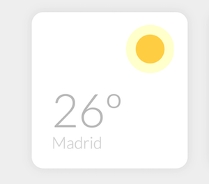
<div class="weather-wrapper">
    <div class="weather-card madrid">
        <div class="weather-icon sun"></div>
        <h1>26º</h1>
        <p>Madrid</p>
    </div>
    <div class="weather-card london">
        <div class="weather-icon cloud"></div>
        <h1>14º</h1>
        <p>London</p>
    </div>
</div>
CSS
Sau đó chúng ta sẽ tạo các icon và hiệu ứng động bằng đoạn css bên dưới.
*, *:before, *:after {
  box-sizing: border-box;
}

.weather-wrapper {
  display: -webkit-box;
  display: -webkit-flex;
  display: -ms-flexbox;
  display: flex;
  -webkit-box-orient: horizontal;
  -webkit-box-direction: normal;
  -webkit-flex-direction: row;
      -ms-flex-direction: row;
          flex-direction: row;
  -webkit-flex-wrap: wrap;
      -ms-flex-wrap: wrap;
          flex-wrap: wrap;
  -webkit-box-pack: center;
  -webkit-justify-content: center;
      -ms-flex-pack: center;
          justify-content: center;
}

.weather-card {
  margin: 20px 20px;
  border-radius: 20px;
  position: relative;
  overflow: hidden;
  awidth: 270px;
  height: 270px;
  background-color: white;
  box-shadow: 0px 0px 25px 1px rgba(50, 50, 50, 0.1);
  -webkit-animation: appear 500ms ease-out forwards;
          animation: appear 500ms ease-out forwards;
}
.weather-card h1 {
  position: absolute;
  font-family: 'Lato', sans-serif;
  font-weight: 300;
  font-size: 80px;
  color: #B8B8B8;
  bottom: 0;
  left: 35px;
  opacity: 0;
  -webkit-transform: translateX(150px);
      -ms-transform: translateX(150px);
          transform: translateX(150px);
  -webkit-animation: title-appear 500ms ease-out 500ms forwards;
          animation: title-appear 500ms ease-out 500ms forwards;
}
.weather-card p {
  position: absolute;
  font-family: 'Lato', sans-serif;
  font-weight: 300;
  font-size: 28px;
  color: #d2d2d2;
  bottom: 0;
  left: 35px;
  -webkit-animation: title-appear 1s ease-out 500ms forwards;
          animation: title-appear 1s ease-out 500ms forwards;
}

.weather-icon {
  position: relative;
  awidth: 50px;
  height: 50px;
  top: 0;
  float: right;
  margin: 40px 40px 0 0;
  -webkit-animation: weather-icon-move 5s ease-in-out infinite;
          animation: weather-icon-move 5s ease-in-out infinite;
}

.sun {
  background: #FFCD41;
  border-radius: 50%;
  box-shadow: rgba(255, 255, 0, 0.1) 0 0 0 4px;
  -webkit-animation: light 800ms ease-in-out infinite alternate, weather-icon-move 5s ease-in-out infinite;
          animation: light 800ms ease-in-out infinite alternate, weather-icon-move 5s ease-in-out infinite;
}

@-webkit-keyframes light {
  from {
    box-shadow: rgba(255, 255, 0, 0.2) 0 0 0 10px;
  }
  to {
    box-shadow: rgba(255, 255, 0, 0.2) 0 0 0 17px;
  }
}

@keyframes light {
  from {
    box-shadow: rgba(255, 255, 0, 0.2) 0 0 0 10px;
  }
  to {
    box-shadow: rgba(255, 255, 0, 0.2) 0 0 0 17px;
  }
}
.cloud {
  margin-right: 60px;
  background: #e1e1e1;
  border-radius: 20px;
  awidth: 25px;
  height: 25px;
  box-shadow: #e1e1e1 24px -6px 0 2px, #e1e1e1 10px 5px 0 5px, #e1e1e1 30px 5px 0 2px, #e1e1e1 11px -8px 0 -3px, #e1e1e1 25px 11px 0 -1px;
}
.cloud:after {
  content: "";
  position: absolute;
  border-radius: 10px;
  background-color: transparent;
  awidth: 4px;
  height: 12px;
  left: 0;
  top: 31px;
  -webkit-transform: rotate(30deg);
      -ms-transform: rotate(30deg);
          transform: rotate(30deg);
  -webkit-animation: rain 800ms ease-in-out infinite alternate;
          animation: rain 800ms ease-in-out infinite alternate;
}

@-webkit-keyframes rain {
  from {
    box-shadow: #2092A9 8px 0px, #2092A9 32px -6px, #2092A9 20px 0px;
  }
  to {
    box-shadow: #2092A9 8px 6px, #2092A9 32px 0px, #2092A9 20px 6px;
  }
}

@keyframes rain {
  from {
    box-shadow: #2092A9 8px 0px, #2092A9 32px -6px, #2092A9 20px 0px;
  }
  to {
    box-shadow: #2092A9 8px 6px, #2092A9 32px 0px, #2092A9 20px 6px;
  }
}
@-webkit-keyframes weather-icon-move {
  50% {
    -webkit-transform: translateY(-8px);
            transform: translateY(-8px);
  }
}
@keyframes weather-icon-move {
  50% {
    -webkit-transform: translateY(-8px);
            transform: translateY(-8px);
  }
}
.inspiration {
  color: #aeaeae;
  font-family: 'Lato', sans-serif;
  font-weight: 300;
  font-size: 24px;
  text-align: center;
}
.inspiration a {
  color: #FA565F;
  font-weight: 400;
  -webkit-animation: all 300ms ease-in-out;
          animation: all 300ms ease-in-out;
}

@-webkit-keyframes appear {
  0% {
    -webkit-transform: scale(0);
            transform: scale(0);
  }
  50% {
    -webkit-transform: scale(1.05);
            transform: scale(1.05);
  }
  75% {
    -webkit-transform: scale(0.95);
            transform: scale(0.95);
  }
  100% {
    -webkit-transform: scale(1);
            transform: scale(1);
  }
}

@keyframes appear {
  0% {
    -webkit-transform: scale(0);
            transform: scale(0);
  }
  50% {
    -webkit-transform: scale(1.05);
            transform: scale(1.05);
  }
  75% {
    -webkit-transform: scale(0.95);
            transform: scale(0.95);
  }
  100% {
    -webkit-transform: scale(1);
            transform: scale(1);
  }
}
@-webkit-keyframes title-appear {
  from {
    opacity: 0;
    -webkit-transform: translateX(150px);
            transform: translateX(150px);
  }
  to {
    opacity: 1;
    -webkit-transform: translateX(0px);
            transform: translateX(0px);
  }
}
@keyframes title-appear {
  from {
    opacity: 0;
    -webkit-transform: translateX(150px);
            transform: translateX(150px);
  }
  to {
    opacity: 1;
    -webkit-transform: translateX(0px);
            transform: translateX(0px);
  }
}
Mình mong là từ bài viết này, các bạn sẽ có thể tạo thêm nhiều mẫu cho riêng mình, và nhớ chia sẻ cho mọi người nhé.
Chuyên Mục: Css
Bài viết được đăng bởi webmaster