Mẫu icon xoay tròn cực đẹp với CSS3
Icon chỉ là một phần nhỏ trong một trang web, nhưng nếu các bạn có thể thiết kế nó theo kiểu đơn giản với hiệu ứng cực cool, thì trang web của các bạn sẽ trở nên sinh động và hiệu quả hơn rất nhiều. Trong bài viết này, mình xin chia sẻ thêm cho các bạn một mẫu icon được làm hoàn toàn bằng CSS3 với ...
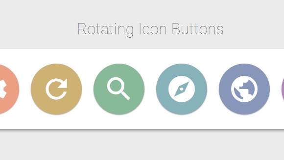
Icon chỉ là một phần nhỏ trong một trang web, nhưng nếu các bạn có thể thiết kế nó theo kiểu đơn giản với hiệu ứng cực cool, thì trang web của các bạn sẽ trở nên sinh động và hiệu quả hơn rất nhiều. Trong bài viết này, mình xin chia sẻ thêm cho các bạn một mẫu icon được làm hoàn toàn bằng CSS3 với sự kết hợp của những hiệu ứng hot nhất hiện nay.
Xem Demo | Download
HTML
Để tạo icon, các bạn chỉ cần sử dụng khung chuẩn html bên dưới.
<div class="main-wrapper">
		<i class="material-icons">attach_file</i>
		<i class="material-icons">settings</i>
		<i class="material-icons">refresh</i>
		<i class="material-icons">search</i>
		<i class="material-icons">explore</i>
		<i class="material-icons">public</i>
		<i class="material-icons">autorenew</i>
		<i class="material-icons">add</i>
</div>
CSS
Sau đó , các bạn sử dụng định dạng icon với đoạn css sau :
@import url(https://fonts.googleapis.com/css?family=Roboto:400,100,100italic,300,300italic,400italic,500,500italic,700,700italic,900,900italic);
* {
		font-family: "Roboto", Arial, sans-serif;
}

body {
		font-size: 1rem;
		background-color: #ebebeb;
		padding: 20px;
		text-align: center;
}

h1 {
		font-weight: 100;
		color: #777;
}

.main-wrapper {
		border-radius: 4px;
		background-color: white;
		padding: 20px;
		box-shadow: 0 3px 6px rgba(0, 0, 0, 0.16), 0 3px 6px rgba(0, 0, 0, 0.23);
		position: relative;
}

i.material-icons {
		font-size: 1.5rem;
		color: white;
		position: relative;
		border-radius: 50%;
		padding: 5px;
		margin: 3px;
		box-shadow: 0 1px 3px rgba(0, 0, 0, 0.12), 0 1px 2px rgba(0, 0, 0, 0.24);
		transition: color 0.2s ease, background-color 0.2s ease, transform 0.3s ease;
}

i.material-icons:after {
		content: "";
		awidth: 100%;
		height: 100%;
		border: solid 2px;
		transform: scale(0.8);
		position: absolute;
		top: -2px;
		left: -2px;
		border-radius: 50%;
		transition: all 0.3s ease;
}

i.material-icons:hover:after {
		transform: scale(1);
		box-shadow: 10px 0 20px rgba(0, 0, 0, 0.19), 6px 0 6px rgba(0, 0, 0, 0.23);
}

i.material-icons:nth-of-type(4) {
		background-color: #88b999;
}

i.material-icons:nth-of-type(4):hover {
		color: #88b999;
}

i.material-icons:nth-of-type(4):after {
		border-color: #88b999;
}

i.material-icons:nth-of-type(5) {
		background-color: #88b2b9;
}

i.material-icons:nth-of-type(5):hover {
		color: #88b2b9;
}

i.material-icons:nth-of-type(5):after {
		border-color: #88b2b9;
}

i.material-icons:nth-of-type(6) {
		background-color: #8897b9;
}

i.material-icons:nth-of-type(6):hover {
		color: #8897b9;
}

i.material-icons:nth-of-type(6):after {
		border-color: #8897b9;
}

i.material-icons:nth-of-type(7) {
		background-color: #af88b9;
}

i.material-icons:nth-of-type(7):hover {
		color: #af88b9;
}

i.material-icons:nth-of-type(7):after {
		border-color: #af88b9;
}

i.material-icons:nth-of-type(8) {
		background-color: #d59acb;
}

i.material-icons:nth-of-type(8):hover {
		color: #d59acb;
}

i.material-icons:nth-of-type(8):after {
		border-color: #d59acb;
}

i.material-icons:nth-of-type(1) {
		background-color: #cd8484;
}

i.material-icons:nth-of-type(1):hover {
		color: #cd8484;
}

i.material-icons:nth-of-type(1):after {
		border-color: #cd8484;
}

i.material-icons:nth-of-type(2) {
		background-color: #ec9f83;
}

i.material-icons:nth-of-type(2):hover {
		color: #ec9f83;
}

i.material-icons:nth-of-type(2):after {
		border-color: #ec9f83;
}

i.material-icons:nth-of-type(3) {
		background-color: #cdb274;
}

i.material-icons:nth-of-type(3):hover {
		color: #cdb274;
}

i.material-icons:nth-of-type(3):after {
		border-color: #cdb274;
}

i.material-icons:hover {
		background-color: transparent;
		transform: rotate(90deg);
		cursor: pointer;
		box-shadow: none;
}

p {
		color: #999;
		font-weight: 300;
		margin-top: 20px;
}

@media (min-awidth:601px) {
	i.material-icons {
		padding:10px;
		margin:5px;
		font-size:2rem;
	}
}

@media (min-awidth:993px) {
	i.material-icons {
		padding:20px;
		margin:10px;
		font-size:4rem;
	}
	i.material-icons:after {
		border-awidth:3px;
		top:-3px;
		left:-3px;
	}
}
Các bạn nhớ chèn thêm font sau trong thẻ <head > để có thể hiển thị icon.
<link href="https://fonts.googleapis.com/icon?family=Material+Icons" rel="stylesheet">
Chúc các bạn có thể sử dụng tốt những icon mà mình giới thiệu trong bài viết này, và mình hy vọng là các bạn có thể hiểu và học thêm được nhiều điều về cách sử dụng CSS3.
Chuyên Mục: Css
Bài viết được đăng bởi webmaster