04/10/2018, 20:10
Thiết kế mẫu Dark Login Form cho Website
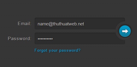
Tranh thủ thêm chút ít thời gian, mình sẽ chia sẻ cho các bạn một mẫu form login được lấy ý tưởng từ trang CSSFlow. Mẫu form này rất thích hợp cho những trang web có màu tối, tuy nhiên các bạn cũng có thể sáng tạo thêm về màu sắc khác nhau để phù hợp cho website hay blog của các bạn. Xem ...
Tranh thủ thêm chút ít thời gian, mình sẽ chia sẻ cho các bạn một mẫu form login được lấy ý tưởng từ trang CSSFlow. Mẫu form này rất thích hợp cho những trang web có màu tối, tuy nhiên các bạn cũng có thể sáng tạo thêm về màu sắc khác nhau để phù hợp cho website hay blog của các bạn.
Xem Demo | Download
HTML
Cấu trúc html cho form này bao gồm 2 trường nhập địa chỉ email và password cùng với nút submit và link khôi phục mật khẩu.
<form method="post" action="index.html" class="login">
    <p>
      <label for="login">Email:</label>
      <input type="text" name="login" id="login" value="name@thuthuatweb.net">
    </p>

    <p>
      <label for="password">Password:</label>
      <input type="password" name="password" id="password" value="4815162342">
    </p>

    <p class="login-submit">
      <button type="submit" class="login-button">Login</button>
    </p>

    <p class="forgot-password"><a href="index.html">Forgot your password?</a></p>
  </form>
CSS
Và dưới đây là toàn bộ đoạn css giúp các bạn tạo được form này.
.login {
  position: relative;
  margin: 80px auto;
  awidth: 400px;
  padding-right: 32px;
  font-weight: 300;
  color: #a8a7a8;
  text-shadow: 1px 1px 0 rgba(0, 0, 0, 0.8);
}
.login p {
  margin: 0 0 10px;
}

input, button, label {
  font-family: 'Helvetica Neue', Helvetica, Arial, sans-serif;
  font-size: 15px;
  font-weight: 300;
  -webkit-box-sizing: border-box;
  -moz-box-sizing: border-box;
  box-sizing: border-box;
}

input[type=text], input[type=password] {
  padding: 0 10px;
  awidth: 300px;
  height: 40px;
  color: #bbb;
  text-shadow: 1px 1px 1px black;
  background: rgba(0, 0, 0, 0.16);
  border: 0;
  border-radius: 5px;
  -webkit-box-shadow: inset 0 1px 4px rgba(0, 0, 0, 0.3), 0 1px rgba(255, 255, 255, 0.06);
  box-shadow: inset 0 1px 4px rgba(0, 0, 0, 0.3), 0 1px rgba(255, 255, 255, 0.06);
}
input[type=text]:focus, input[type=password]:focus {
  color: white;
  background: rgba(0, 0, 0, 0.1);
  outline: 0;
}

label {
  float: left;
  awidth: 100px;
  line-height: 40px;
  padding-right: 10px;
  font-weight: 100;
  text-align: right;
  letter-spacing: 1px;
}

.forgot-password {
  padding-left: 100px;
  font-size: 13px;
  font-weight: 100;
  letter-spacing: 1px;
}

.login-submit {
  position: absolute;
  top: 12px;
  right: 0;
  awidth: 48px;
  height: 48px;
  padding: 8px;
  border-radius: 32px;
  -webkit-box-shadow: 0 0 4px rgba(0, 0, 0, 0.35);
  box-shadow: 0 0 4px rgba(0, 0, 0, 0.35);
}
.login-submit:before, .login-submit:after {
  content: ';
  z-index: 1;
  position: absolute;
}
.login-submit:before {
  top: 28px;
  left: -4px;
  awidth: 4px;
  height: 10px;
  -webkit-box-shadow: inset 0 1px rgba(255, 255, 255, 0.06);
  box-shadow: inset 0 1px rgba(255, 255, 255, 0.06);
}
.login-submit:after {
  top: -4px;
  bottom: -4px;
  right: -4px;
  awidth: 36px;
}

.login-button {
  position: relative;
  z-index: 2;
  awidth: 48px;
  height: 48px;
  padding: 0 0 48px;
  /* Fix wrong positioning in Firefox 9 & older (bug 450418) */
  text-indent: 120%;
  white-space: nowrap;
  overflow: hidden;
  background: none;
  border: 0;
  border-radius: 24px;
  cursor: pointer;
  -webkit-box-shadow: inset 0 1px 1px rgba(0, 0, 0, 0.2), 0 1px rgba(255, 255, 255, 0.1);
  box-shadow: inset 0 1px 1px rgba(0, 0, 0, 0.2), 0 1px rgba(255, 255, 255, 0.1);
  /* Must use another pseudo element for the gradient background because Webkit */
  /* clips the background incorrectly inside elements with a border-radius.     */
}
.login-button:before {
  content: ';
  position: absolute;
  top: 5px;
  bottom: 5px;
  left: 5px;
  right: 5px;
  background: #00a2d3;
  border-radius: 24px;
  background-image: -webkit-linear-gradient(top, #00a2d3, #0d7796);
  background-image: -moz-linear-gradient(top, #00a2d3, #0d7796);
  background-image: -o-linear-gradient(top, #00a2d3, #0d7796);
  background-image: linear-gradient(to bottom, #00a2d3, #0d7796);
  -webkit-box-shadow: inset 0 0 0 1px #00a2d3, 0 0 0 5px rgba(0, 0, 0, 0.16);
  box-shadow: inset 0 0 0 1px #00a2d3, 0 0 0 5px rgba(0, 0, 0, 0.16);
}
.login-button:active:before {
  background: #0591ba;
  background-image: -webkit-linear-gradient(top, #0591ba, #00a2d3);
  background-image: -moz-linear-gradient(top, #0591ba, #00a2d3);
  background-image: -o-linear-gradient(top, #0591ba, #00a2d3);
  background-image: linear-gradient(to bottom, #0591ba, #00a2d3);
}
.login-button:after {
  content: ';
  position: absolute;
  top: 15px;
  left: 12px;
  awidth: 25px;
  height: 19px;
  background: url("img/arrow.png") 0 0 no-repeat;
}

::-moz-focus-inner {
  border: 0;
  padding: 0;
}

.lt-ie9 input[type=text], .lt-ie9 input[type=password] {
  line-height: 40px;
  background: #282828;
}
.lt-ie9 .login-submit {
  position: absolute;
  top: 12px;
  right: -28px;
  padding: 4px;
}
.lt-ie9 .login-submit:before, .lt-ie9 .login-submit:after {
  display: none;
}
.lt-ie9 .login-button {
  line-height: 48px;
}
.lt-ie9 .about {
  background: #313131;
}
Chúc các bạn thành công !
Chuyên Mục: Css, Thiết kế website
Bài viết được đăng bởi webmaster