04/10/2018, 20:02
Single input 3D form với CSS3 và jQuery
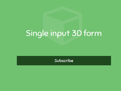
Hôm nay mình sẽ chia sẻ cho các bạn một mẫu form nhập liệu đơn với hiệu ứng 3D đẹp mắt và đầy ấn tượng chỉ với bằng CSS3 và jQuery. Mẫu form này rất thích hợp cho việc tạo các form Subscribe. Xem Demo | Download HTML Đầu tiên chúng ta cần có bộ khung chuẩn html như sau : <div ...
Hôm nay mình sẽ chia sẻ cho các bạn một mẫu form nhập liệu đơn với hiệu ứng 3D đẹp mắt và đầy ấn tượng chỉ với bằng CSS3 và jQuery. Mẫu form này rất thích hợp cho việc tạo các form Subscribe.
Xem Demo | Download
HTML
Đầu tiên chúng ta cần có bộ khung chuẩn html như sau :
<div id="cuboid">
	<form>

		<div>
			<p class="cuboid-text">Subscribe</p>
		</div>

		<div>

			<label for="submit" class="submit-icon">
				<i class="fa fa-chevron-right"></i>
			</label>
			<input type="text" id="email" class="cuboid-text" placeholder="Your Email" autocomplete="off"/>

			<input type="submit" id="submit" />
		</div>

		<div>
			<p class="cuboid-text loader">Just a moment</p>
		</div>

		<div>

			<span class="reset-icon"><i class="fa fa-refresh"></i></span>
			<p class="cuboid-text">Thankyou, we'll be in touch</p>
		</div>
	</form>
</div>
CSS
Để tạo hiệu ứng 3D , chúng ta cần đoạn css sau :
* {margin: 0; padding: 0;}
body {
	background: hsl(120, 40%, 60%);
	padding-top: 150px;
	font: normal 18px Sniglet; color: white; text-align: center;
}

/*general styles*/
h1 {font-weight: normal; font-size: 36px; margin-bottom: 75px;}
.fun-cube i {transform: scale(10); opacity: 0.1;}

#cuboid {
	awidth: 400px; margin: 0 auto;
	/*this also makes #cuboid a container for absolutely positioned descendants*/
	perspective: 1000px;
}
#cuboid form {
	/*counter translate*/
	transform: translateZ(-20px);
	/*propogate 3d space for children*/
	transform-style: preserve-3d;
	/*prevent height collapse as children are absolutely positioned*/
	height: 40px;
	/*for smooth animations*/
	transition: all 0.35s;
}

/*faces*/
.cuboid-text {
	/*each face will be 40px high*/
	line-height: 40px; height: 40px;
	background: hsl(120, 40%, 20%);
}
.loader {
	background: hsl(120, 40%, 30%);
	animation: phase 1s infinite;
}
/*Lets create a pulsating animation for the loader face*/
@keyframes phase {
	50% {background: hsl(120, 70%, 30%);}
}
#email {
	background: white; outline: none; border: 0 none;
	font: inherit; text-align: left; color: hsl(120, 40%, 30%);
	display: block; awidth: 100%; padding: 0 10px;
	box-sizing: border-box;
}
#submit {display: none;}

.submit-icon, .reset-icon {
	position: absolute; top: 0; right: 0;
	color: rgba(0, 0, 0, 0.25);
	line-height: 40px; padding: 0 10px;
	/*smooth transitions when user activates input and types something*/
	transition: all 0.5s;
	/*to make the icons feel like buttons*/
	cursor: pointer;
}
/*.active = when the user is typing something*/
.submit-icon.active {color: hsl(120, 40%, 30%);}
.reset-icon {color: rgba(255, 255, 255, 0.25); font-size: 14px;}

#cuboid div {position: absolute; top: 0; left: 0; awidth: 100%;}
/*3D transforms. Each face will be rotated in multiples of -90deg and moved 20px(half of their 40px height) out*/
#cuboid div:nth-child(1) {transform: rotateX(0deg) translateZ(20px);}
#cuboid div:nth-child(2) {transform: rotateX(-90deg) translateZ(20px);}
#cuboid div:nth-child(3) {transform: rotateX(-180deg) translateZ(20px);}
#cuboid div:nth-child(4) {transform: rotateX(-270deg) translateZ(20px);}

/*the form will have 4 states/classes(default+3) for rotation*/
#cuboid form:hover,
#cuboid form.ready {transform: translateZ(-20px) rotateX(90deg);}
#cuboid form.loading {transform: translateZ(-20px) rotateX(180deg);}
#cuboid form.complete {transform: translateZ(-20px) rotateX(270deg);}
jQuery
Cuối cùng là chúng ta chỉ cần đoạn jQuery sau nữa là đủ :
<script src="jquery-1.7.1.min.js" type="text/javascript"></script>
<script type="text/javascript">
//jQuery time

//add '.ready' to form when user focuses on it
$("#email").focus(function(){
	$("#cuboid form").addClass("ready");
})
//remove '.ready' when user blus away but only if there is no content
$("#email").blur(function(){
	if($(this).val() == "")
		$("#cuboid form").removeClass("ready");
})

//If the user is typing something make the arrow green/.active
$("#email").keyup(function(){
	//this adds .active class only if the input has some text
	$(".submit-icon").toggleClass("active", $(this).val().length > 0);
})

//on form submit remove .ready and add .loading to the form
$("#cuboid form").submit(function(){
	$(this).removeClass("ready").addClass("loading");
	//finish loading in 3s
	setTimeout(complete, 3000);
	//prevent default form submisson
	return false;
})
function complete()
{
	$("#cuboid form").removeClass("loading").addClass("complete");
}
//reset/refresh functionality
$(".reset-icon").click(function(){
	$("#cuboid form").removeClass("complete");
})
</script>
Mình hy vọng là qua bài viết này,các bạn sẽ có thêm nhiều lựa chọn cho website hay blog của mình, và hơn hết là các bạn sẽ nâng cao khả năng sử dụng CSS3 và jQuery của mình.
Chuyên Mục: Css, Javascript
Bài viết được đăng bởi webmaster
-
Hải Phụng Business