04/10/2018, 20:07
Thiết kế Menu Bottom với CSS3 và borderMenu.js
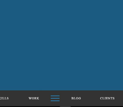
Hôm nay mình sẽ chia sẻ cho các bạn một mẫu menu được đặt ở vị trí bottom, tức là ở dưới cùng của trang web. Mẫu menu này với hiệu ứng overley cực cool, đảm bảo sẽ làm hài lòng những bạn khó tính nhất. Xem Demo | Download HTML Đầu tiên là chúng ta xây dựng khung chuẩn html cho menu ...
Hôm nay mình sẽ chia sẻ cho các bạn một mẫu menu được đặt ở vị trí bottom, tức là ở dưới cùng của trang web. Mẫu menu này với hiệu ứng overley cực cool, đảm bảo sẽ làm hài lòng những bạn khó tính nhất.
Xem Demo | Download
HTML
Đầu tiên là chúng ta xây dựng khung chuẩn html cho menu như sau :
<nav id="bt-menu" class="bt-menu">
	<a href="#" class="bt-menu-trigger"><span>Menu</span></a>
		<ul>
	            <li><a href="#" class="bt-icon icon-user-outline">About</a></li>
		    <li><a href="#" class="bt-icon icon-sun">Skills</a></li>
		    <li><a href="#" class="bt-icon icon-windows">Work</a></li>
		    <li><a href="#" class="bt-icon icon-speaker">Blog</a></li>
		    <li><a href="#" class="bt-icon icon-star">Clients</a></li>
		    <li><a href="#" class="bt-icon icon-bubble">Contact</a></li>
		</ul>
</nav>
CSS
Sau đó các bạn copy và dùng đoạn css sau :
*,
*:after,
*::before {
    -webkit-box-sizing: border-box;
    -moz-box-sizing: border-box;
    box-sizing: border-box;
}

body  {
	background: #2980b9;
}

.container {
	padding: 80px;
    text-align: center;
}

a.title{ color:#fff; font-size:12px; }

.container h1 {color:white; text-align: center;}

.bt-menu {
	position: fixed;
	top: 0;
	left: 0;
	awidth: 100%;
	height: 0;
	border-awidth: 0px;
	border-style: solid;
	border-color: #333;
	background-color: rgba(0,0,0,0);
	-webkit-backface-visibility: hidden;
	-webkit-transition: border-awidth 0.3s, background-color 0.3s, height 0s 0.3s;
	transition: border-awidth 0.3s, background-color 0.3s, height 0s 0.3s;
}

.bt-menu.bt-menu-open {
	height: 100%;
	border-awidth: 30px 30px 90px 30px;
	background-color: rgba(0,0,0,0.3);
	-webkit-transition: border-awidth 0.3s, background-color 0.3s;
	transition: border-awidth 0.3s, background-color 0.3s;
}

.bt-overlay {
	position: absolute;
	awidth: 100%;
}

.bt-menu-open .bt-overlay {
	height: 100%;
}

.bt-menu-trigger {
	position: fixed;
	bottom: 22px;
	left: 50%;
	z-index: 100;
	display: block;
	margin-left: -25px;
	awidth: 50px;
	height: 50px;
	cursor: pointer;
}

.bt-menu-trigger span {
	position: absolute;
	top: 50%;
	left: 0;
	display: block;
	awidth: 100%;
	height: 8%;
	background-color: #fff;
	font-size: 0px;
	-webkit-transition: background-color 0.3s;
	transition: background-color 0.3s;
	-webkit-touch-callout: none;
	-webkit-user-select: none;
	-khtml-user-select: none;
	-moz-user-select: none;
	-ms-user-select: none;
	user-select: none;
}

.bt-menu-open .bt-menu-trigger span {
	background-color: #2980b9;
}

.bt-menu-trigger span:before,
.bt-menu-trigger span:after {
	position: absolute;
	left: 0;
	awidth: 100%;
	height: 100%;
	background: #fff;
	content: ';
	-webkit-transition: -webkit-transform 0.3s, background-color 0.3s;
	transition: transform 0.3s, background-color 0.3s;
}

.bt-menu-trigger span:before {
	-webkit-transform: translateY(-250%);
	transform: translateY(-250%);
}

.bt-menu-trigger span:after {
	-webkit-transform: translateY(250%);
	transform: translateY(250%);
}

.bt-menu-open .bt-menu-trigger span:before,
.bt-menu-open .bt-menu-trigger span:after {
	background-color: #2980b9;
}

.bt-menu-open .bt-menu-trigger span:before {
	-webkit-transform: translateY(-350%);
	transform: translateY(-350%);
}

.bt-menu-open .bt-menu-trigger span:after {
	-webkit-transform: translateY(350%);
	transform: translateY(350%);
}

.bt-menu ul {
	position: fixed;
	bottom: 0px;
	left: 0;
	margin: 0;
	padding: 0;
	awidth: 100%;
	list-style: none;
	text-align: center;
	white-space: nowrap;
	height: 0;
	-webkit-transition: height 0s 0.3s;
	transition: height 0s 0.3s;
}

.bt-menu.bt-menu-open ul {
	height: 90px;
	-webkit-transition: none;
	transition: none;
}

.bt-menu ul li,
.bt-menu ul li a {
	text-align: center;
}

.bt-menu ul li {
	display: inline-block;
	margin: 0 2%;
	awidth: 5%;
	height: 90px;
	line-height: 90px;
	opacity: 0;
	-webkit-transition: -webkit-transform 0.3s, opacity 0.3s;
	transition: transform 0.3s, opacity 0.3s;
	-webkit-transform: translate3d(0,100%,0);
	transform: translate3d(0,100%,0);
}

.bt-menu ul li:nth-child(3) {
	margin-right: 70px;
}

.bt-menu ul li:nth-child(4) {
	margin-left: 70px;
}

.bt-menu.bt-menu-open ul li {
	opacity: 1;
	-webkit-transform: translate3d(0,0,0);
	transform: translate3d(0,0,0);
}

.bt-menu.bt-menu-open ul li:first-child,
.bt-menu.bt-menu-open ul li:last-child {
	-webkit-transition-delay: 0.15s;
	transition-delay: 0.15s;
}

.bt-menu.bt-menu-open ul li:nth-child(2),
.bt-menu.bt-menu-open ul li:nth-last-child(2) {
	-webkit-transition-delay: 0.1s;
	transition-delay: 0.1s;
}

.bt-menu.bt-menu-open ul li:nth-child(3),
.bt-menu.bt-menu-open ul li:nth-last-child(3) {
	-webkit-transition-delay: 0.05s;
	transition-delay: 0.05s;
}

.bt-menu ul li a {
	display: block;
	outline: none;
	color: #fff;
	text-decoration: none;
	text-transform: uppercase;
	letter-spacing: 1px;
	font-size: 1.15em;
	-webkit-transition: color 0.2s;
	transition: color 0.2s;
}

.bt-menu ul li a:before {
	display: none;
	font-size: 32px;
}

.bt-menu ul li a:hover,
.bt-menu ul li a:focus {
	color: #2980b9;
}

@media screen and (max-awidth: 65.1em) {
	.bt-menu ul li a {
		font-size: 90%;
	}
}

@media screen and (max-awidth: 55.5em) {
	.bt-menu ul li {
		margin: 0 15px;
	}

	.bt-menu ul li a {
		font-size: 0px;
	}

	.bt-menu ul li a:before {
		display: block;
	}
}

@media screen and (max-awidth: 32em) {
	.bt-menu-trigger {
		awidth: 40px;
		margin-left: -20px;
	}

	.bt-menu ul li {
		margin: 0 2%;
	}

	.bt-menu ul li:nth-child(3) {
		margin-right: 50px;
	}

	.bt-menu ul li:nth-child(4) {
		margin-left: 50px;
	}

	.bt-menu ul li a:before {
		font-size: 24px;
	}
}
Javascript
Cuối cùng là chèn 2 đoạn script sau vào là được :
<script src="classie.js"></script>
<script src="borderMenu.js"></script>
2 đoạn script bên trên các bạn có thể tìm thấy ở mục download mà mình để ở trong bài viết này.
Chúc các bạn thành công !
Chuyên Mục: Css, Javascript
Bài viết được đăng bởi webmaster